Day 06
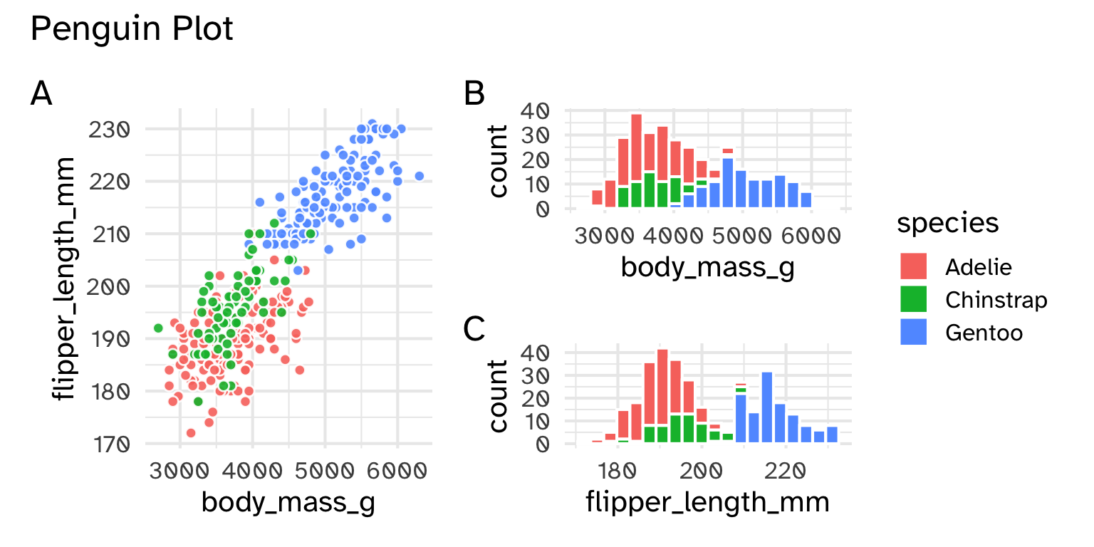
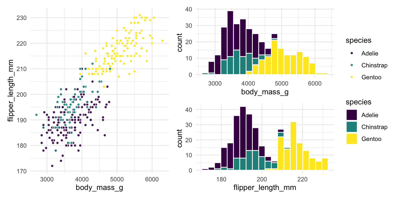
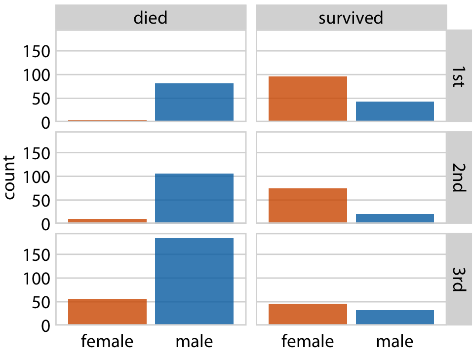
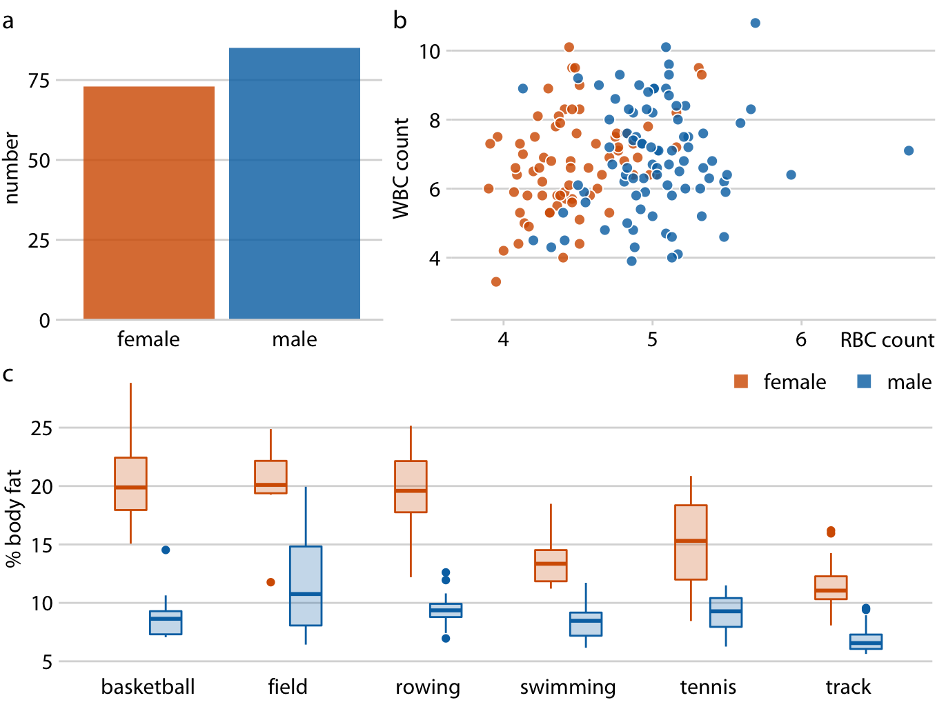
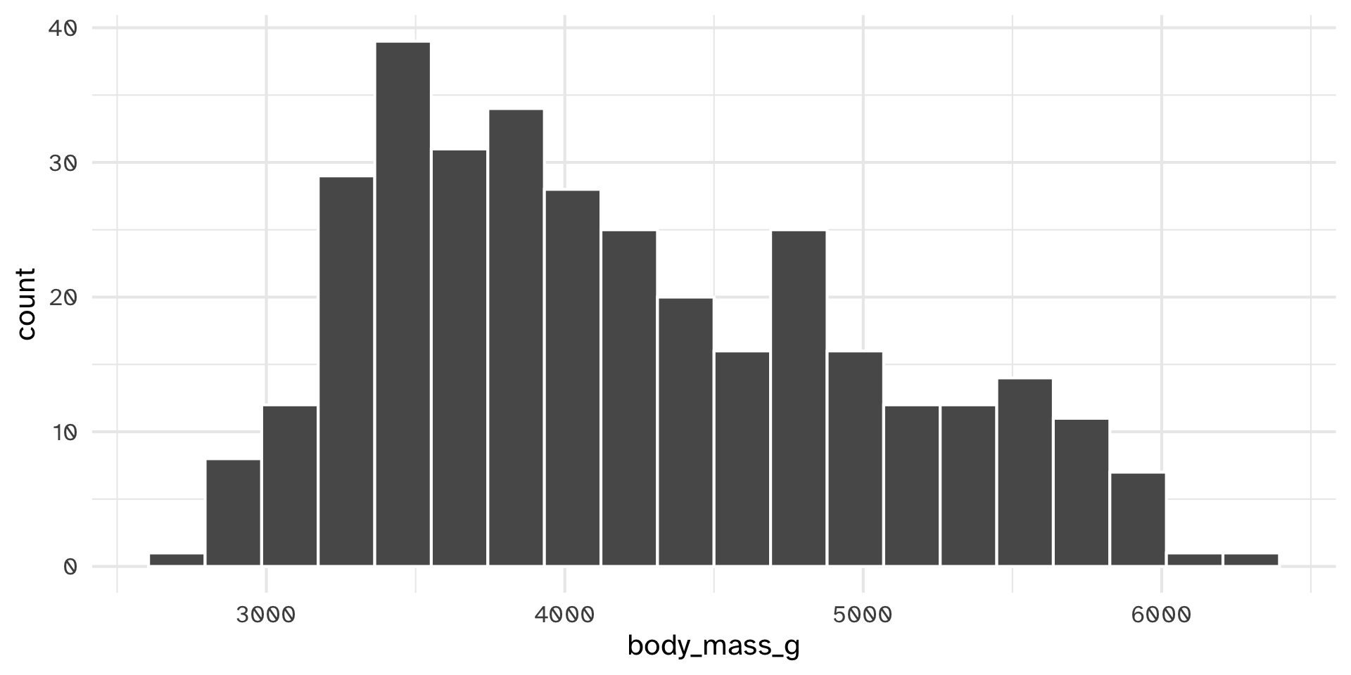
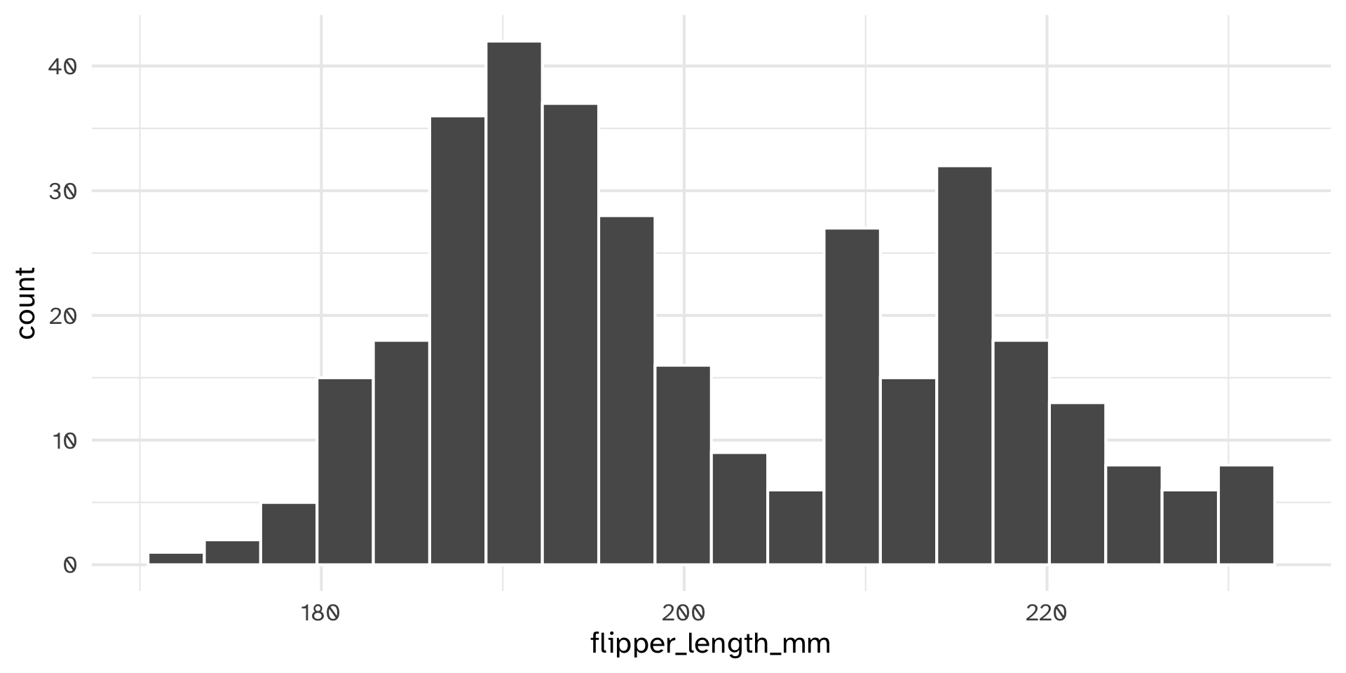
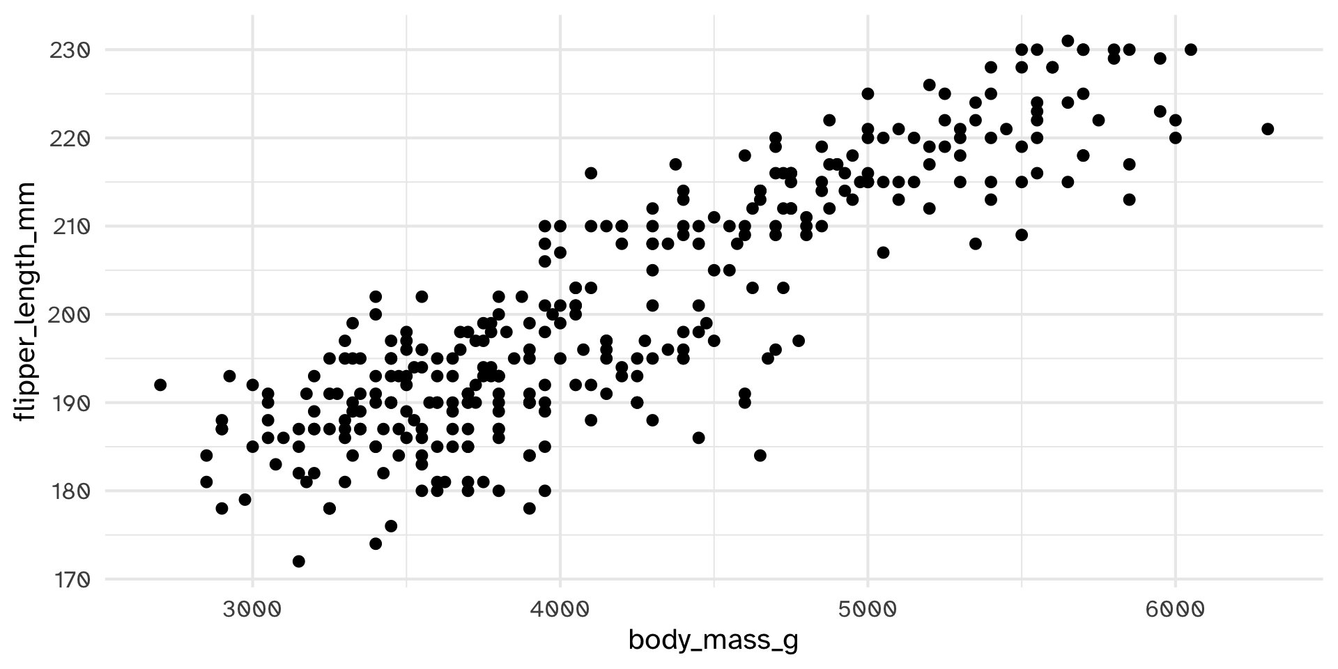
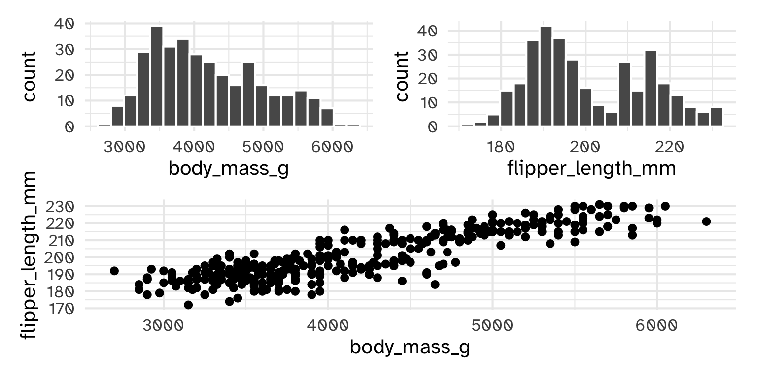
Each plot shares aesthetics but shows different subsets of data
The plots might share data, but don’t share aesthetics
Imagine reading these three plots one after another in a report. What’s hard about it? How would you fix it?
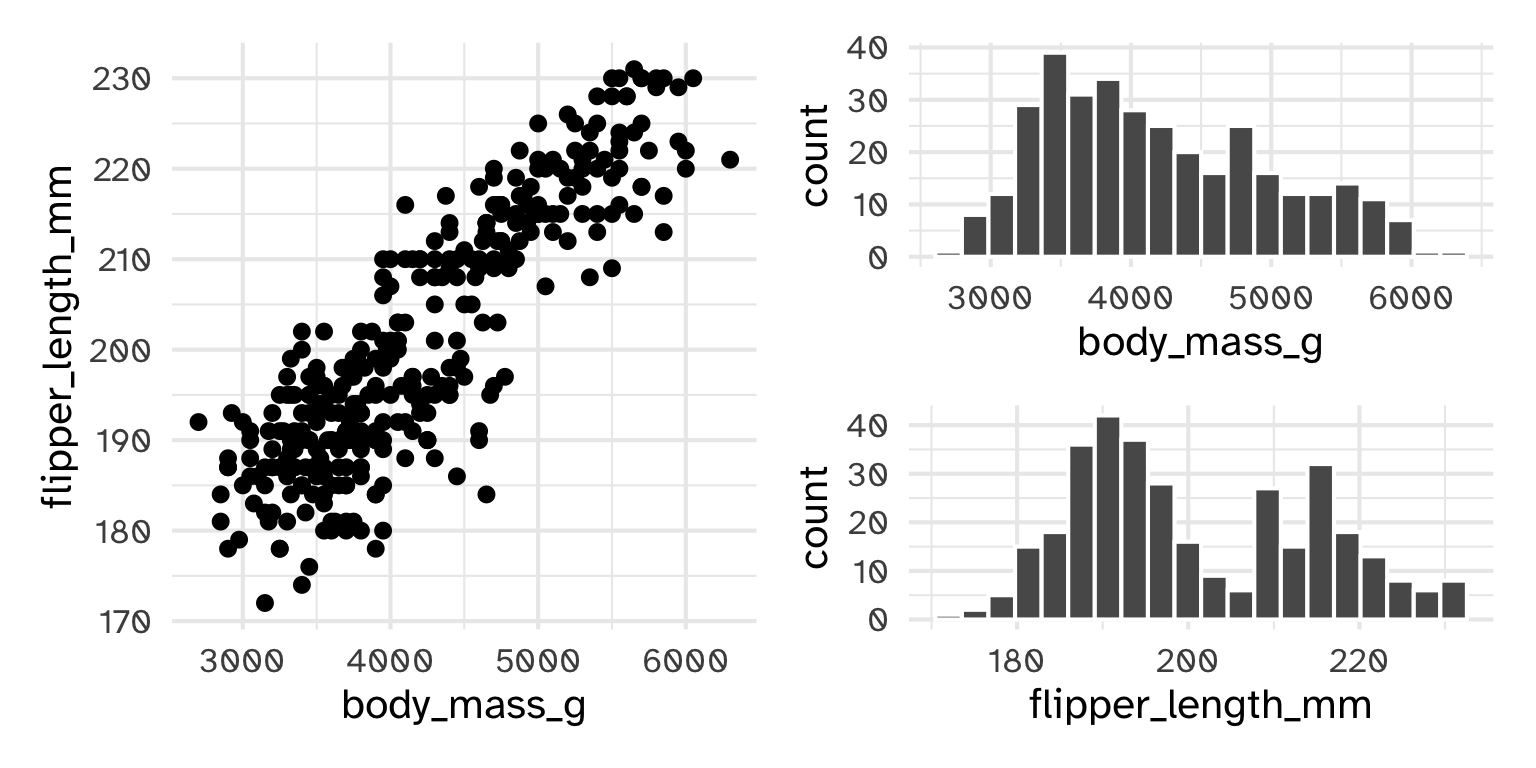
What’s redundant in this figure?
p1 <- ggplot(penguins) +
  geom_histogram(bins = 20, col = "white", aes(x = body_mass_g, fill = species))

p2 <- ggplot(penguins) +
  geom_histogram(bins = 20,  col = "white", aes(x = flipper_length_mm, fill = species))

p3 <- ggplot(penguins) +
  geom_point(shape = 21, alpha = .9, col = "white", aes(x = body_mass_g, y = flipper_length_mm, fill = species))

p3 + (p1/p2) 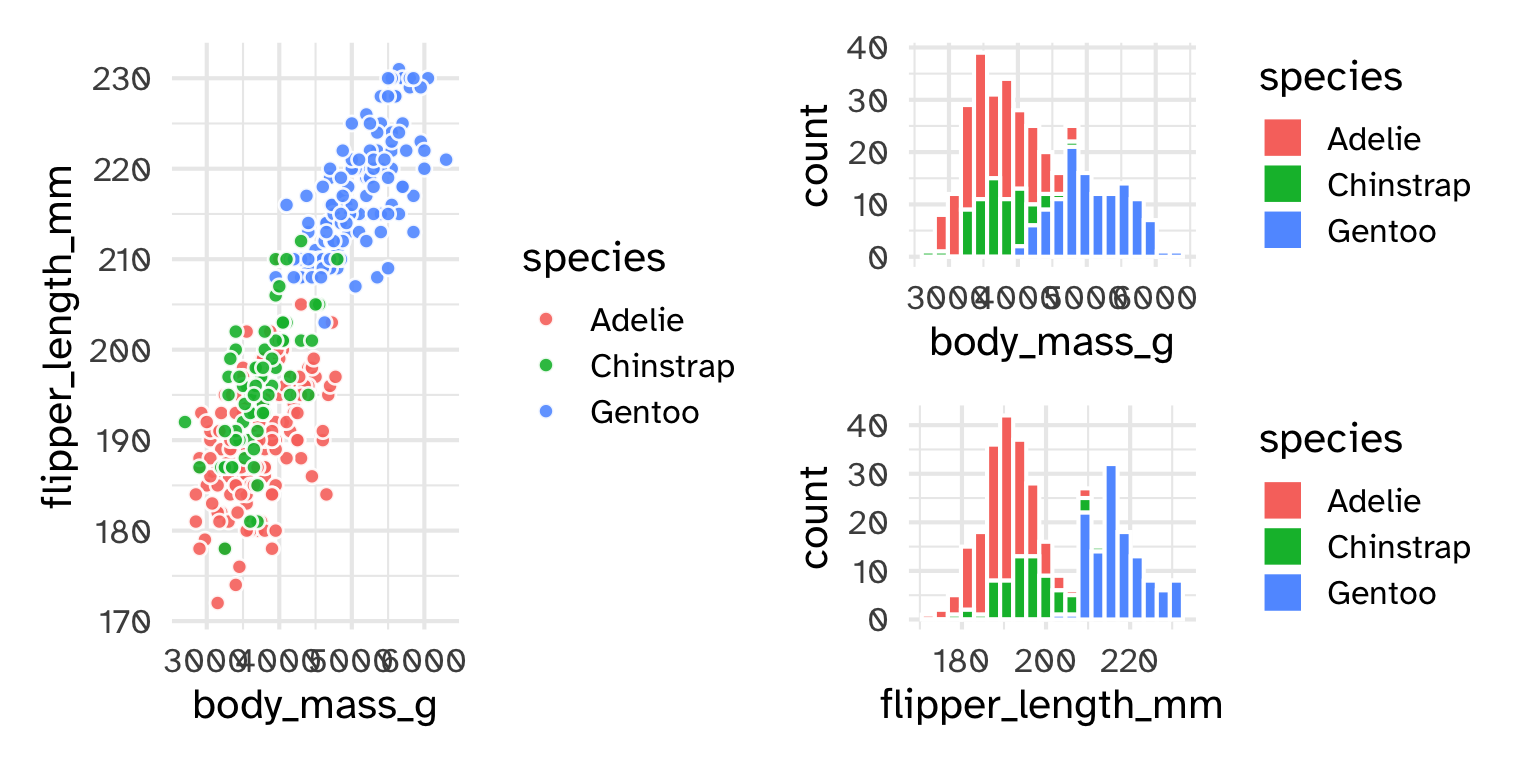
p1 <- ggplot(penguins) +
  geom_histogram(bins = 20, col = "white", aes(x = body_mass_g, fill = species))

p2 <- ggplot(penguins) +
  geom_histogram(bins = 20,  col = "white", aes(x = flipper_length_mm, fill = species))

p3 <- ggplot(penguins) +
  geom_point(shape = 21, alpha = .9, col = "white", aes(x = body_mass_g, y = flipper_length_mm, fill = species))

p3 + (p1/p2) +
  plot_layout(guides = 'collect')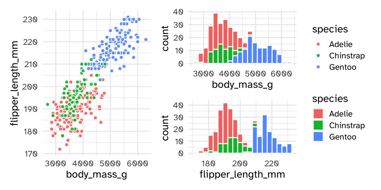
point legend)p1 <- ggplot(penguins) +
geom_histogram(bins = 20, col = "white", aes(x = body_mass_g, fill = species))
p2 <- ggplot(penguins) +
geom_histogram(bins = 20, col = "white", aes(x = flipper_length_mm, fill = species))
p3 <- ggplot(penguins) +
geom_point(shape = 21, alpha = .9, col = "white", aes(x = body_mass_g, y = flipper_length_mm, fill = species)) +
theme(legend.position = "none")
p3 + (p1/p2) +
plot_layout(guides = 'collect')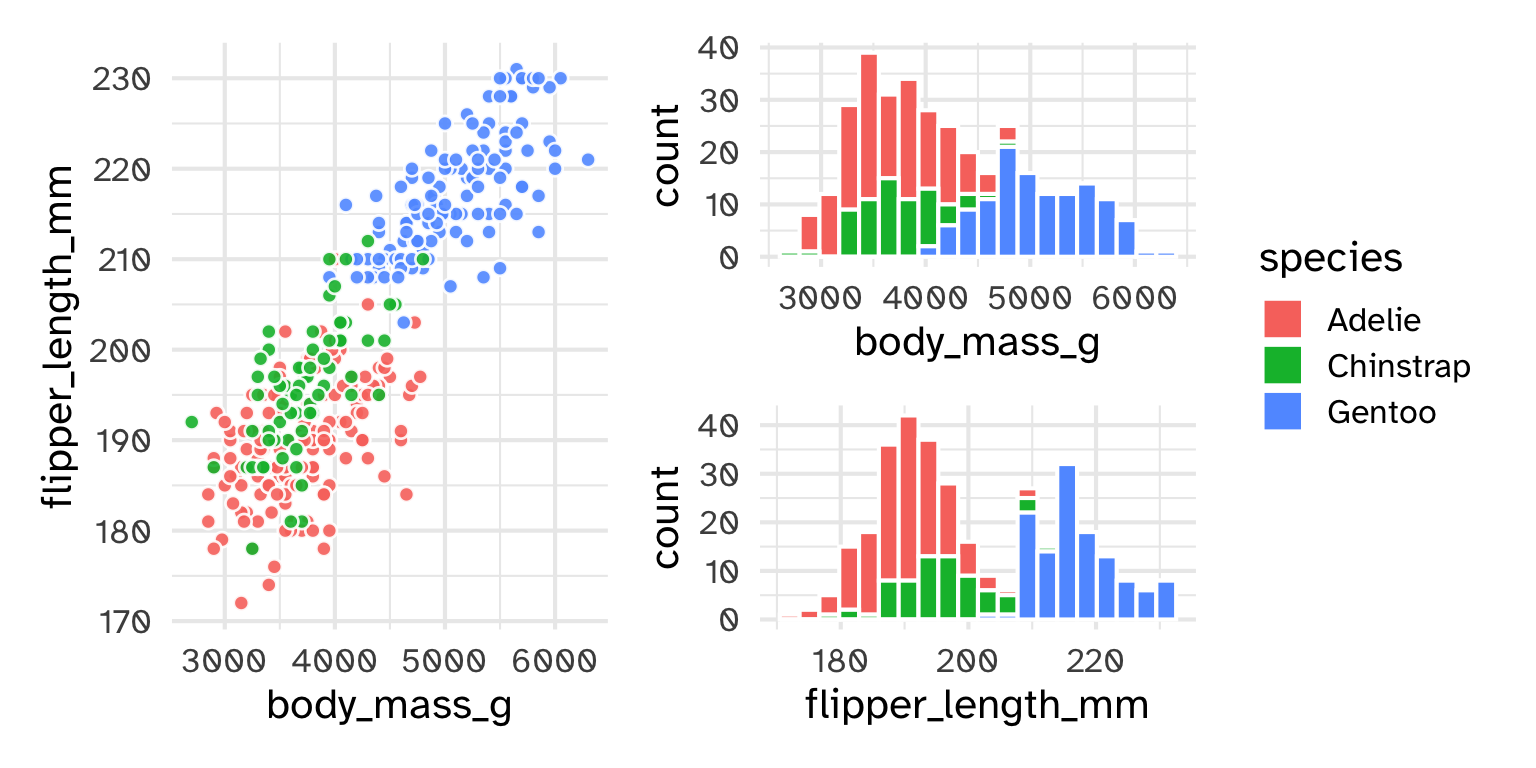
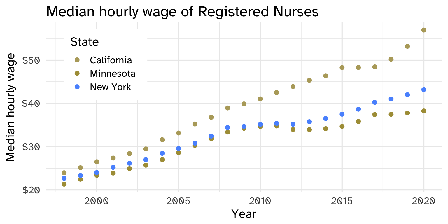
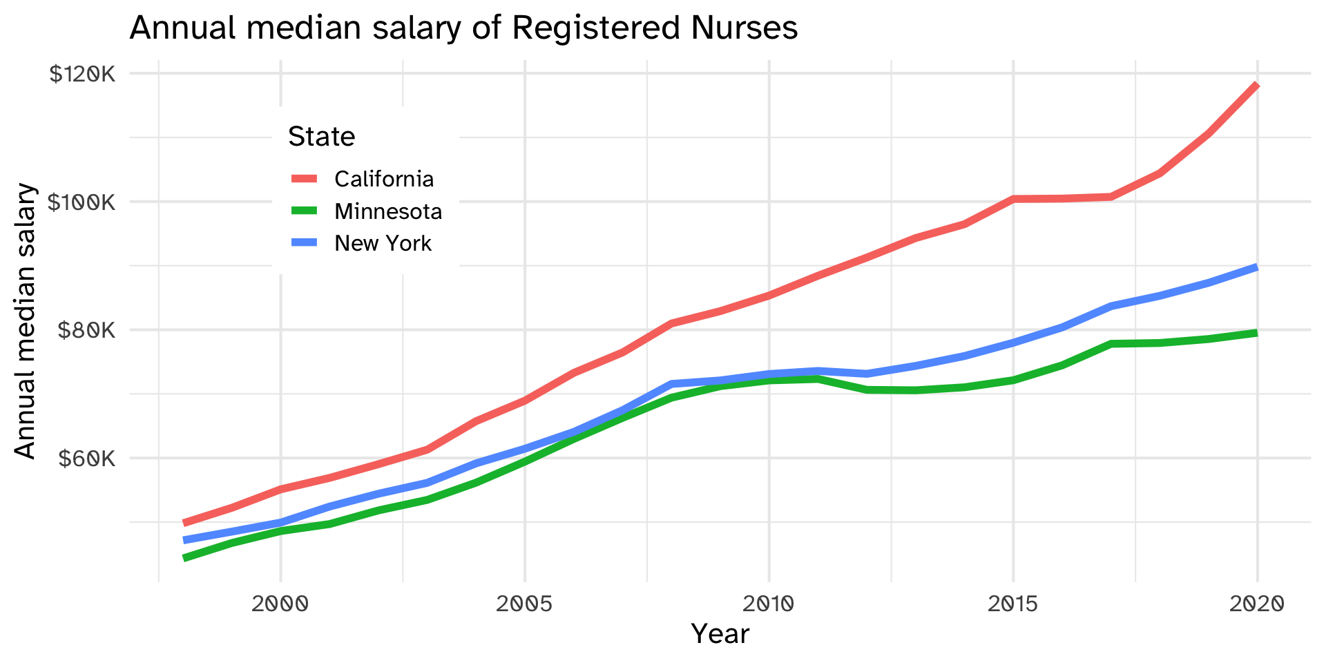
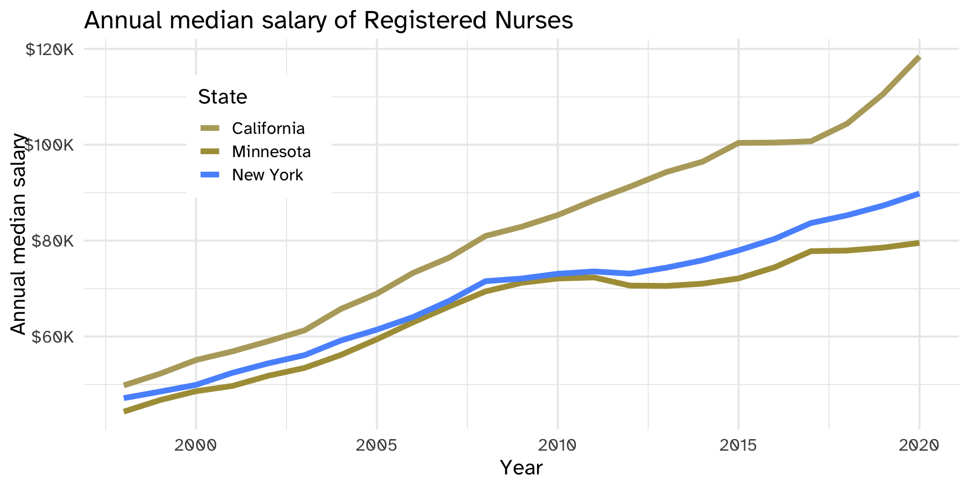
Graph A, as seen by someone with deuteranopia (a common form of colorblindness): which state is which? How sure are you?
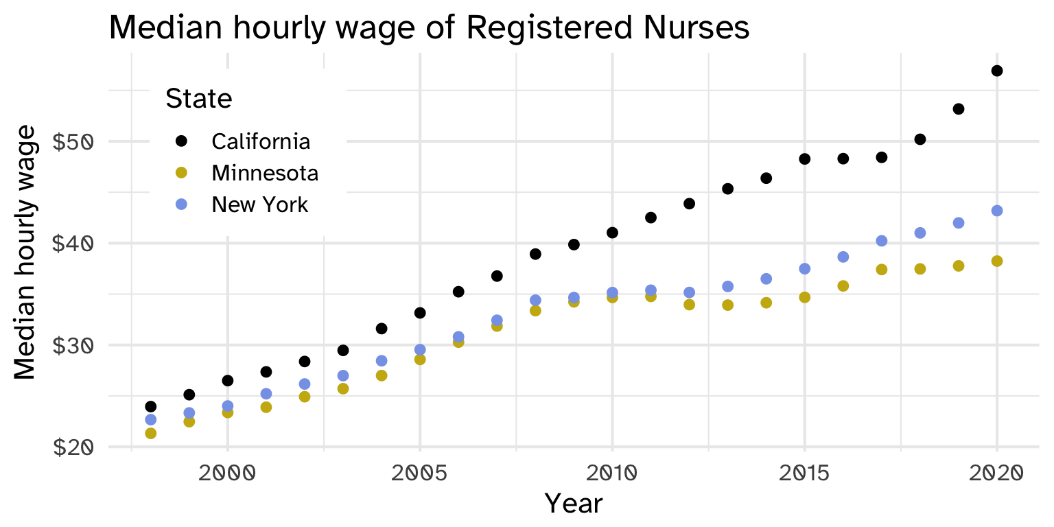
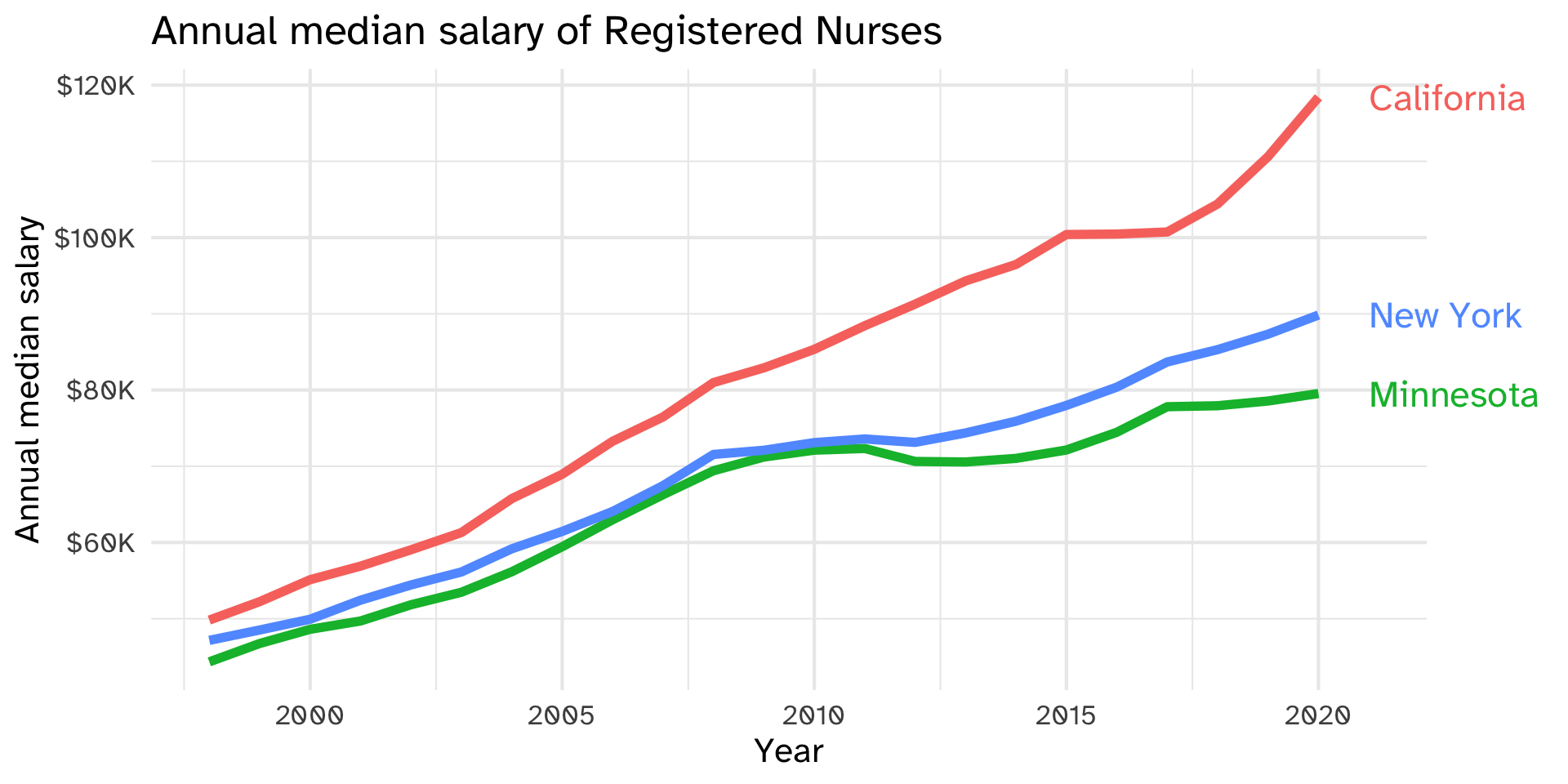
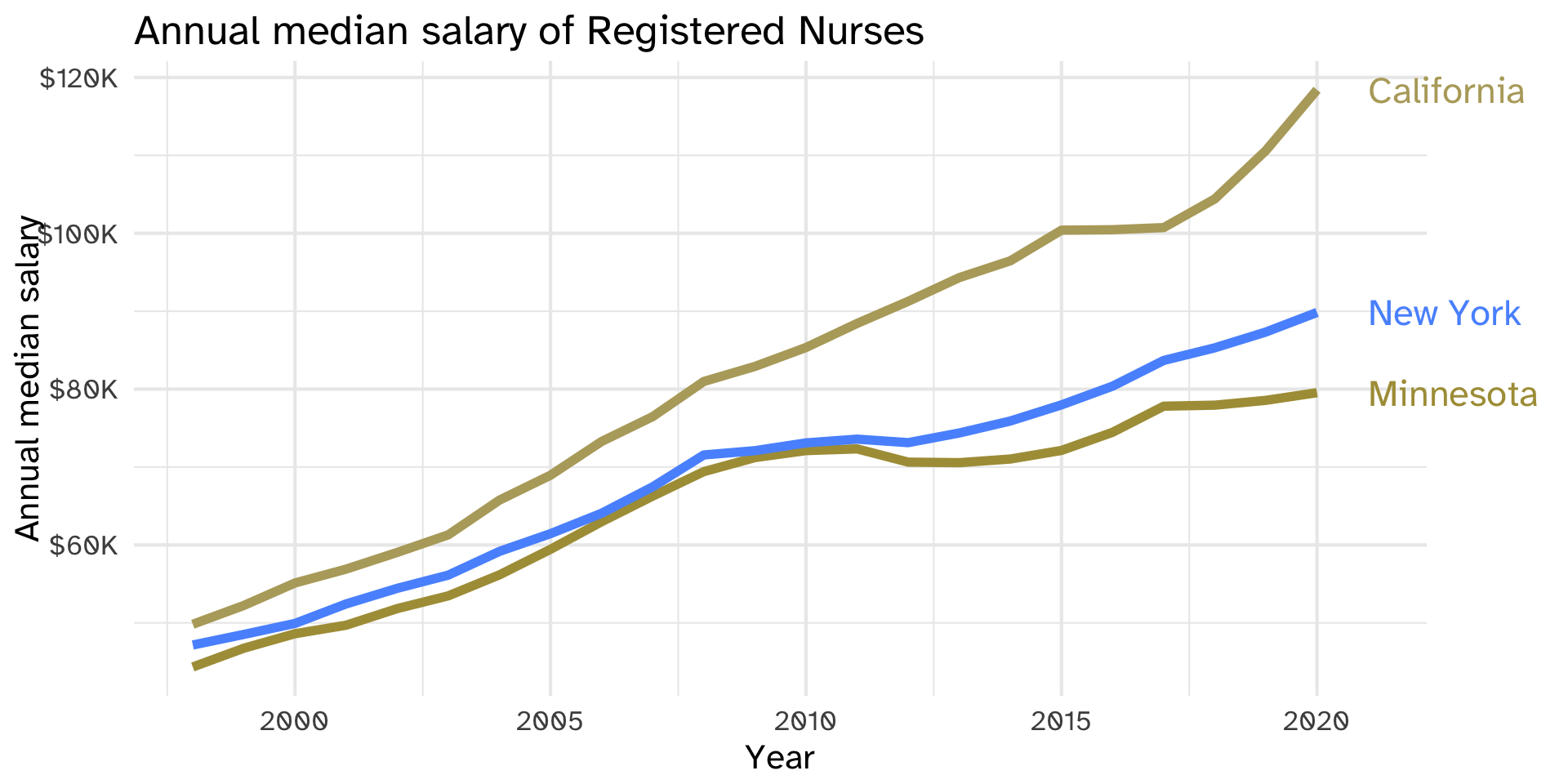
Graph B: same data, same viewer. What changed? Why is it easier?
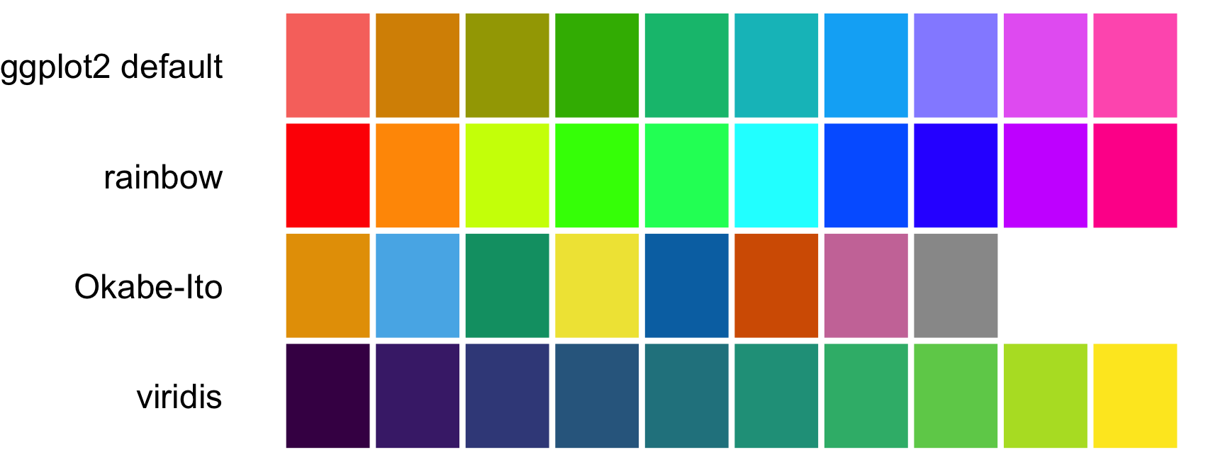
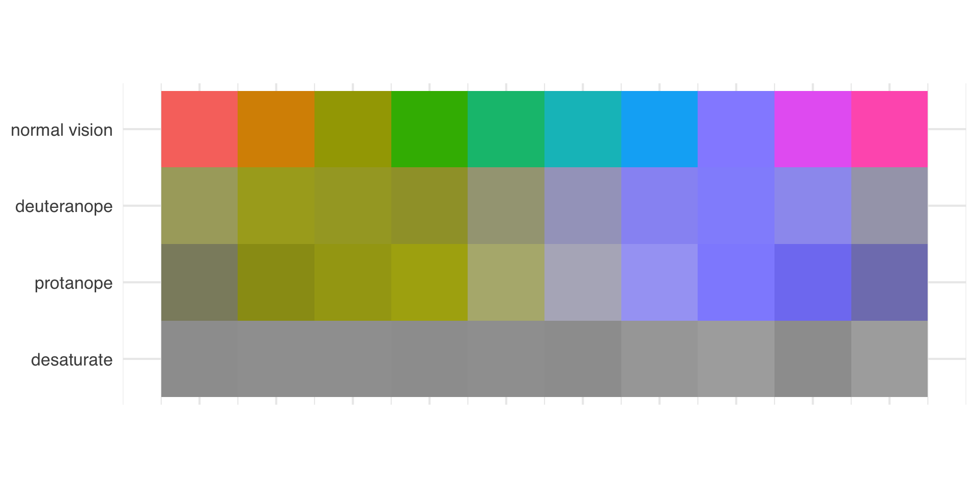
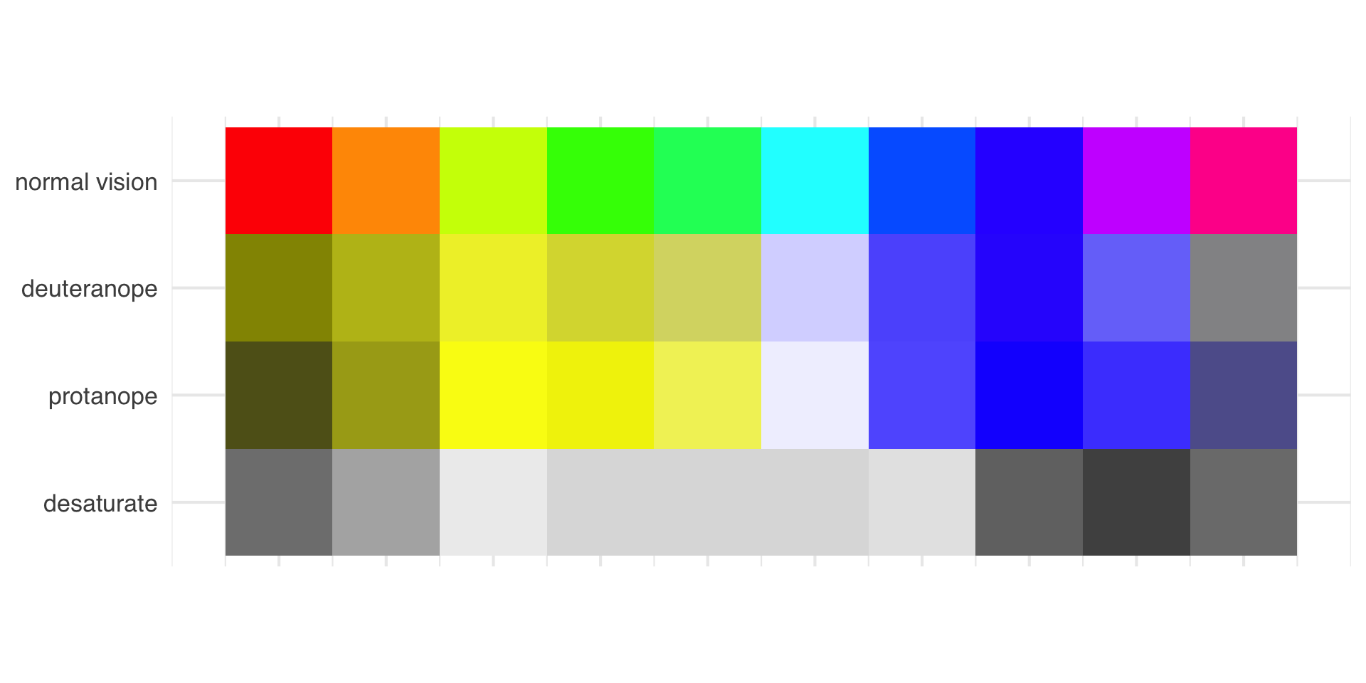
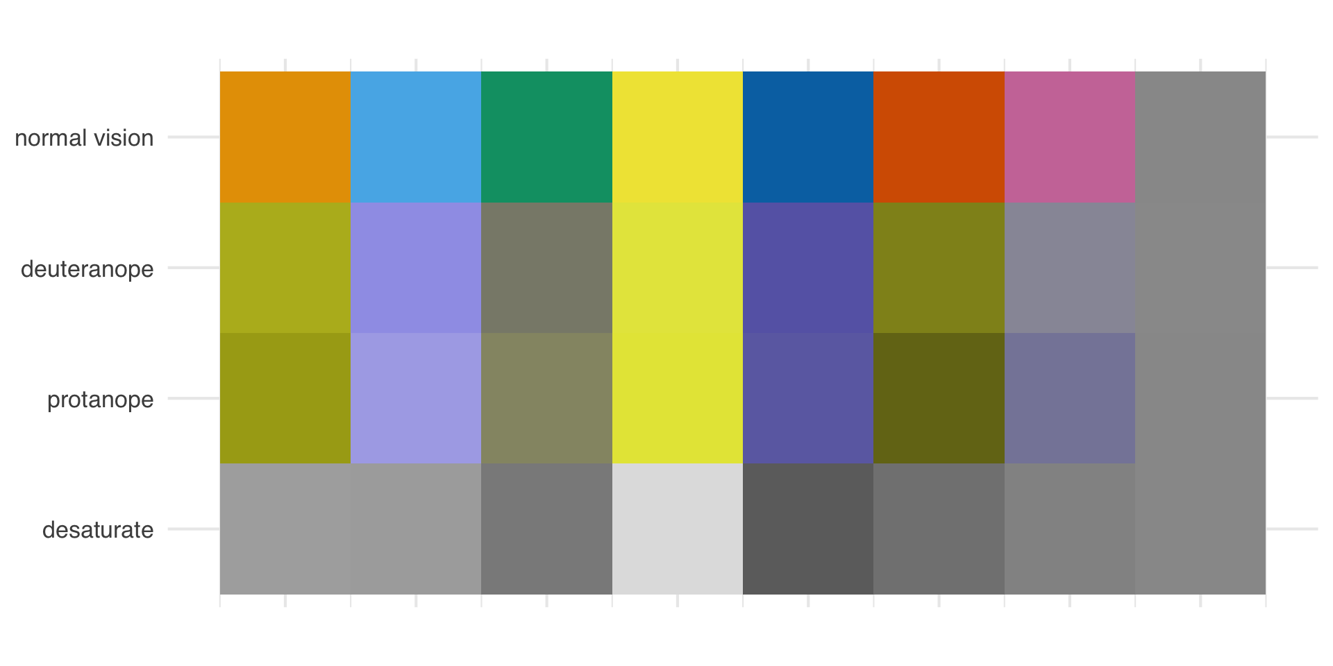
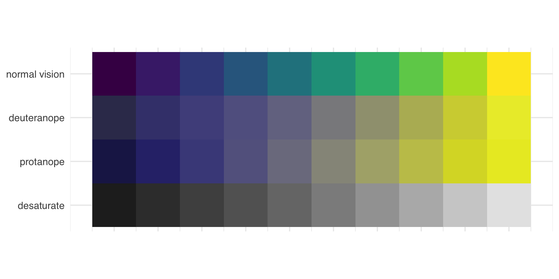
Rank these four palettes from best to worst for someone with colorblindness. Then we’ll check.
00:30
Use colorblind friendly color scales (e.g., Okabe Ito, viridis)
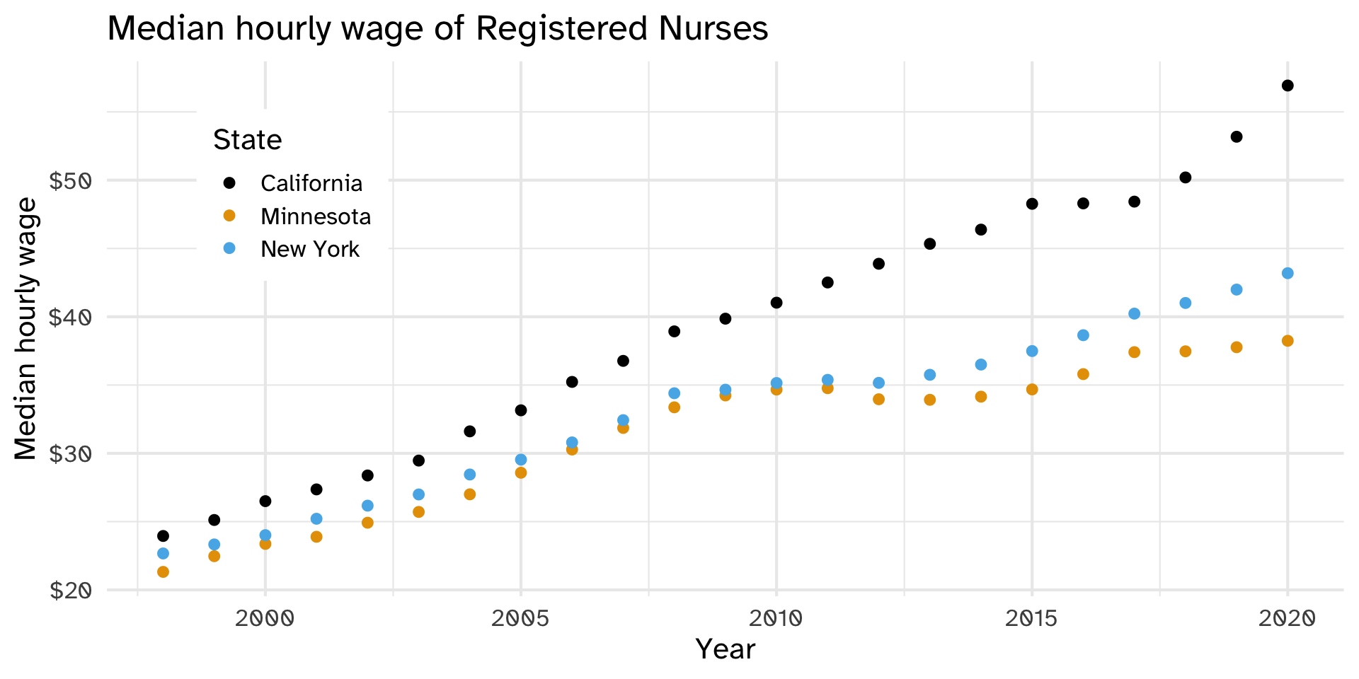
What if we can’t change the colors (brand guidelines, grayscale printing, …)?
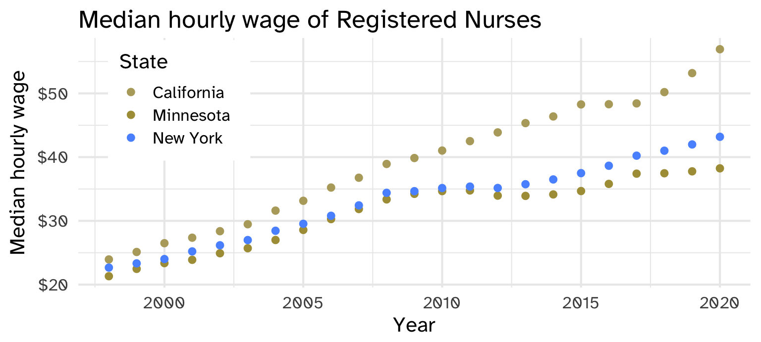
What else could we map to state so readers can tell the states apart without relying on color?
Use shape and color where possible
Default ggplot2 scale
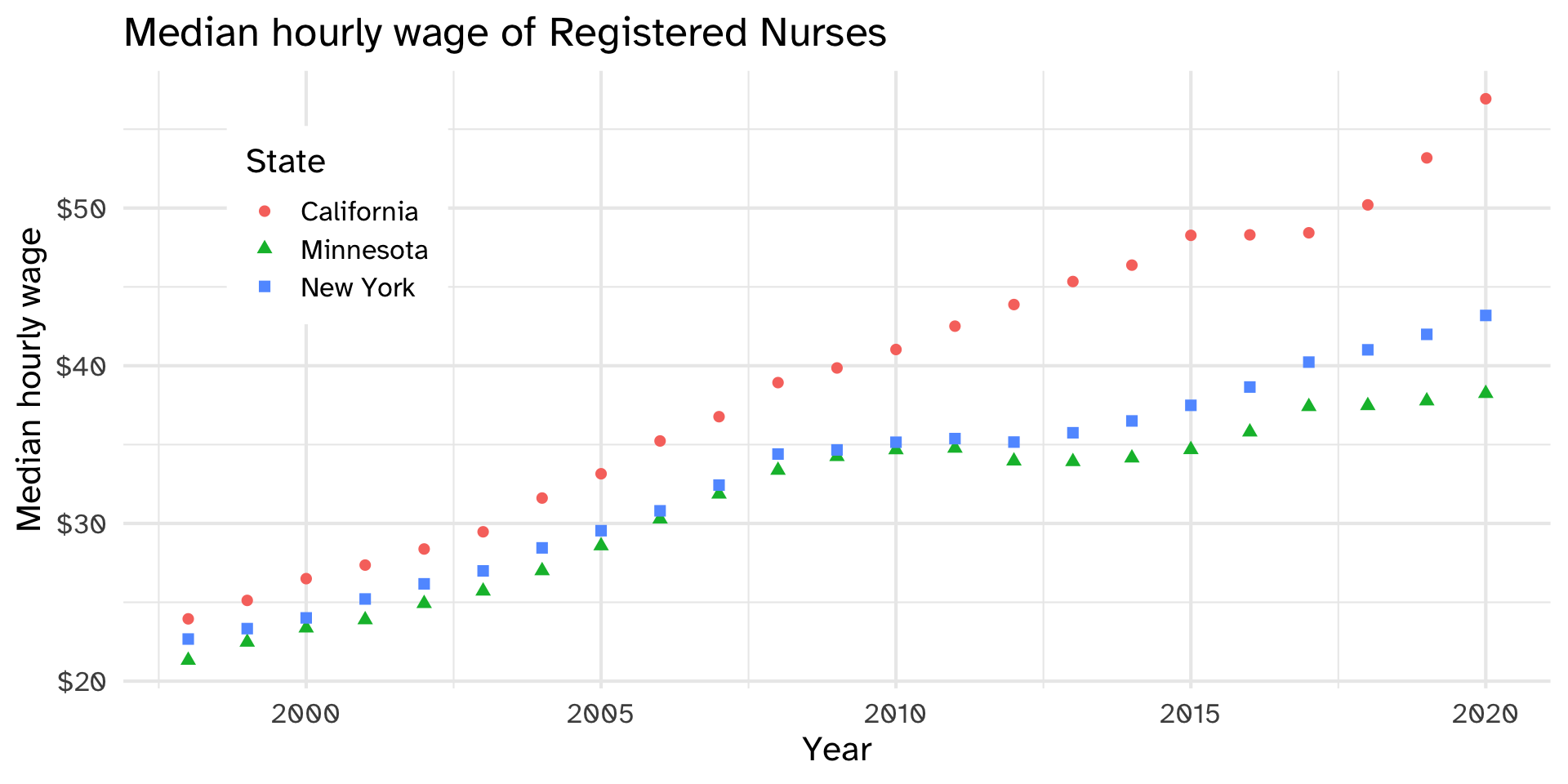
Default ggplot2 scale with deuteranopia
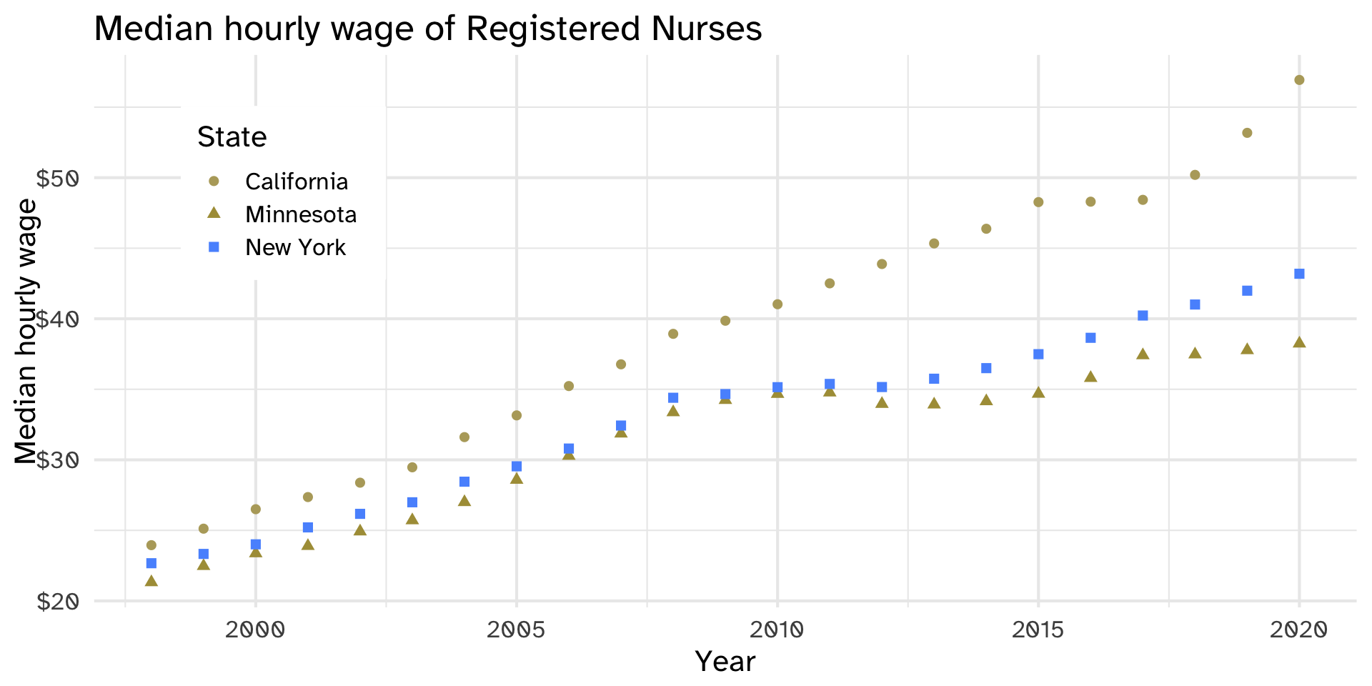
Graph A: Which line is California? Minnesota? New York? Try it with the right panel (deuteranopia).
Default ggplot2 scale
Default ggplot2 scale with deuteranopia
Graph B: Try again. What changed, and why is it easier?
Default ggplot2 scale
Default ggplot2 scale with deuteranopia
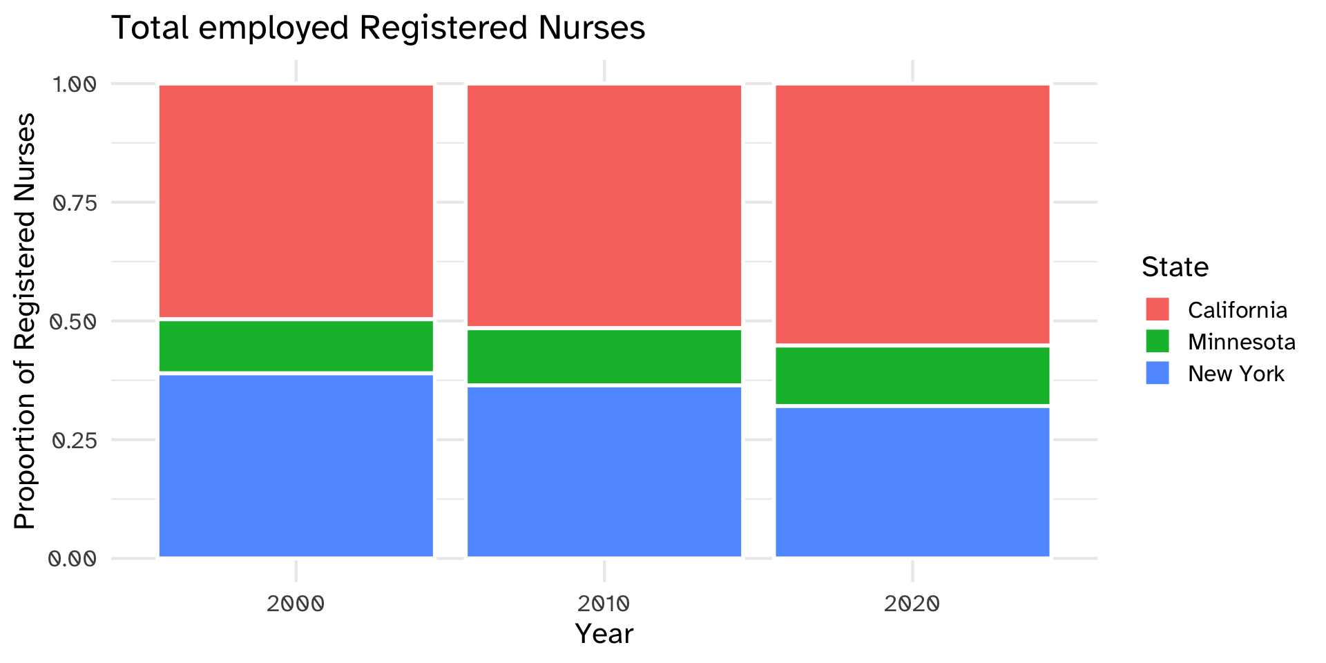
Graph A: In the right panel (tritanopia), where does one state’s bar end and the next begin?
Default ggplot2 scale
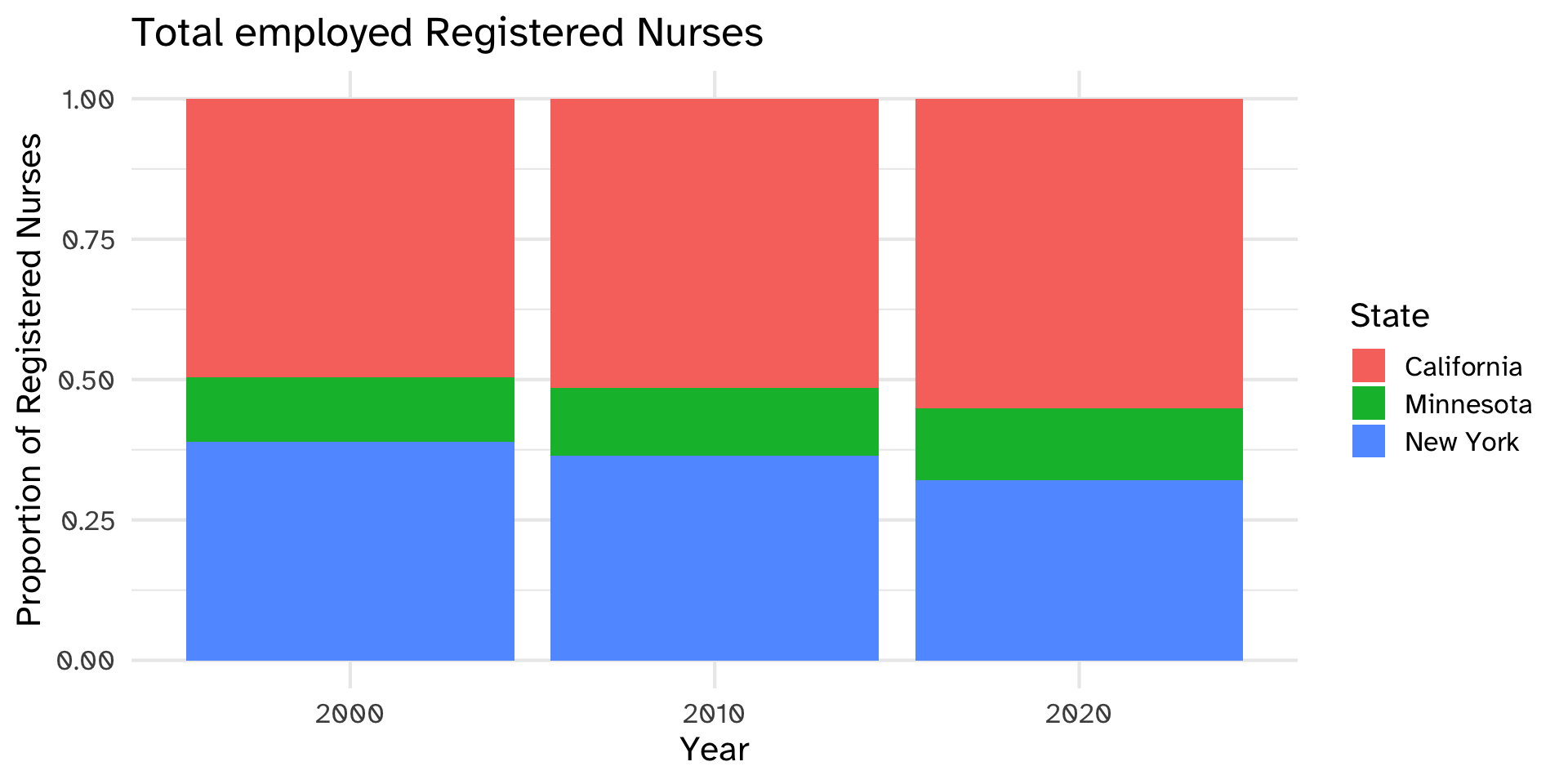
Default ggplot2 scale with tritanopia
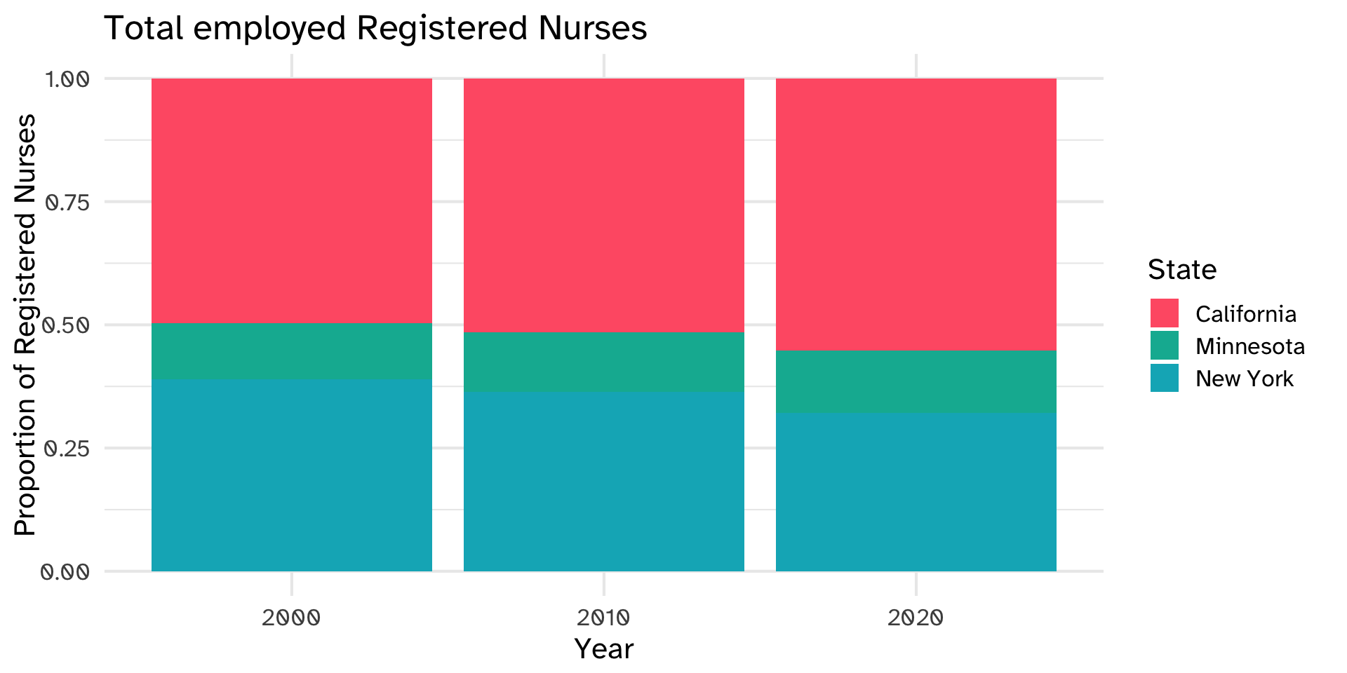
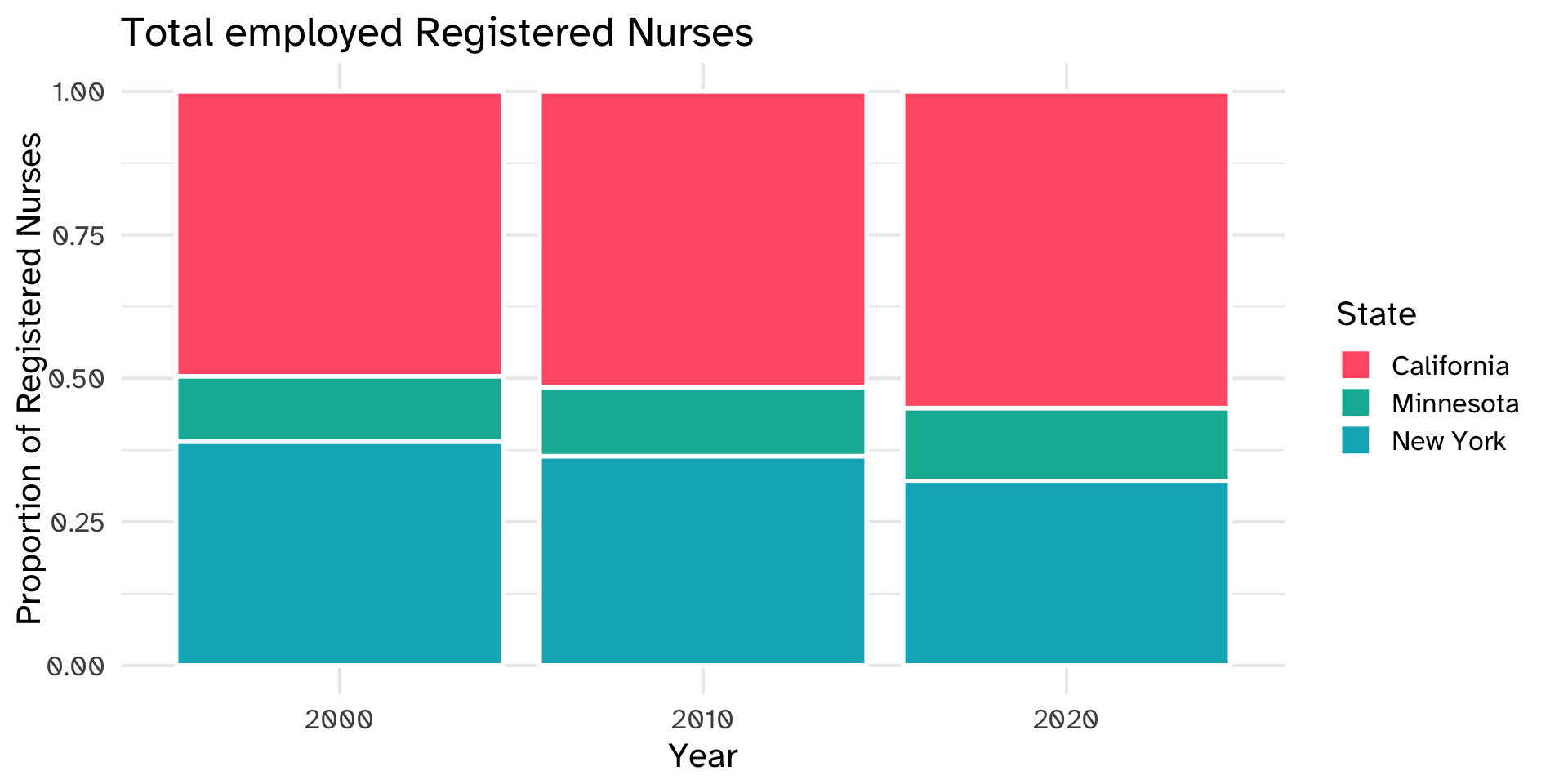
Graph B: Try again. What did the white lines add?
Default ggplot2 scale
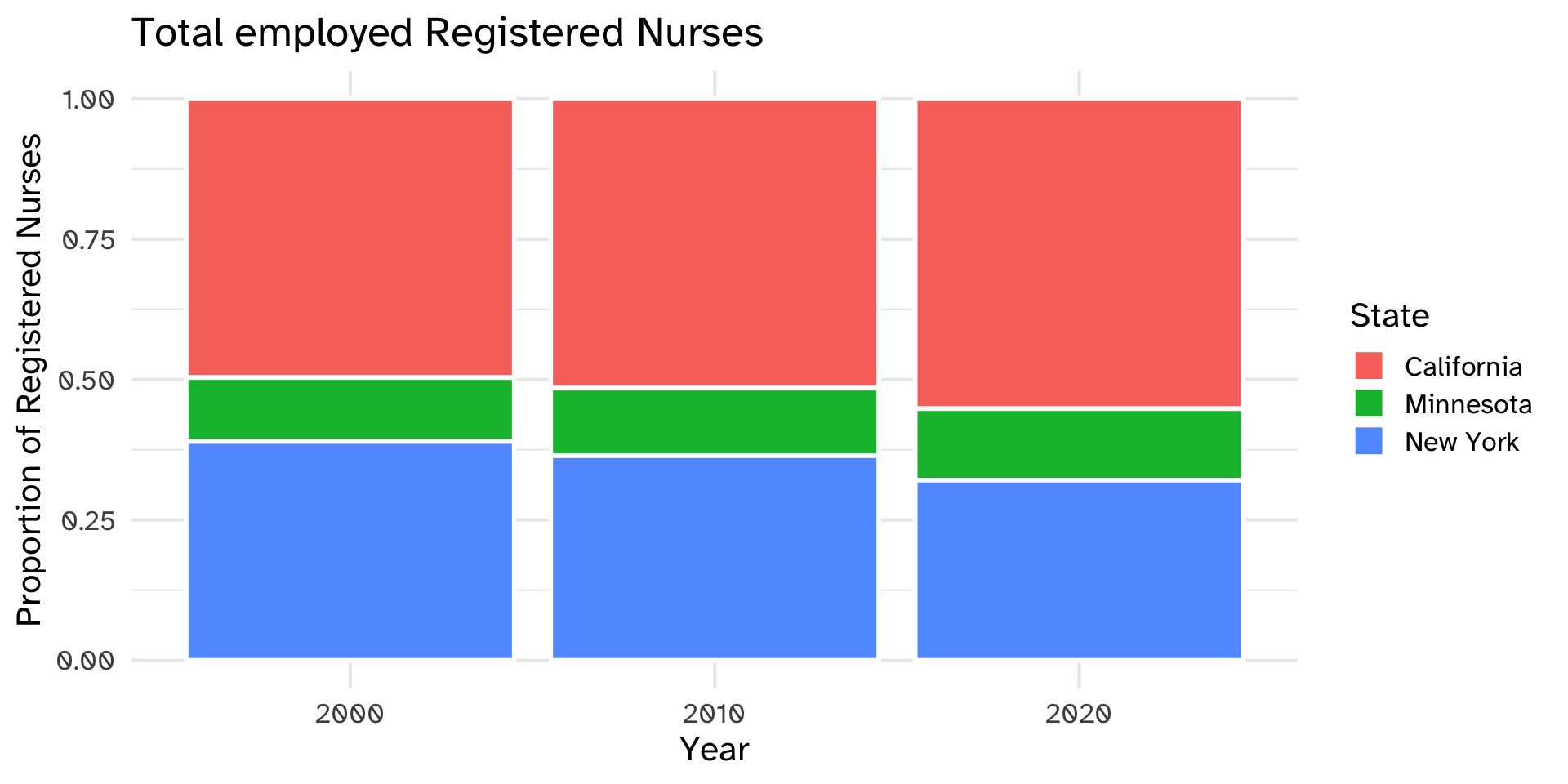
Default ggplot2 scale with tritanopia
What can you read from this graph? What can’t you?
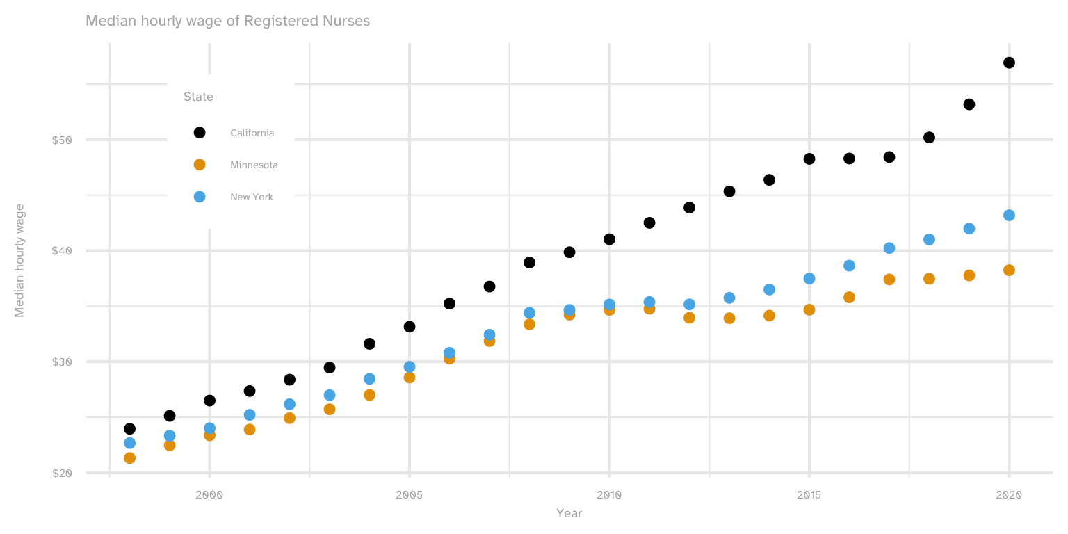
What changed?
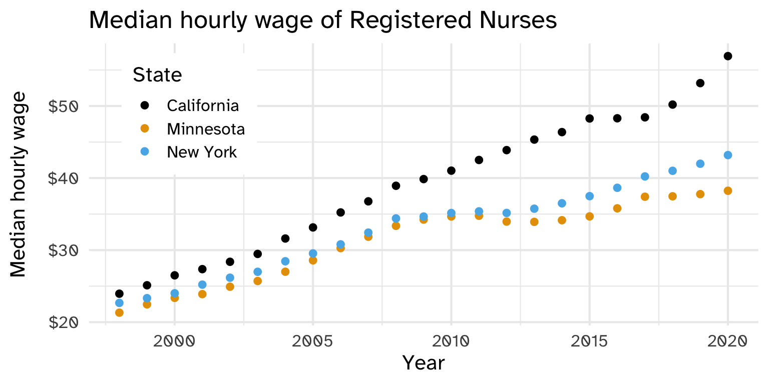
Contrast of the text against the white background: Graph A 2.1:1, Graph B 21:1
Explain this graph to someone who can’t see it. What are the variables and units? What’s the point?
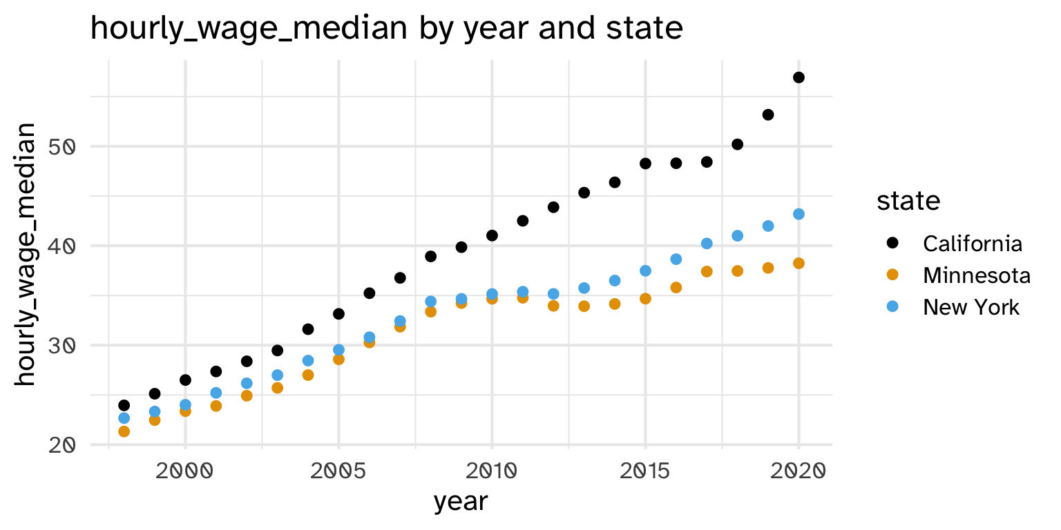
What changed? Which graph tells you what to look for?
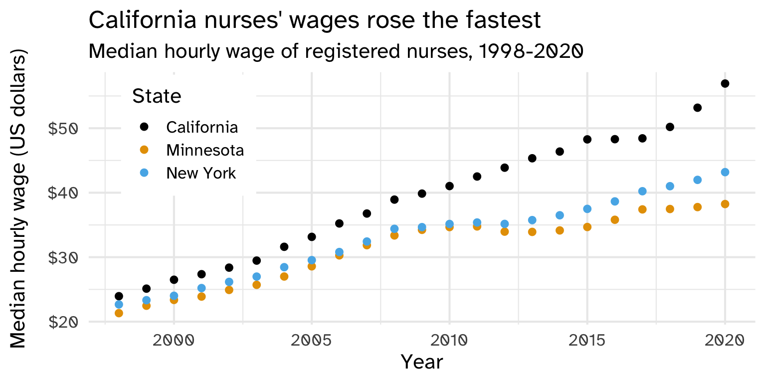
Using only this graph (or its alt text): what was New York’s median hourly wage in 2010?
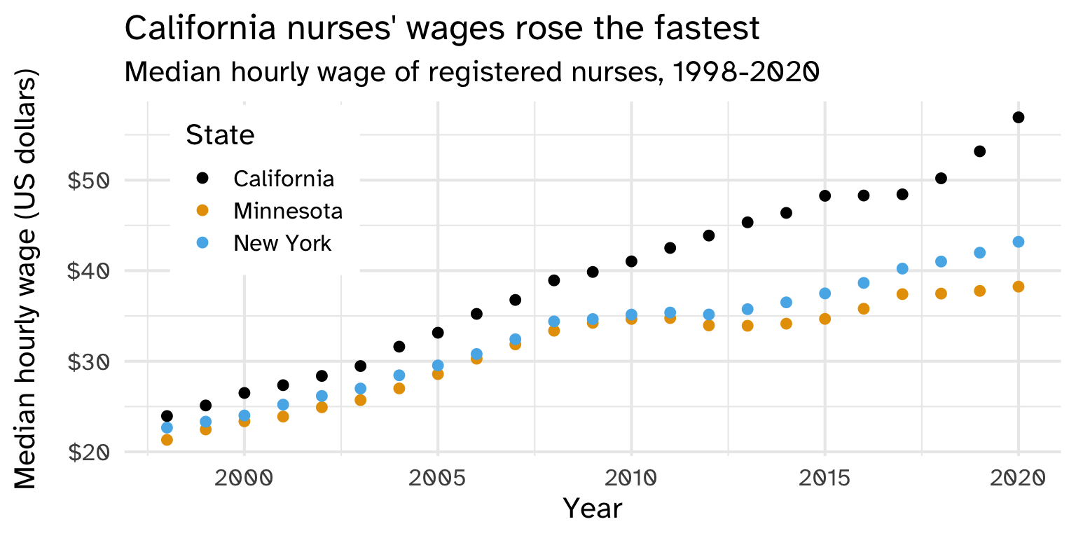
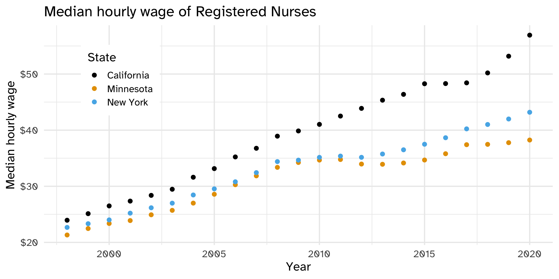
Imagine someone who can’t see this graph. Write 2-3 sentences that tell them what they need to know.
01:30
CHART TYPE of TYPE OF DATA where REASON FOR INCLUDING CHART
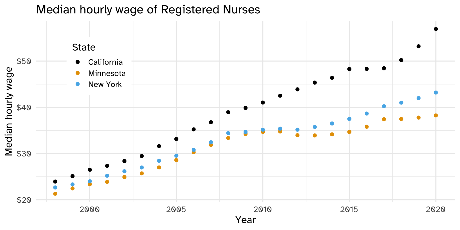
With a neighbor: which part of the formula is each bullet? What would you add or change? How does it compare to yours?
02:00
Listen: what do you learn about this graph?
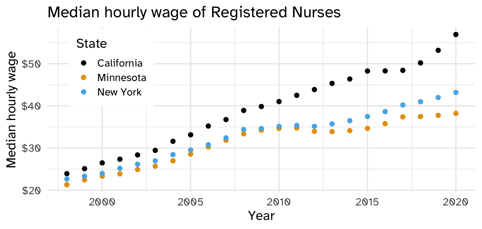
Listen again: what changed? What could you do now that you couldn’t before?
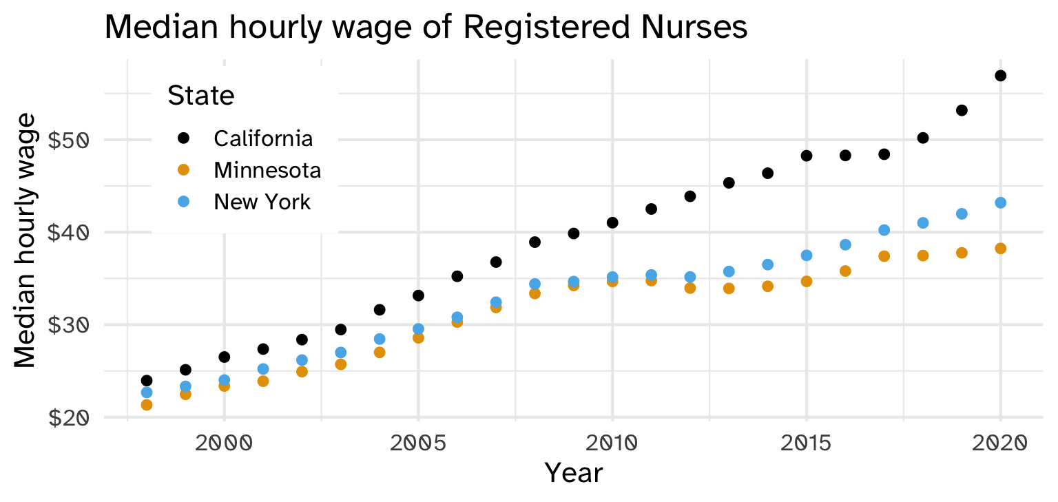
nurses_subset |>
  ggplot(aes(x = year, y = hourly_wage_median, color = state)) +
  geom_point(size = 2) +
  ggthemes::scale_color_colorblind() +
  scale_y_continuous(labels = scales::label_dollar()) +
  labs(
    x = "Year", y = "Median hourly wage", color = "State",
    title = "Median hourly wage of Registered Nurses"
  ) +
  theme(
    legend.position = c(0.15, 0.75),
    legend.background = element_rect(fill = "white", color = "white")
  )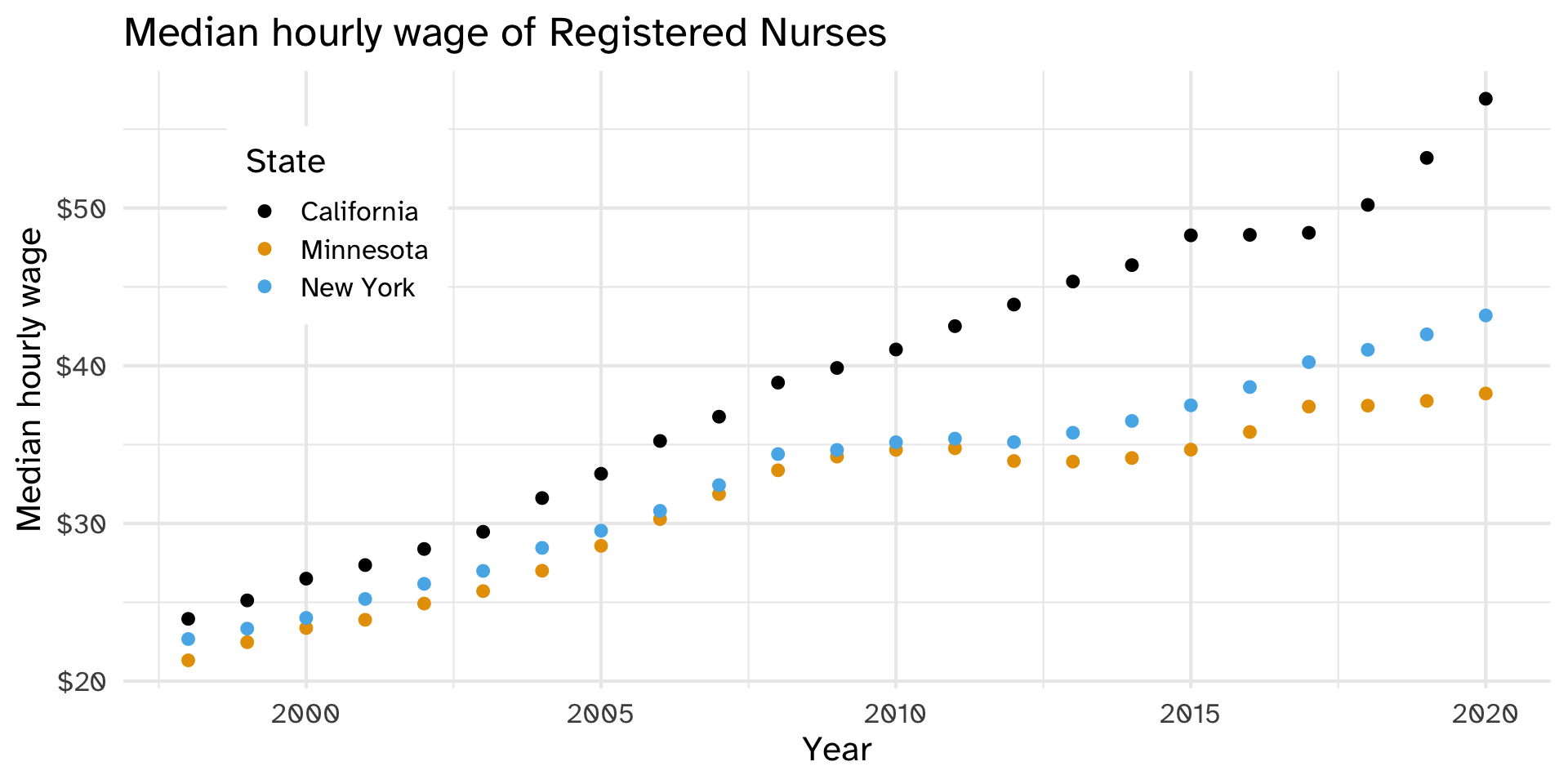
Use both color and shape aesthetics
nurses_subset |>
  ggplot(aes(x = year, y = hourly_wage_median, color = state, shape = state)) +
  geom_point(size = 2) +
  scale_y_continuous(labels = scales::label_dollar()) +
  labs(
    x = "Year", y = "Median hourly wage", color = "State", shape = "State",
    title = "Median hourly wage of Registered Nurses"
  ) +
  theme(
    legend.position = c(0.15, 0.75),
    legend.background = element_rect(fill = "white", color = "white")
    )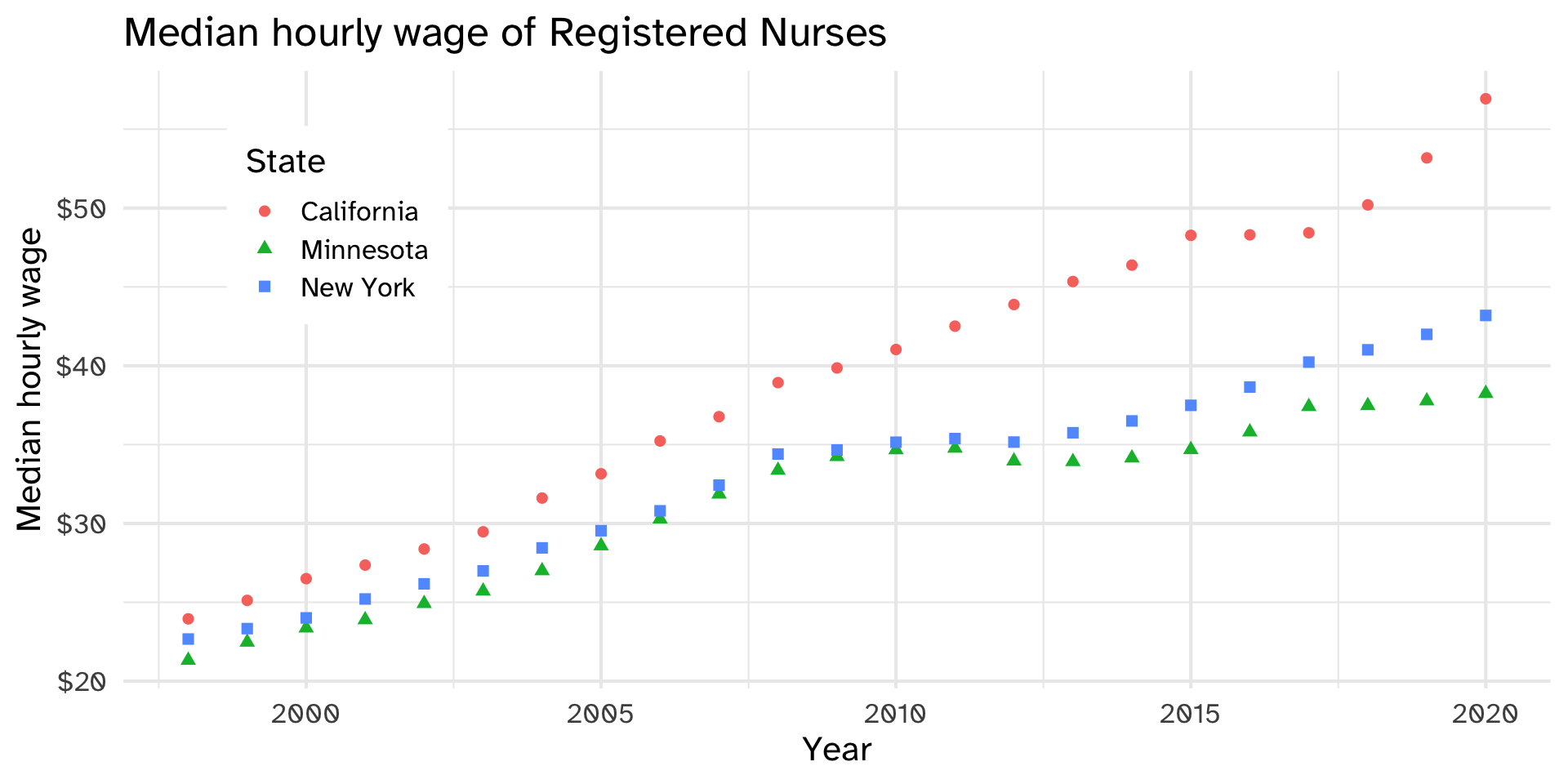
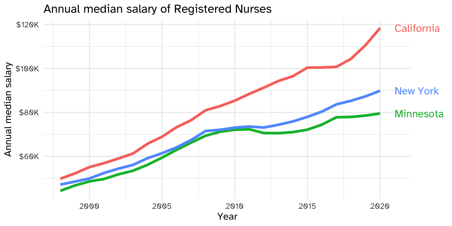
Could do “by hand” with annotate(). Alternatively, use geom_text()
nurses_subset |>
  ggplot(aes(x = year, y = annual_salary_median, color = state)) +
  geom_line(show.legend = FALSE, linewidth = 2) +
  geom_text(
    data = nurses_subset |> filter(year == max(year)),
    aes(label = state), hjust = 0, nudge_x = 1,
    show.legend = FALSE, size = 6
  ) +
  scale_y_continuous(labels = scales::label_dollar(scale = 1/1000, suffix = "K")) +
  labs(
    x = "Year", y = "Annual median salary", color = "State",
    title = "Annual median salary of Registered Nurses"
  ) +
  coord_cartesian(clip = "off") +
  theme(
    plot.margin = margin(0.1, 0.9, 0.1, 0.1, "in")
    )
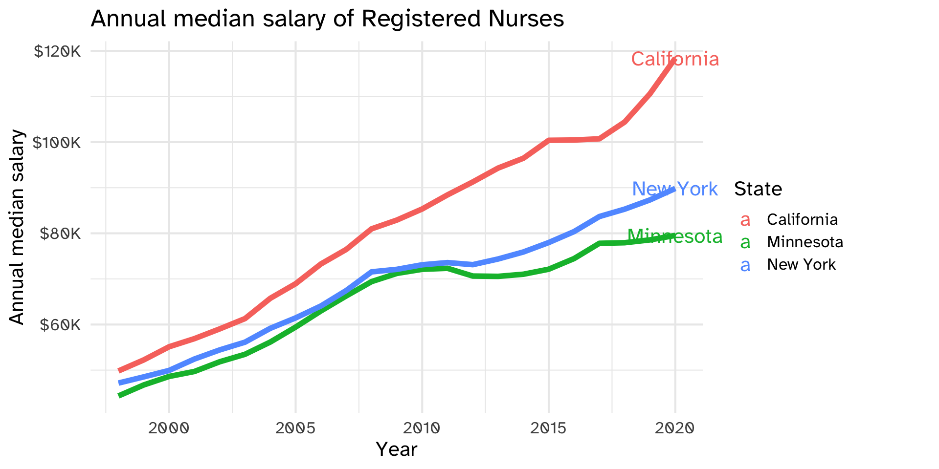
First, filter the data to include the endpoints only. Use the label aesthetic to map to the label in your data (in this case, state). geom_label by default will use the x and y aesthetics defined in ggplot()
nurses_subset |>
  ggplot(aes(x = year, y = annual_salary_median, color = state)) +
  geom_line(show.legend = FALSE, linewidth = 2) +
  geom_text(
    data = nurses_subset |> filter(year == max(year)),
    aes(label = state)
  ) +
  scale_y_continuous(labels = scales::label_dollar(scale = 1/1000, suffix = "K")) +
  labs(
    x = "Year", y = "Annual median salary", color = "State",
    title = "Annual median salary of Registered Nurses"
  ) +
  coord_cartesian(clip = "off") +
  theme(
    plot.margin = margin(0.1, 0.9, 0.1, 0.1, "in")
    )
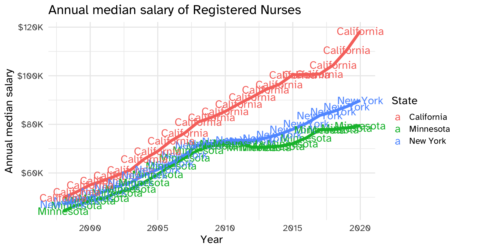
(Here’s what it looks like if we don’t filter to the endpoints)
nurses_subset |>
  ggplot(aes(x = year, y = annual_salary_median, color = state)) +
  geom_line(show.legend = FALSE, linewidth = 2) +
  geom_text(
    aes(label = state)
  ) +
  scale_y_continuous(labels = scales::label_dollar(scale = 1/1000, suffix = "K")) +
  labs(
    x = "Year", y = "Annual median salary", color = "State",
    title = "Annual median salary of Registered Nurses"
  ) +
  coord_cartesian(clip = "off") +
  theme(
    plot.margin = margin(0.1, 0.9, 0.1, 0.1, "in")
    )
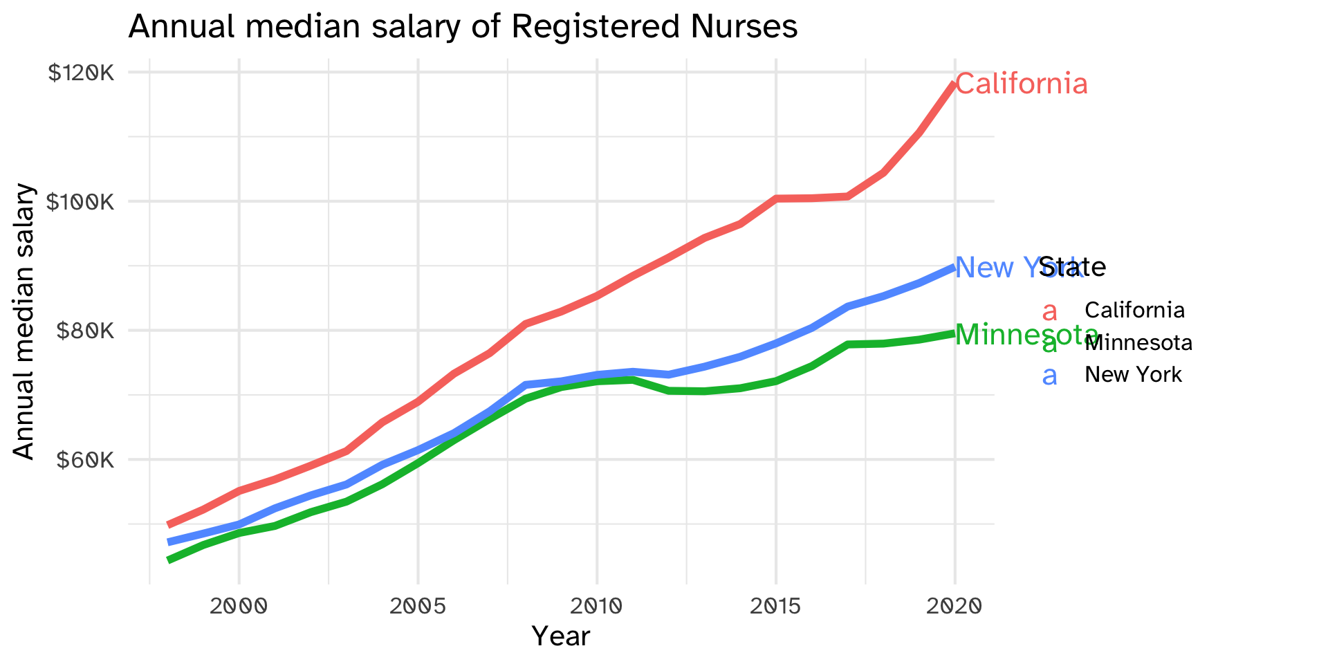
hjust=0 means “left justified”, or make the label start at the x-y coordinate you gave it. size = 6 makes the label bigger
nurses_subset |>
  ggplot(aes(x = year, y = annual_salary_median, color = state)) +
  geom_line(show.legend = FALSE, linewidth = 2) +
  geom_text(
    data = nurses_subset |> filter(year == max(year)),
    aes(label = state),
    hjust = 0,
    size = 6
  ) +
  scale_y_continuous(labels = scales::label_dollar(scale = 1/1000, suffix = "K")) +
  labs(
    x = "Year", y = "Annual median salary", color = "State",
    title = "Annual median salary of Registered Nurses"
  ) +
  coord_cartesian(clip = "off") +
  theme(
    plot.margin = margin(0.1, 0.9, 0.1, 0.1, "in")
    )
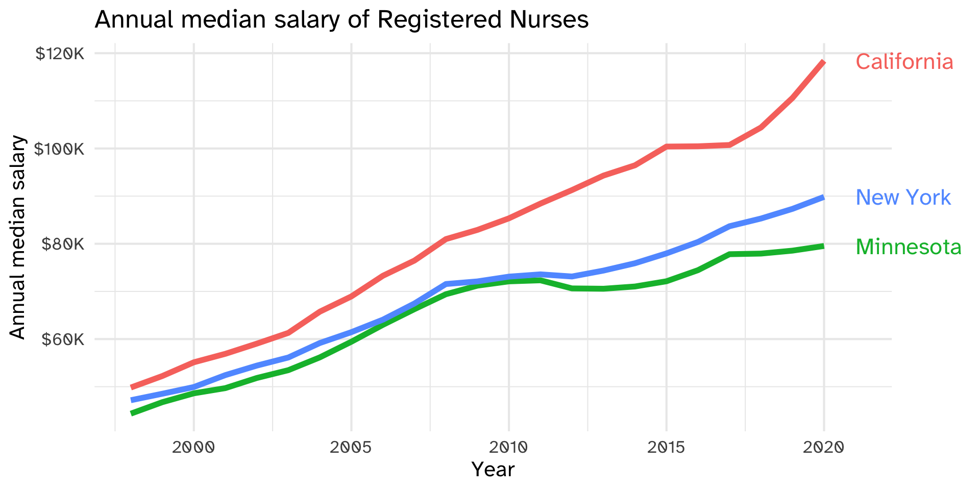
nudge_x = 1 “nudges” each label one unit in the x-direction (so each label is a small distance away from what it’s labeling). show.legend=FALSE tells ggplot not to include the aesthetics for geom_text in the legend
nurses_subset |>
  ggplot(aes(x = year, y = annual_salary_median, color = state)) +
  geom_line(show.legend = FALSE, linewidth = 2) +
  geom_text(
    data = nurses_subset |> filter(year == max(year)),
    aes(label = state),
    hjust = 0,
    size = 6,
    nudge_x = 1,
    show.legend = FALSE,
  ) +
  scale_y_continuous(labels = scales::label_dollar(scale = 1/1000, suffix = "K")) +
  labs(
    x = "Year", y = "Annual median salary", color = "State",
    title = "Annual median salary of Registered Nurses"
  ) +
  coord_cartesian(clip = "off") +
  theme(
    plot.margin = margin(0.1, 0.9, 0.1, 0.1, "in")
    )
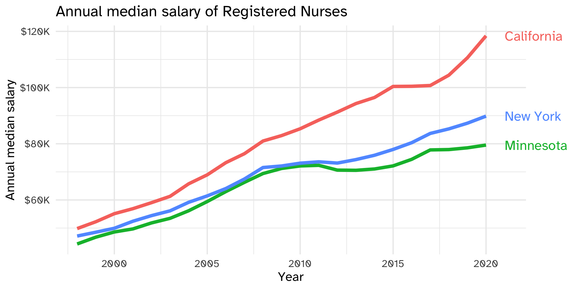
Finally, we have to tell ggplot not to trim the plot, and leave room in the right margin for the labels themselves
nurses_subset |>
  ggplot(aes(x = year, y = annual_salary_median, color = state)) +
  geom_line(show.legend = FALSE, linewidth = 2) +
  geom_text(
    data = nurses_subset |> filter(year == max(year)),
    aes(label = state),
    hjust = 0,
    size = 6,
    nudge_x = 1,
    show.legend = FALSE,
  ) +
  scale_y_continuous(labels = scales::label_dollar(scale = 1/1000, suffix = "K")) +
  labs(
    x = "Year", y = "Annual median salary", color = "State",
    title = "Annual median salary of Registered Nurses"
  ) +
  coord_cartesian(clip = "off") +
  theme(
    plot.margin = margin(0.1, 0.9, 0.1, 0.1, "in")
    )
Set the color aesthetic to white
nurses_subset |>
  filter(year %in% c(2000, 2010, 2020)) |>
  ggplot(aes(x = factor(year), y = total_employed_rn, fill = state)) +
  geom_col(position = "fill", color = "white", linewidth = 1) +
  labs(
    x = "Year", y = "Proportion of Registered Nurses", fill = "State",
    title = "Total employed Registered Nurses"
  )