Plot design
Day 04
Warm Up
- Log into maize
- If you have to type your PAT in everytime you push to GitHub, follow the directions at Getting Set up with Git and GitHub #4 to tell RStudio to save your credentials (may or may not work on maize 🤷♀️ but definitely works on local installations)
- Find the
.qmdtemplate for today at the course website - Open it up in maize/Rstudio
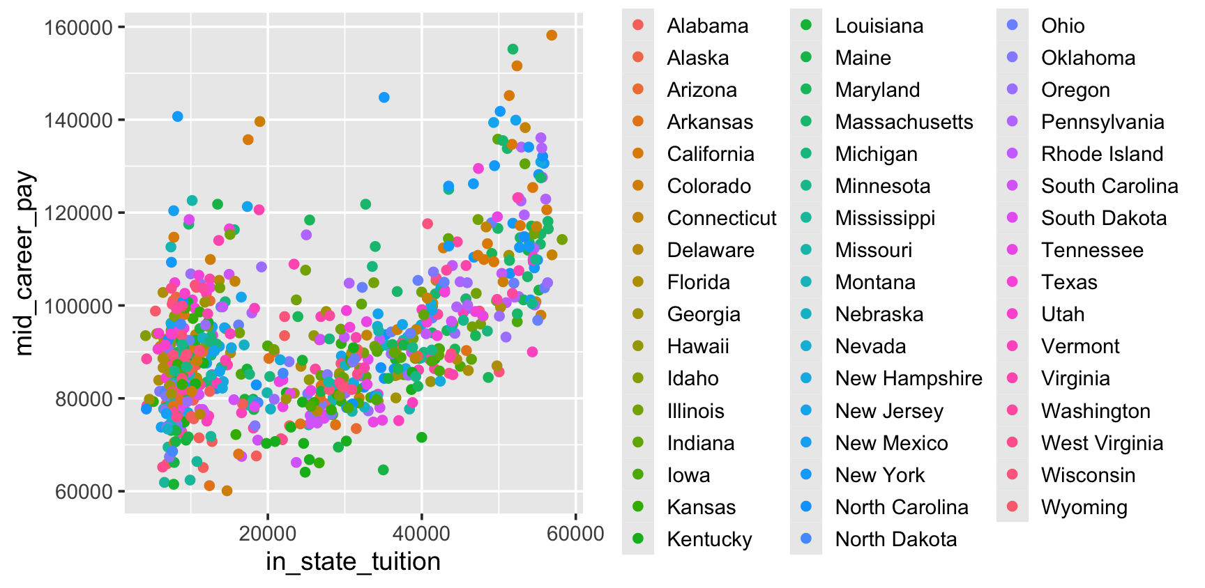
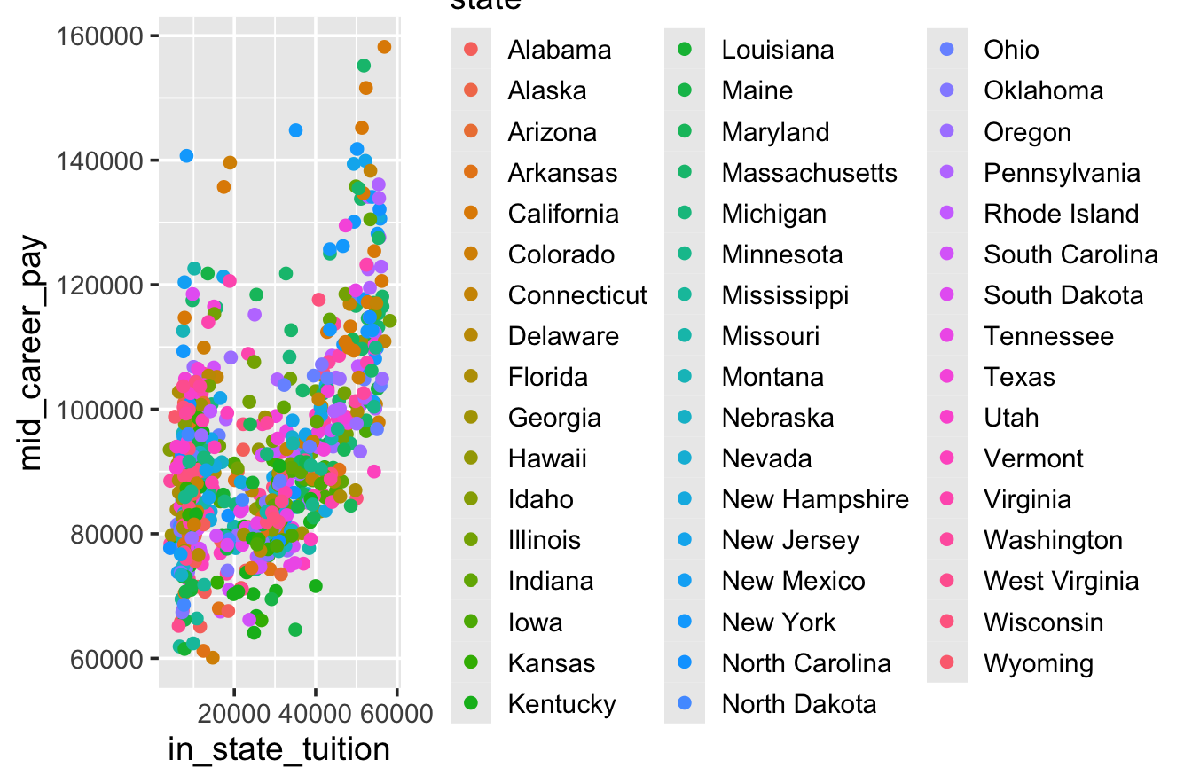
- Work with a neighbor to recreate this graph →
08:00
Polishing plots
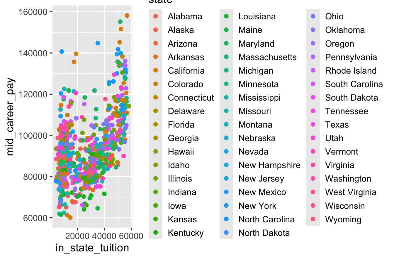
We’re not quite satisfied….
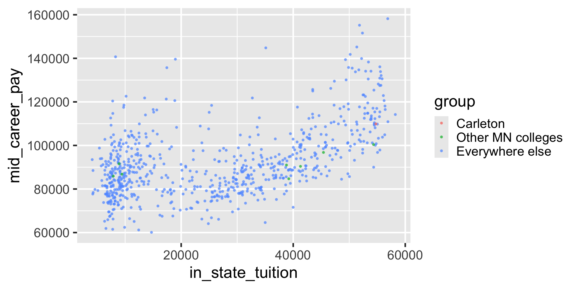
- I can’t tell 50 states apart (and I can’t find Carleton!)
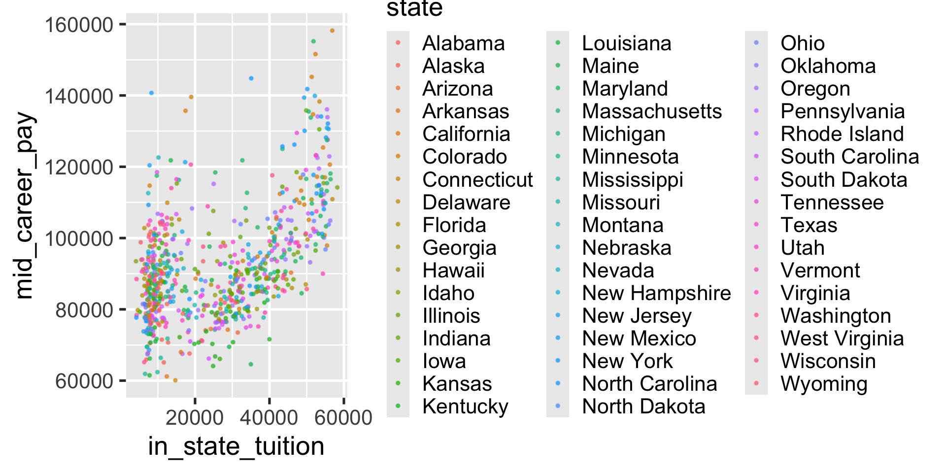
- The points pile on top of each other
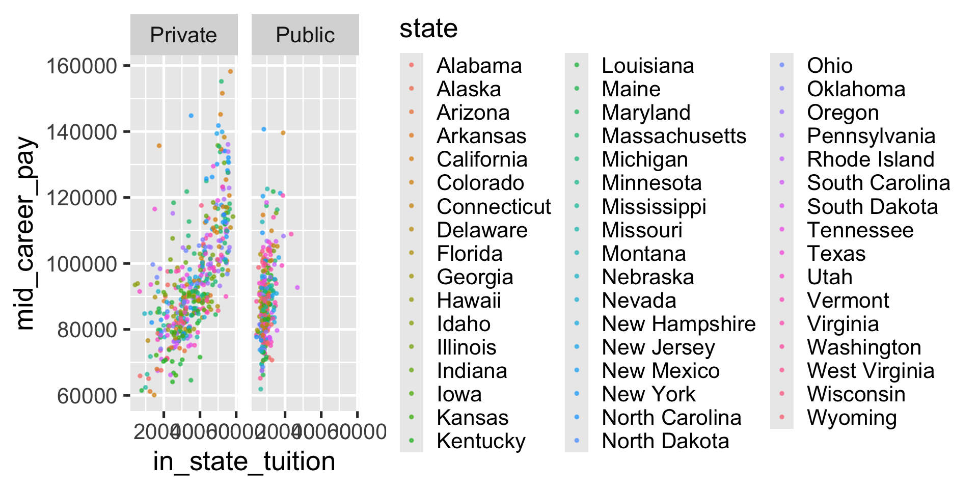
- Public and private schools are all mixed together
- I don’t like the default color scheme
- I don’t like the gray background
Setting aesthetics
Setting = choosing a certain value for an aesthetic
Facets
Make “small multiples”, where each facet shows a subset of the data
Tip
You may have seen this before using the syntax facet_wrap(~type). Both work, but vars() is the more modern/flexible syntax, so that’s what I’ve used here
Choose what to color by
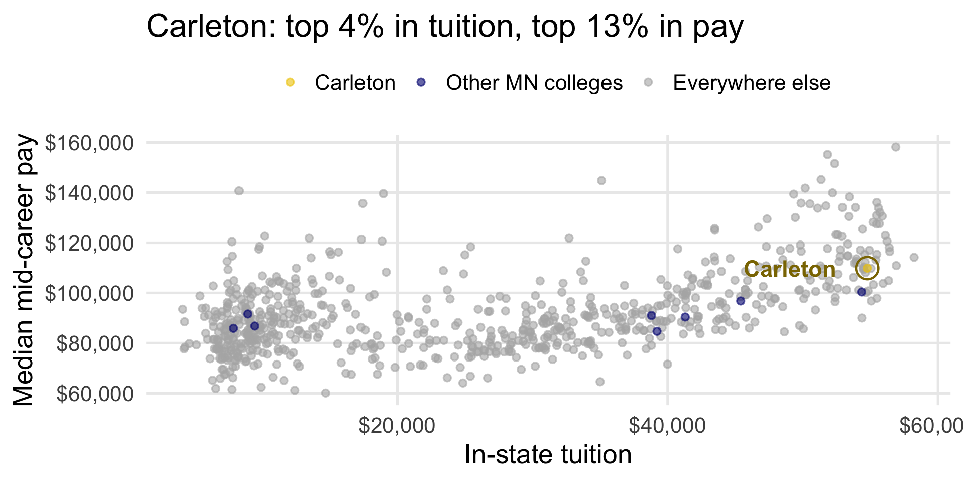
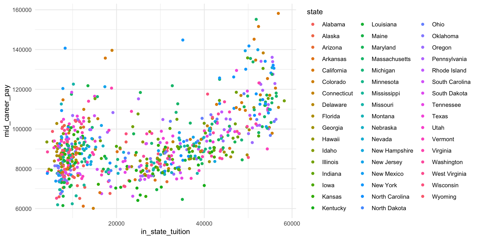
50 colors are too many to tell apart. Instead, I made a group variable that splits schools into Carleton, other Minnesota colleges, and everywhere else. (We’ll learn to make variables like this next week!)
Example (built-in scale)
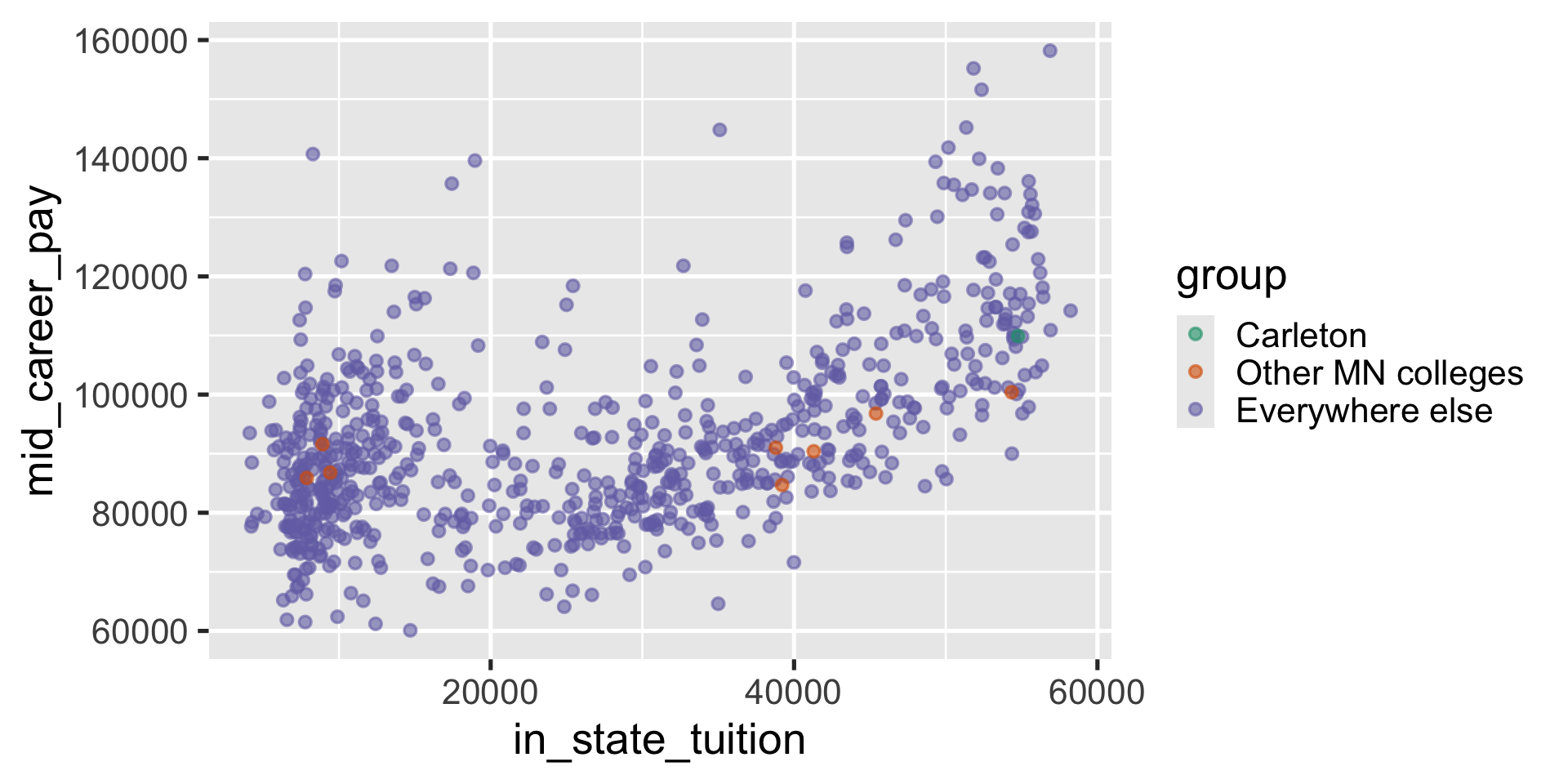
Example (built-in scale)
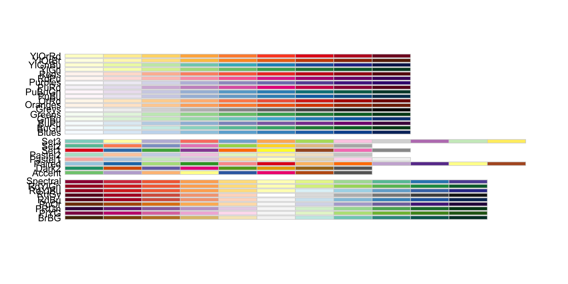
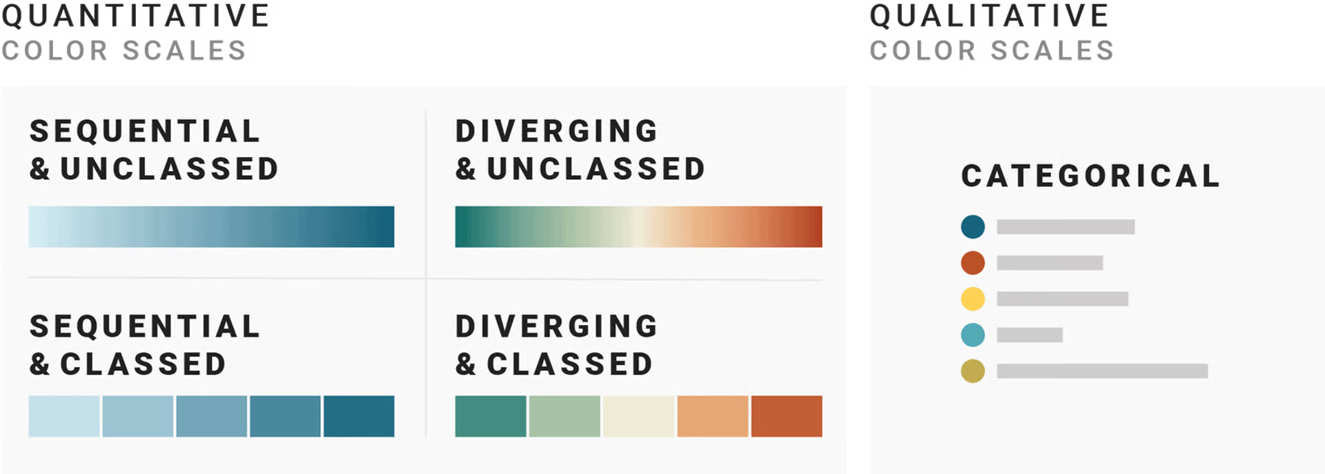
Aside: types of color scales
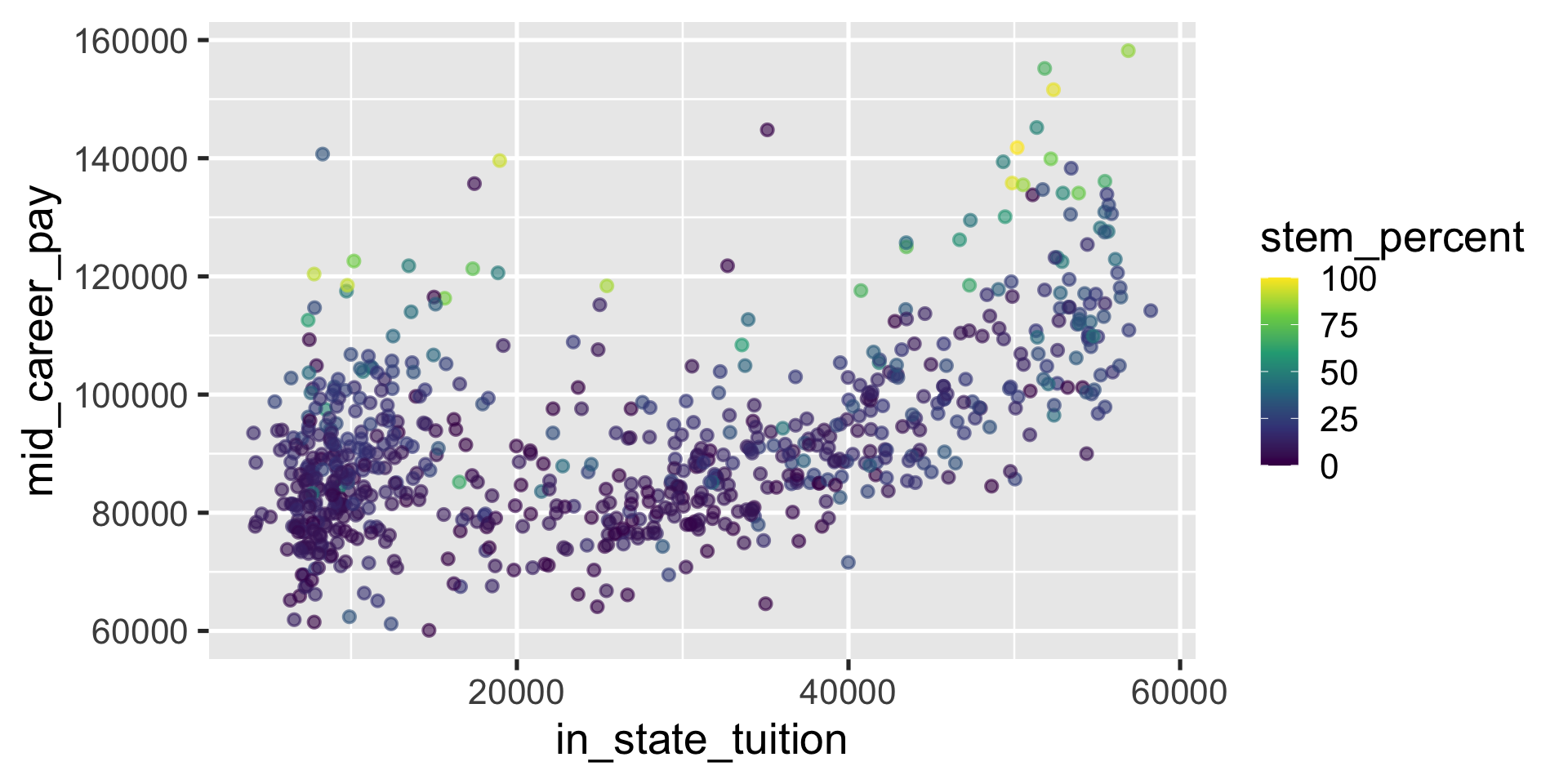
Example (continuous color scale)
Sometimes the variable we color by is numeric, like the percent of graduates with STEM degrees. Then we need a continuous color scale.
Example (manual color palette)
Let’s make Carleton gold2, other Minnesota colleges navyblue, and everyone else gray70
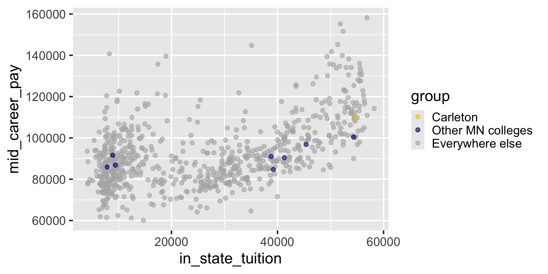
You may have to try a few things to get the colors in the right order
Can also change non-color scales
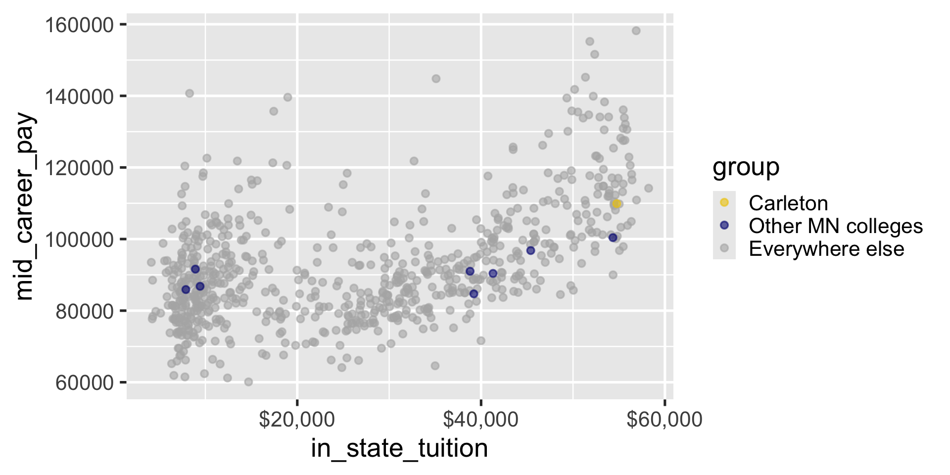
Can also change non-color scales
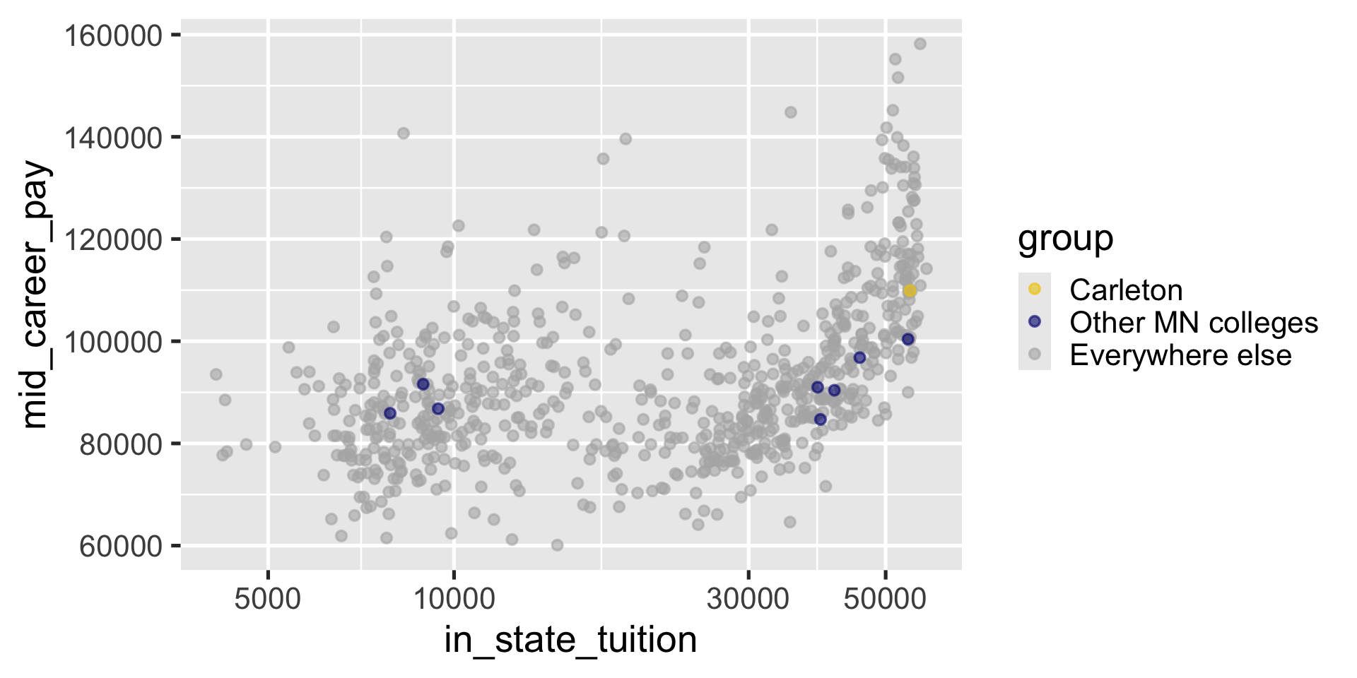
Can also change non-color scales
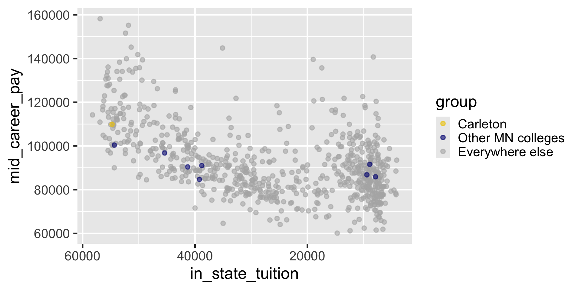
Changing Themes
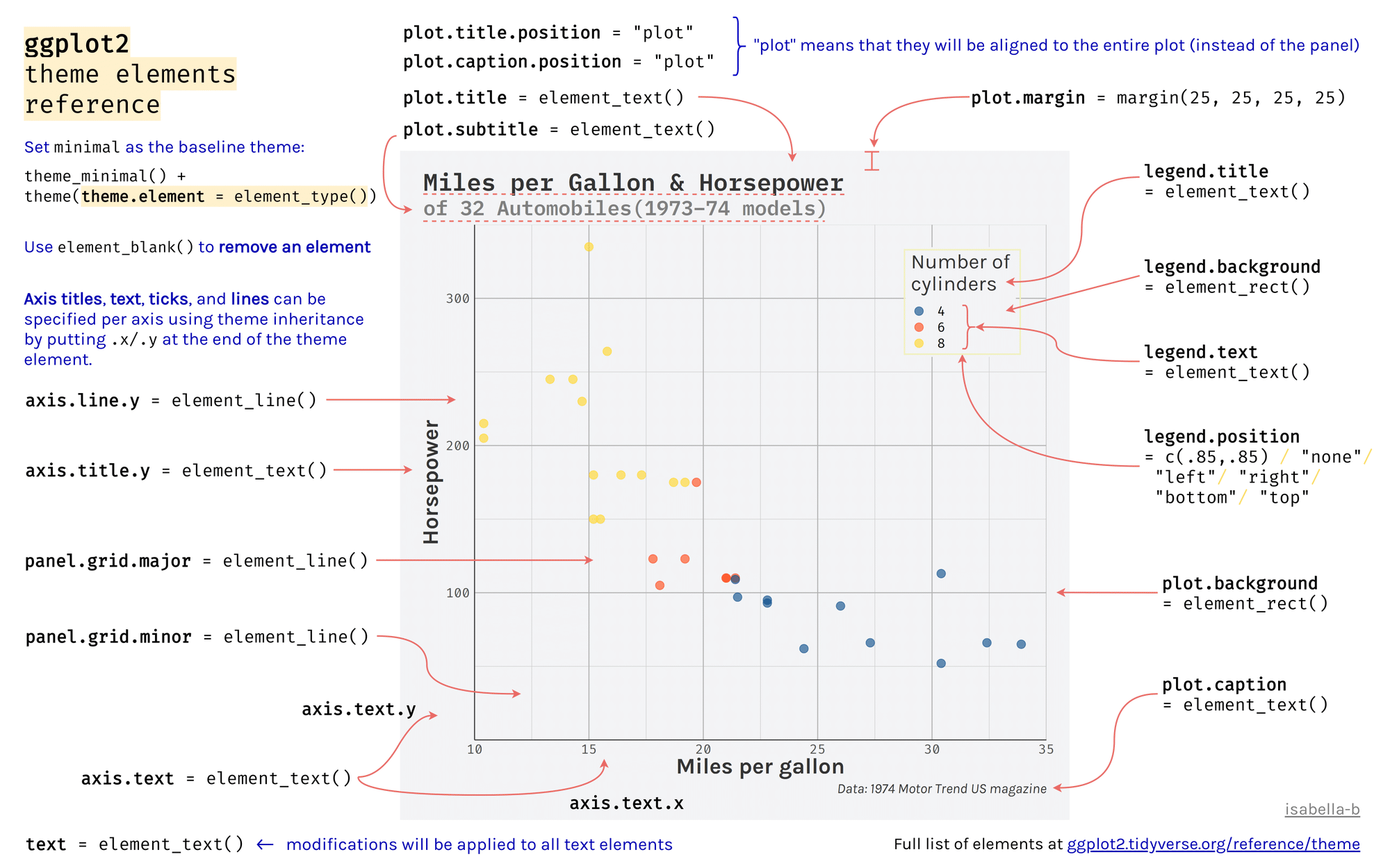
Theme: The non-data ink on your plots
- background
- tick marks
- grid lines
- font
- legend position
- legend appearance
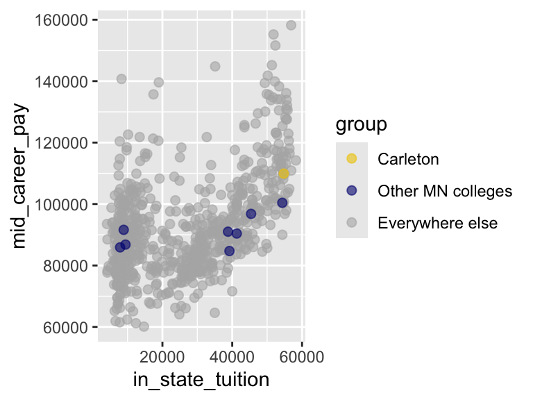
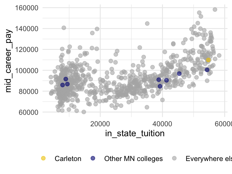
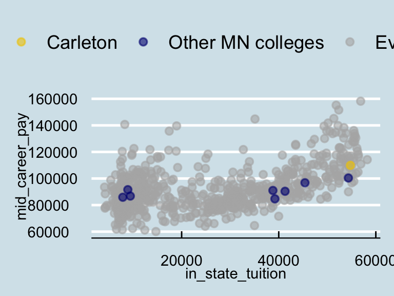
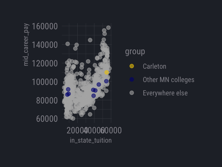
Try it
Apply theme_light() to the scatterplot
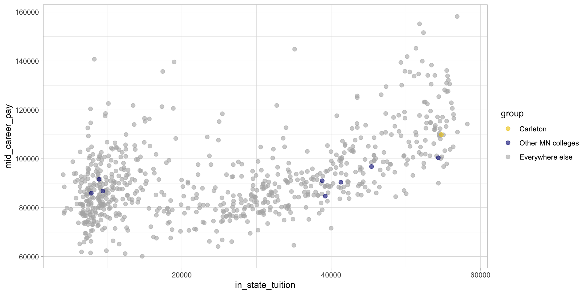
00:30
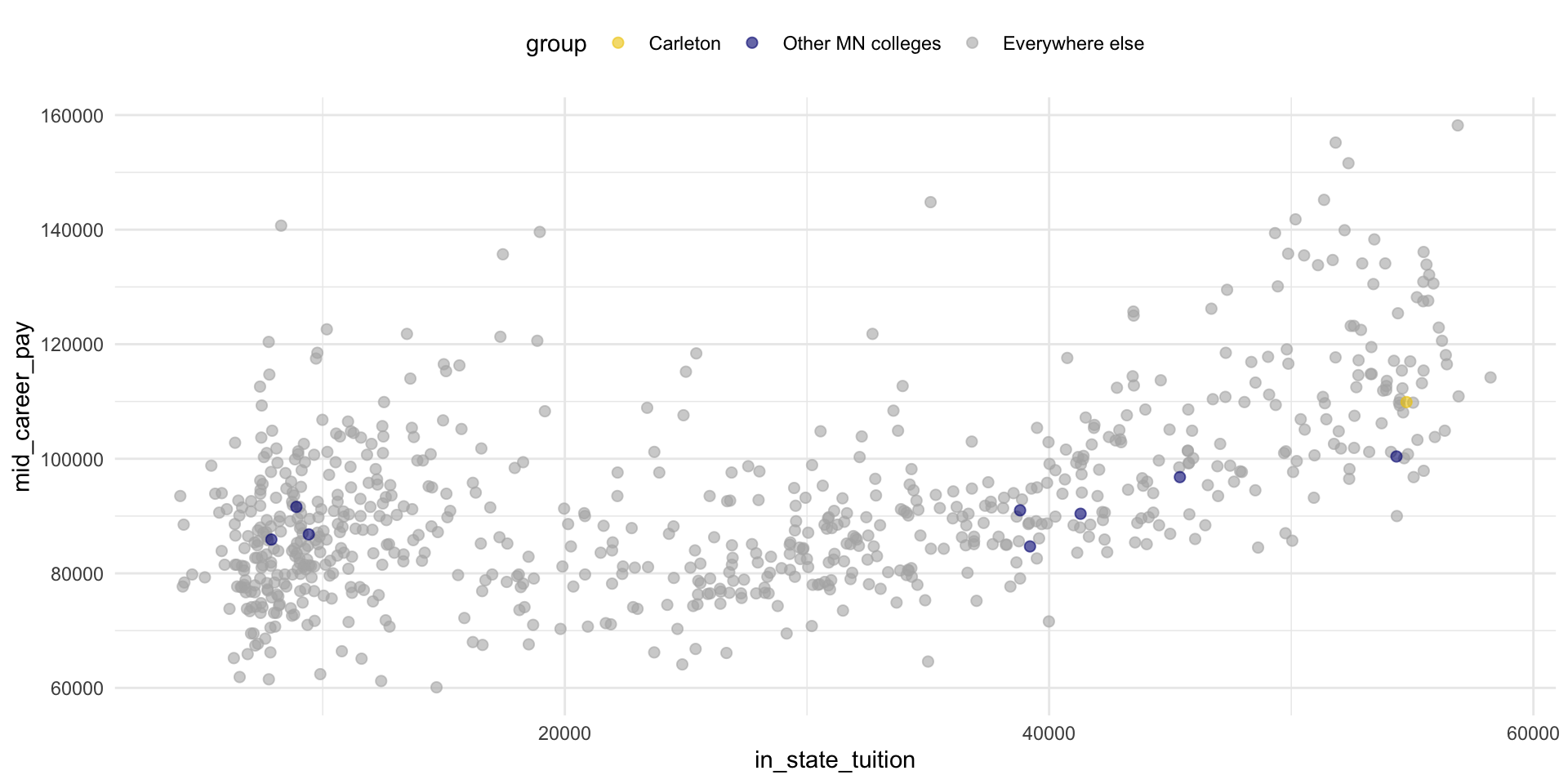
Move the legend
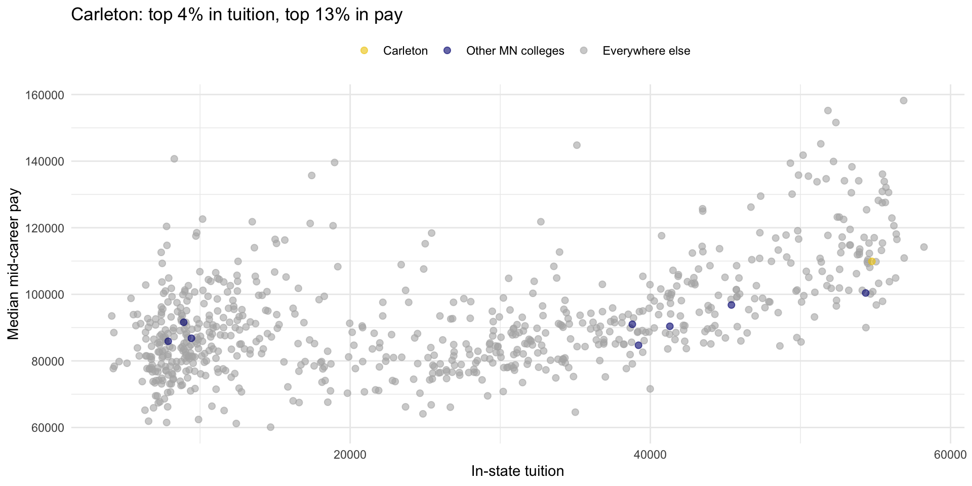
Clean up labels and title
ggplot(college_pay) +
  geom_point(
    aes(x = in_state_tuition,
        y = mid_career_pay,
        color = group),
    alpha = 0.6,
    size = 2
    ) +
scale_color_manual(values = c("gold2", "navyblue", "gray70")) +
theme_minimal() +
theme(
legend.position = "top"
) +
labs(
x = "In-state tuition",
y = "Median mid-career pay",
color = "",
title = "Carleton: top 4% in tuition, top 13% in pay"
)
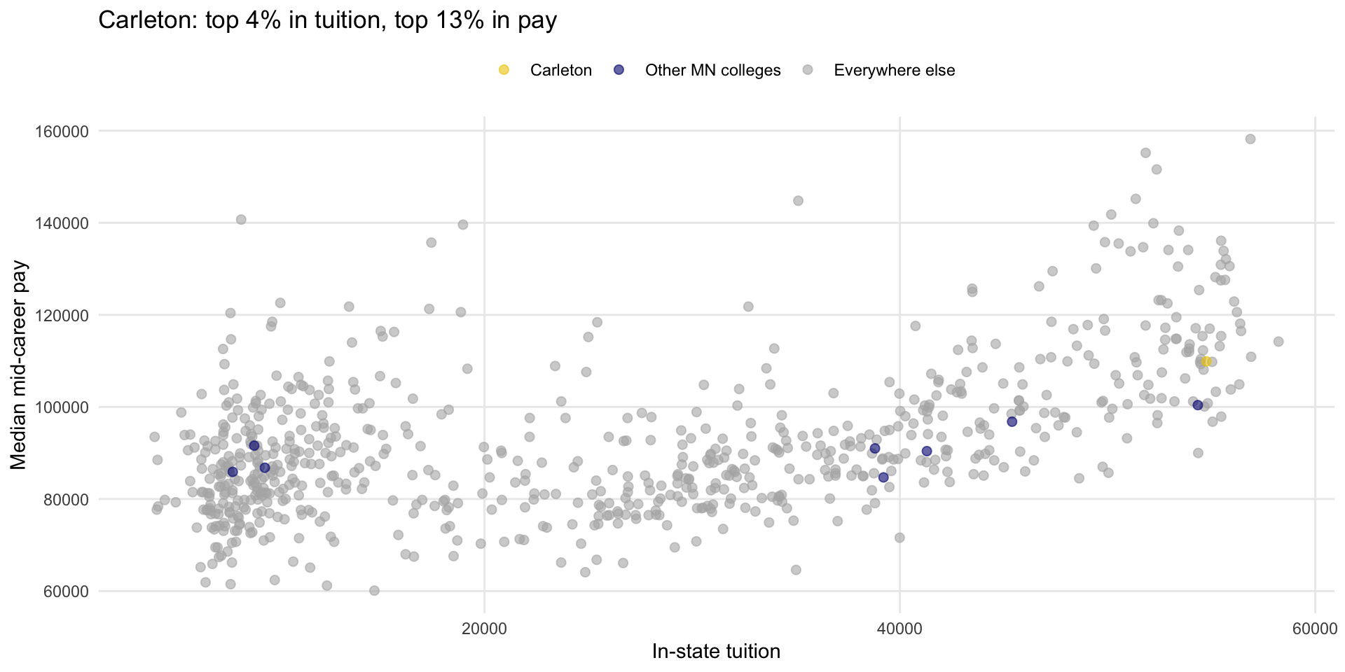
Remove minor gridlines
ggplot(college_pay) +
geom_point(
aes(x = in_state_tuition,
y = mid_career_pay,
color = group),
alpha = 0.6,
size = 2
) +
scale_color_manual(values = c("gold2", "navyblue", "gray70")) +
theme_minimal() +
theme(
legend.position = "top",
panel.grid.minor = element_blank()
) +
labs(
x = "In-state tuition",
y = "Median mid-career pay",
color = "",
title = "Carleton: top 4% in tuition, top 13% in pay"
)
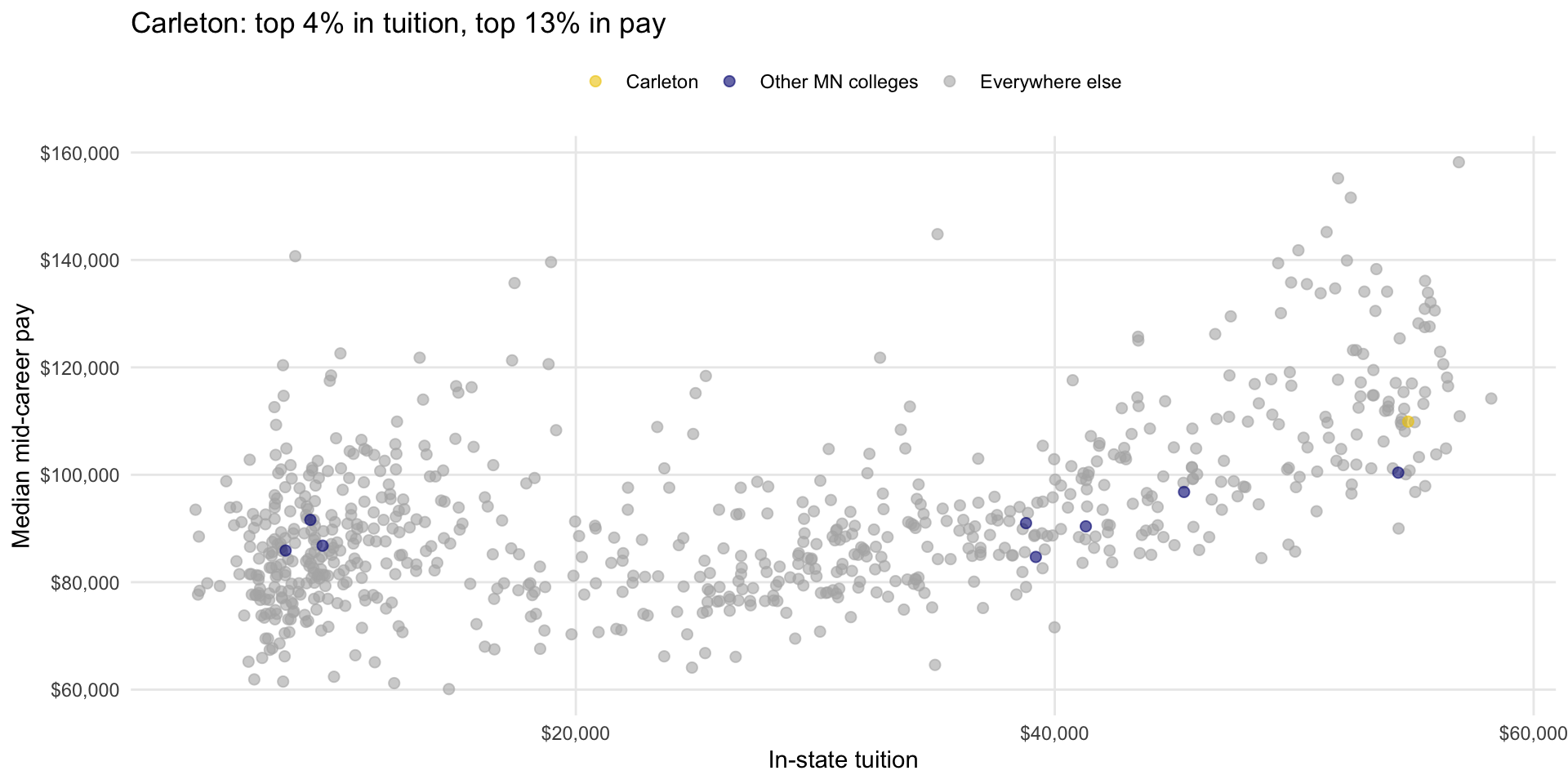
Format the axes
ggplot(college_pay) +
  geom_point(
    aes(x = in_state_tuition,
        y = mid_career_pay,
        color = group),
    alpha = 0.6,
    size = 2
    ) +
  scale_color_manual(values = c("gold2", "navyblue", "gray70")) +
scale_x_continuous(labels = scales::dollar) +
scale_y_continuous(labels = scales::dollar) +
theme_minimal() +
theme(
legend.position = "top",
panel.grid.minor = element_blank()
) +
labs(
x = "In-state tuition",
y = "Median mid-career pay",
color = "",
title = "Carleton: top 4% in tuition, top 13% in pay"
)
Add an annotation
ggplot(college_pay) +
  geom_point(
    aes(x = in_state_tuition,
        y = mid_career_pay,
        color = group),
    alpha = 0.6,
    size = 2
    ) +
  scale_color_manual(values = c("gold2", "navyblue", "gray70")) +
  scale_x_continuous(labels = scales::dollar) +
  scale_y_continuous(labels = scales::dollar) +
  theme_minimal() +
  theme(
    legend.position = "top",
    panel.grid.minor = element_blank()
  ) +
  labs(
    x = "In-state tuition",
    y = "Median mid-career pay",
    color = "",
    title = "Carleton: top 4% in tuition, top 13% in pay"
) +
annotate("point",
x = 54759,
y = 109900,
shape = 1,
size = 7,
stroke = 1.2,
col = "gold4") +
annotate("text",
x = 52500,
y = 109900,
label = "Carleton",
hjust = 1,
fontface = "bold",
col = "gold4")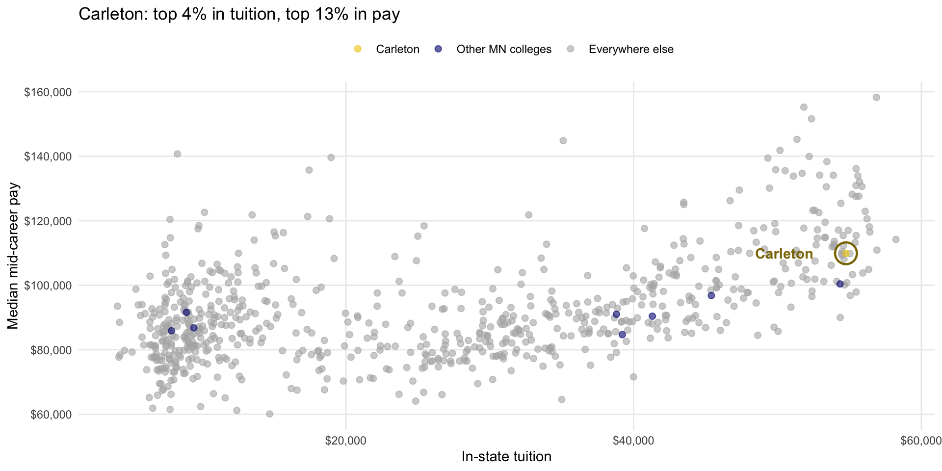
Tip
I had to look these values up in the data, and try a few different combinations to get it to look OK
Increase text size
ggplot(college_pay) +
  geom_point(
    aes(x = in_state_tuition,
        y = mid_career_pay,
        color = group),
    alpha = 0.6,
    size = 2
    ) +
  scale_color_manual(values = c("gold2", "navyblue", "gray70")) +
  scale_x_continuous(labels = scales::dollar) +
  scale_y_continuous(labels = scales::dollar) +
  theme_minimal(base_size = 20) +
  theme(
    legend.position = "top",
    panel.grid.minor = element_blank()
  ) +
  labs(
    x = "In-state tuition",
    y = "Median mid-career pay",
    color = "",
    title = "Carleton: top 4% in tuition, top 13% in pay"
  ) +
  annotate("point",
           x = 54759,
           y = 109900,
           shape = 1,
           size = 7,
           stroke = 1.2,
           col = "gold4") +
  annotate("text",
           x = 52500,
           y = 109900,
           label = "Carleton",
           hjust = 1,
           fontface = "bold",
           size = 6,
           col = "gold4")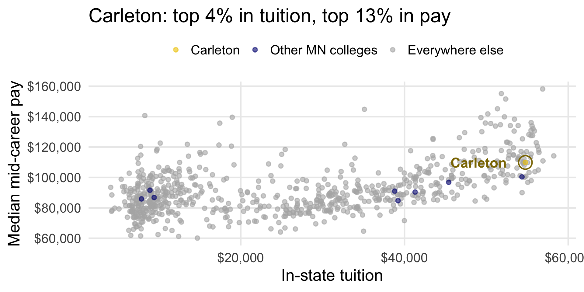
“Final” version
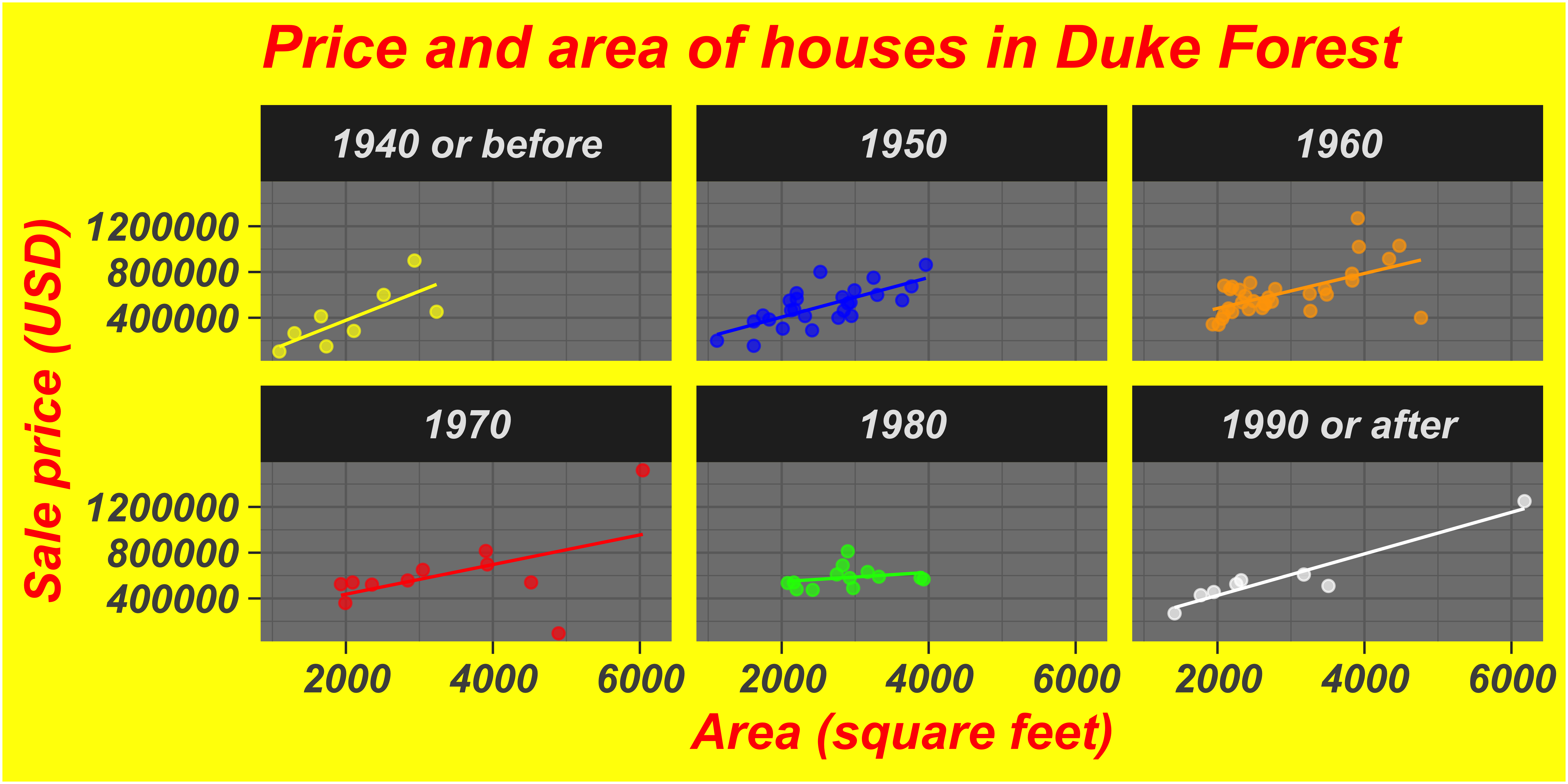
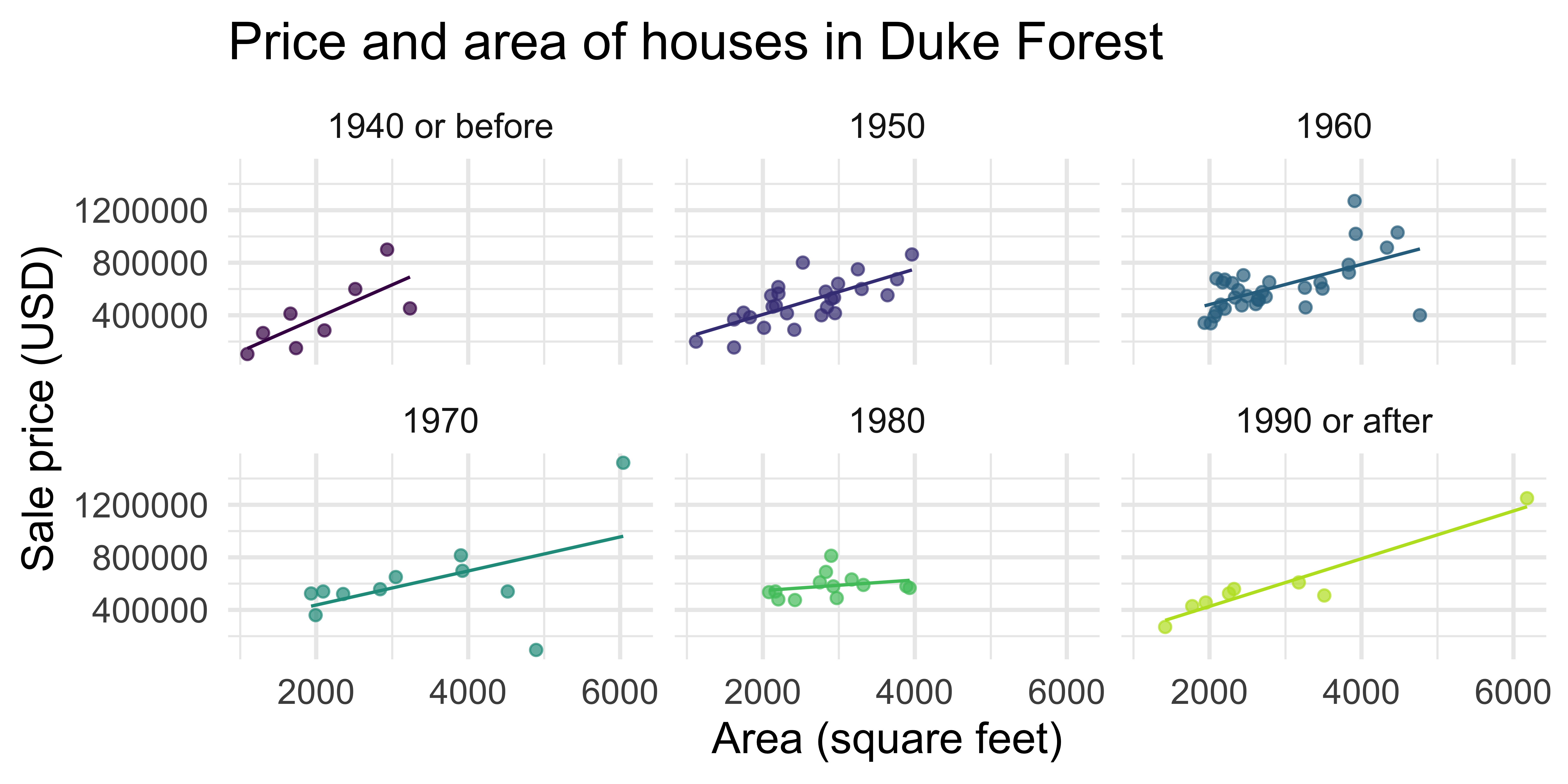
Which do you prefer?
1. Show the data, don’t distort it
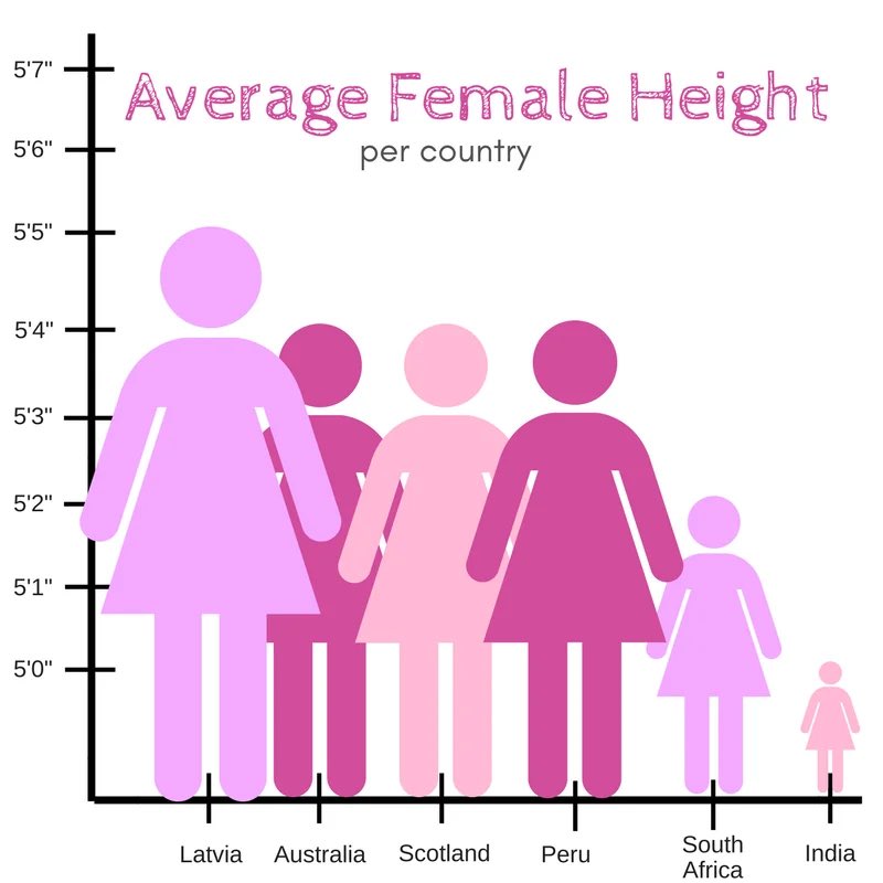
1. Show the data, don’t distort it
What a huge effect! 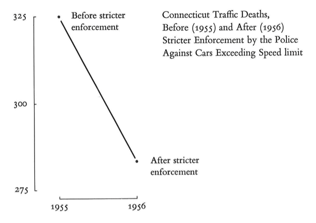
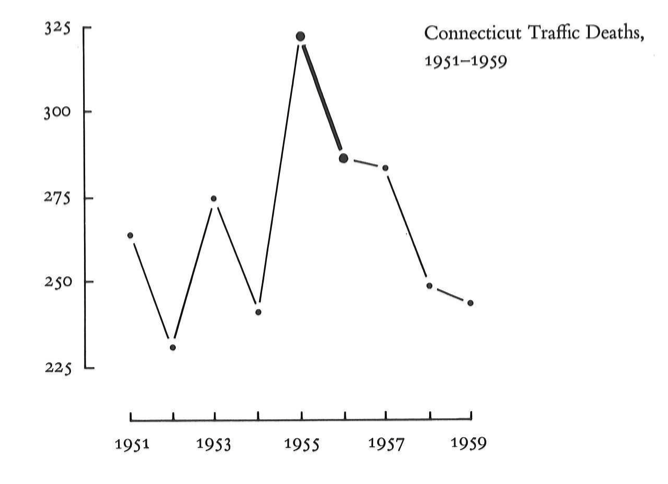
But it isn’t the whole story
2. Choose the right plot: Which slice is the biggest/smallest?
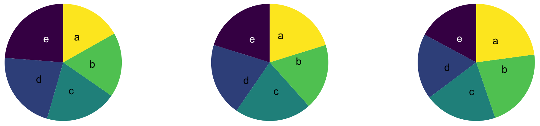
00:30
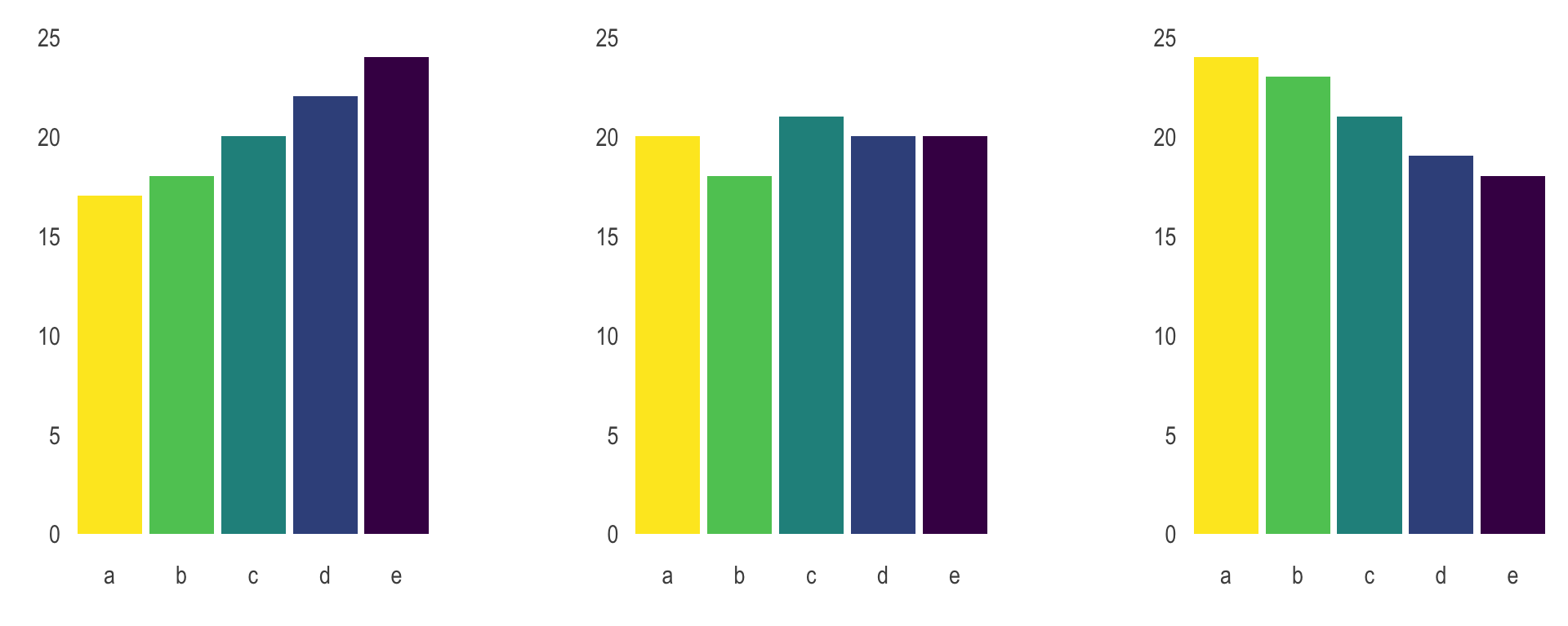
2. Choose the right plot
Wilke has good suggestions in chapters 5-16
Always stop and think about how easy it is to see the story
Try a few different options
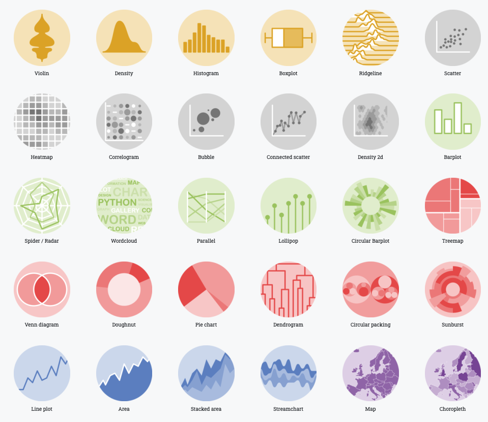
3. Use color meaningfully and with restraint
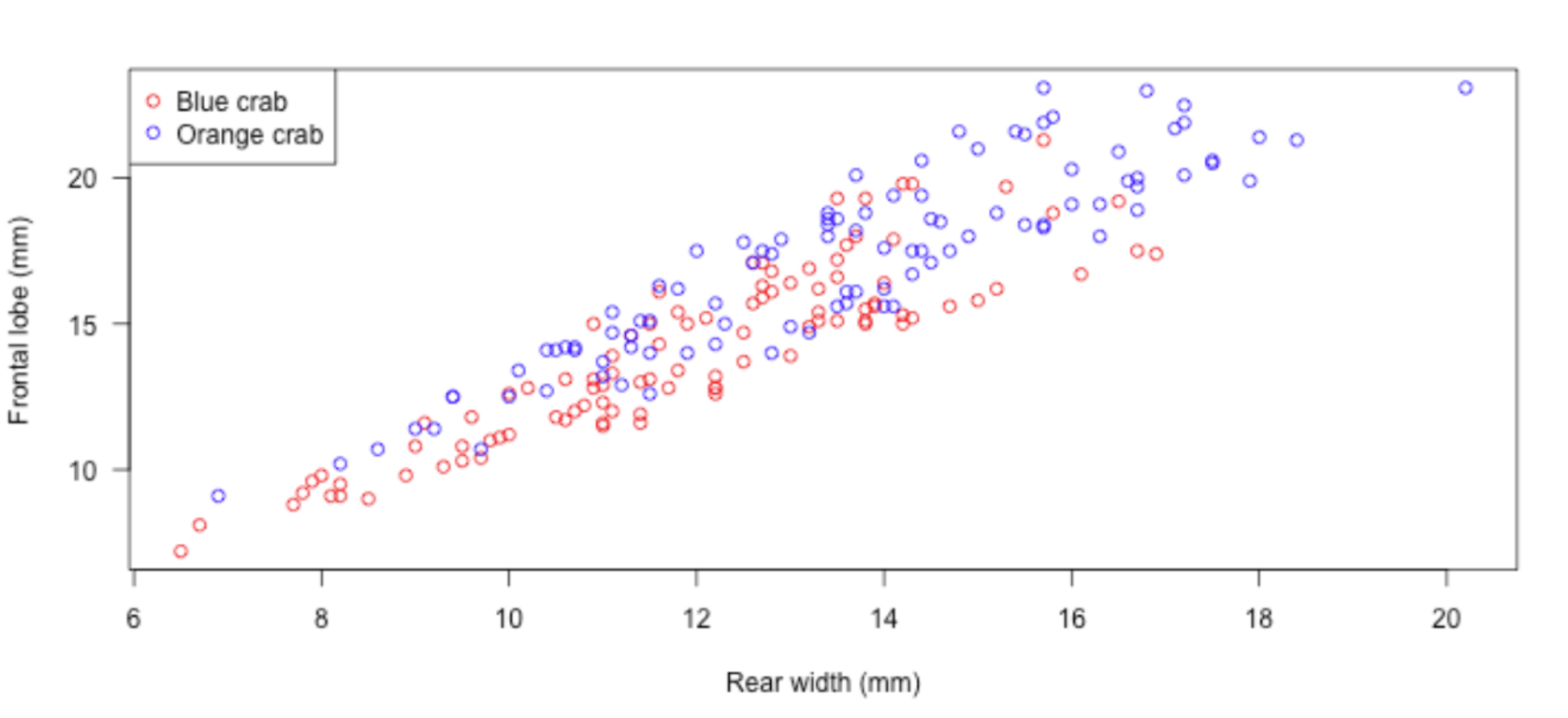
3. Use color meaningfully and with restraint
4. Tell a story
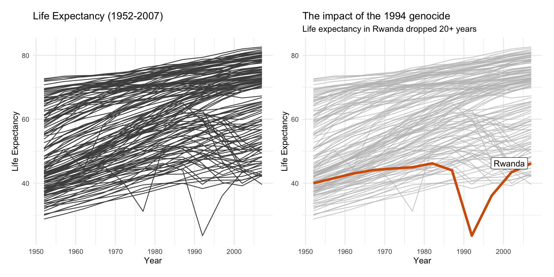
4. Tell a story
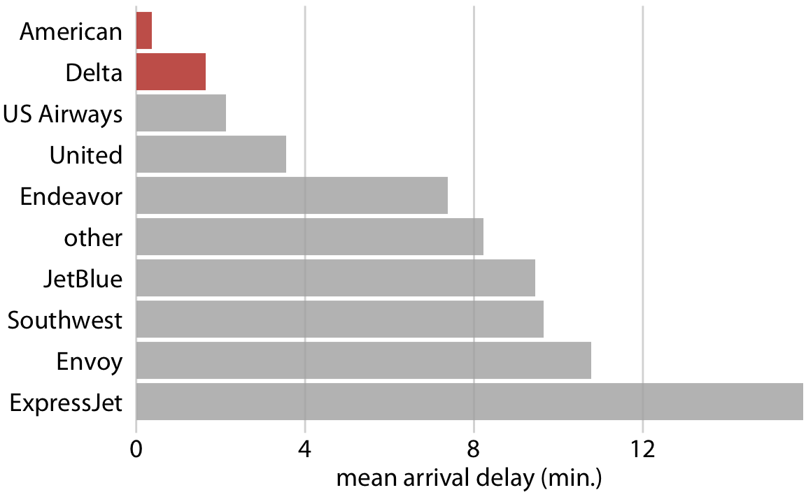
One way to do this is by highlighting the important parts
5. Leave out non-story details
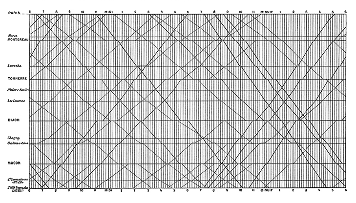
Is this train schedule easy to read?
5. Leave out non-story details
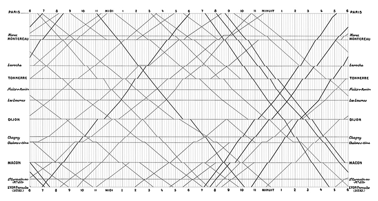
Does removing gridlines make it somewhat easier?
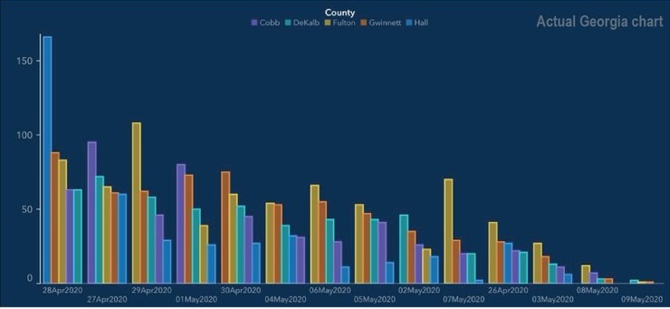
Data visualizations have an aura of objectivity
“We focus on four conventions which imbue visualisations with a sense of objectivity, transparency and facticity. These include: a) two-dimensional viewpoints; b) clean layouts; c) geometric shapes and lines; d) the inclusion of data sources.”
Same data, two stories
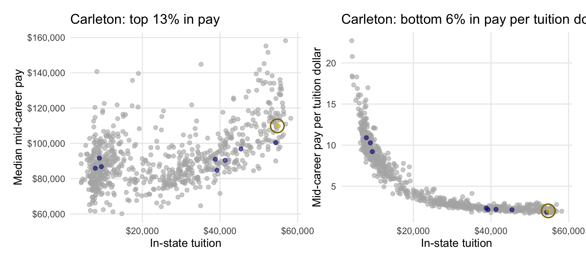
Both are true. Which would go in an admissions brochure? Which would go in a critique of college costs?
Why does the graph on the right have such a strong negative trend?
Good graphs can also break these guidelines
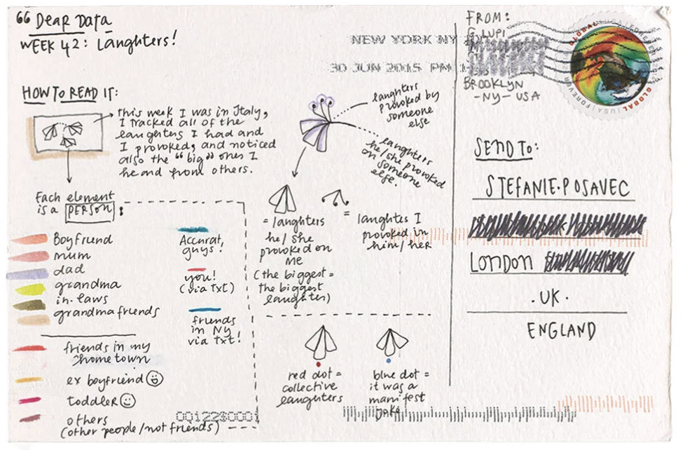
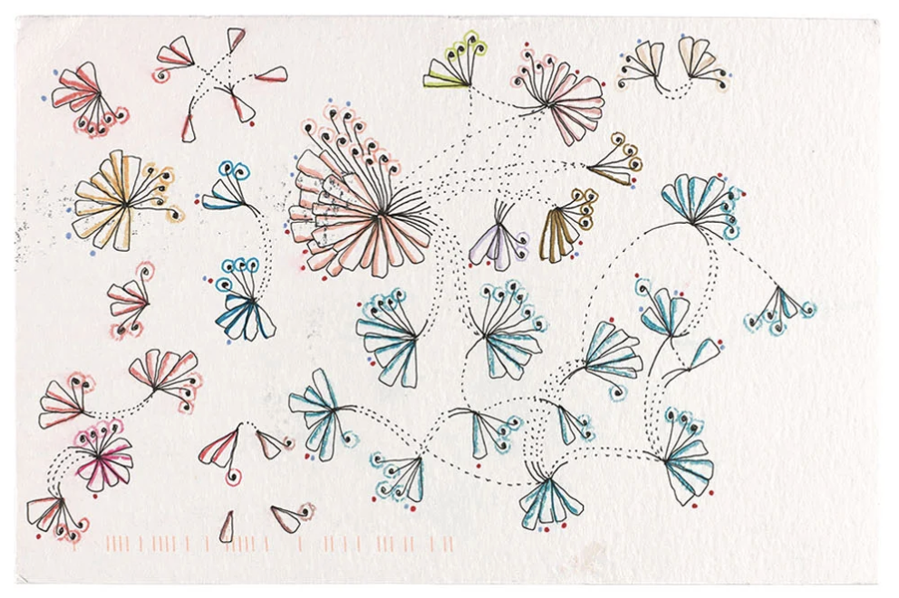
Good graphs can also break these guidelines