
Intro to ggplot2
TipNote:
The YAML header includes the line eval: false. Make sure to delete this when you are ready to render your file.
Tip
If you need a refresher for how to access the quarto file from this document, see Activity01
The data we’re using today contains information about all seasons of Survivor and comes from the survivoR R package. In the show, a group of people (called castaways) are placed in an isolated location, where they must provide food, fire, and shelter for themselves. The castaways compete in challenges testing the contestants’ physical abilities like running and swimming or their mental abilities like puzzles and endurance challenges for rewards and immunity from elimination. The castaways are progressively eliminated from the game as they are voted out by their fellow contestants until only two or three remain. At that point, the players who were eliminated (the “jury”) vote for the winner. The winner is given the title of “Sole Survivor” and is awarded the grand prize of $1,000,000
survivor_episodes = readr::read_csv("../../data/survivor_episodes.csv") # https://stat220-f26.github.io/data/survivor_episodes.csv-
season: the number of each season -
version: which country’s version of the show (US,AU,SA,UK,NZ) -
episode_number_overall: the episode’s position across the entire run of that version (episode 1 of season 1 is1, episode 1 of season 2 continues counting up, etc.) -
episode: the episode’s position within its own season -
episode_label:"Ep 1","Finale","Reunion", etc. -
viewers: number of people who watched the episode live -
imdb_rating: the episode’s average IMDB rating -
n_ratings: how many IMDB users rated the episode
Speed Groupwork
Round 1: View the data and summary statistics
1. To get started, load the tidyverse and and take a glimpse at the dataset. How many rows and columns are there? What does each row represent?
Each row is an individual episode. There are 1,136 rows and 9 columns.
Rows: 1,136
Columns: 9
$ season                 <dbl> 1, 1, 1, 1, 1, 1, 1, 1, 1, 1, 1, 1, 1, 1, 1, 1,…
$ version                <chr> "US", "AU", "SA", "UK", "NZ", "US", "AU", "SA",…
$ episode_number_overall <dbl> 1, 1, 1, 1, 1, 2, 2, 2, 2, 2, 3, 3, 3, 3, 3, 4,…
$ episode                <dbl> 1, 1, 1, 1, 1, 2, 2, 2, 2, 2, 3, 3, 3, 3, 3, 4,…
$ episode_label          <chr> "Ep 1", "Ep 1", "Ep 1", "Ep 1", "Ep 1", "Ep 2",…
$ episode_date           <date> 2000-05-31, 2016-08-21, 2006-09-03, NA, 2017-0…
$ viewers                <dbl> 15510000, 783000, NA, NA, NA, 18100000, 734000,…
$ imdb_rating            <dbl> 8.0, 7.9, NA, NA, 6.7, 7.4, 7.7, NA, NA, 6.5, 7…
$ n_ratings              <dbl> 330, 42, NA, NA, 9, 238, 31, NA, NA, 8, 229, 30…
2. Skim through the data a bit. Do you notice any variables or rows that have lots of missing data?
Yes,
viewershas lots of missing data
3. For example, the chunk below selects the viewers column. Run summary(survivor_episodes$viewers) and describe what you find. (What does the NA's line in the output mean?)
This gives the summary statistics for the variable - the NA’s indicates that there were 358 entries with missing data
summary(survivor_episodes$viewers) Min. 1st Qu. Median Mean 3rd Qu. Max. NA's
508000 5855000 9700000 10889454 14427500 51690000 358 4. Another handy function is unique(). Run unique() on the version variable to see which countries have their own version of Survivor.
unique(survivor_episodes$version)[1] "US" "AU" "SA" "UK" "NZ"
ImportantWait!
Stop here and wait for the next round of groups before moving on
Round 2: Scatterplots
Guess: over Survivor’s 25-year, 47-season run, has episode viewership gone up or down?
First, let’s create a scatterplot of viewers_finale (the number of viewers for the last episode of the season) vs. viewers_premiere (the number of viewers for the first episode of the season).
First, let’s create a scatterplot of viewers (the number of people watching) vs. episode_number_overall (how far into the show’s history that episode is).
A note on wording: when we say viewers vs. episode_number_overall, this should be interpreted as “variable on the y-axis” vs. “variable on the x-axis”.
5. Fill in the data and aesthetic mapping in the below code chunk. What is returned? What’s missing?
6. Add the appropriate geometric object to create the scatterplot. This is called adding a layer to a plot. Remember to always put the + at the end of a line, never at the start.
ggplot(data = survivor_episodes, mapping = aes(y = viewers, x = episode_number_overall)) +
  geom_point()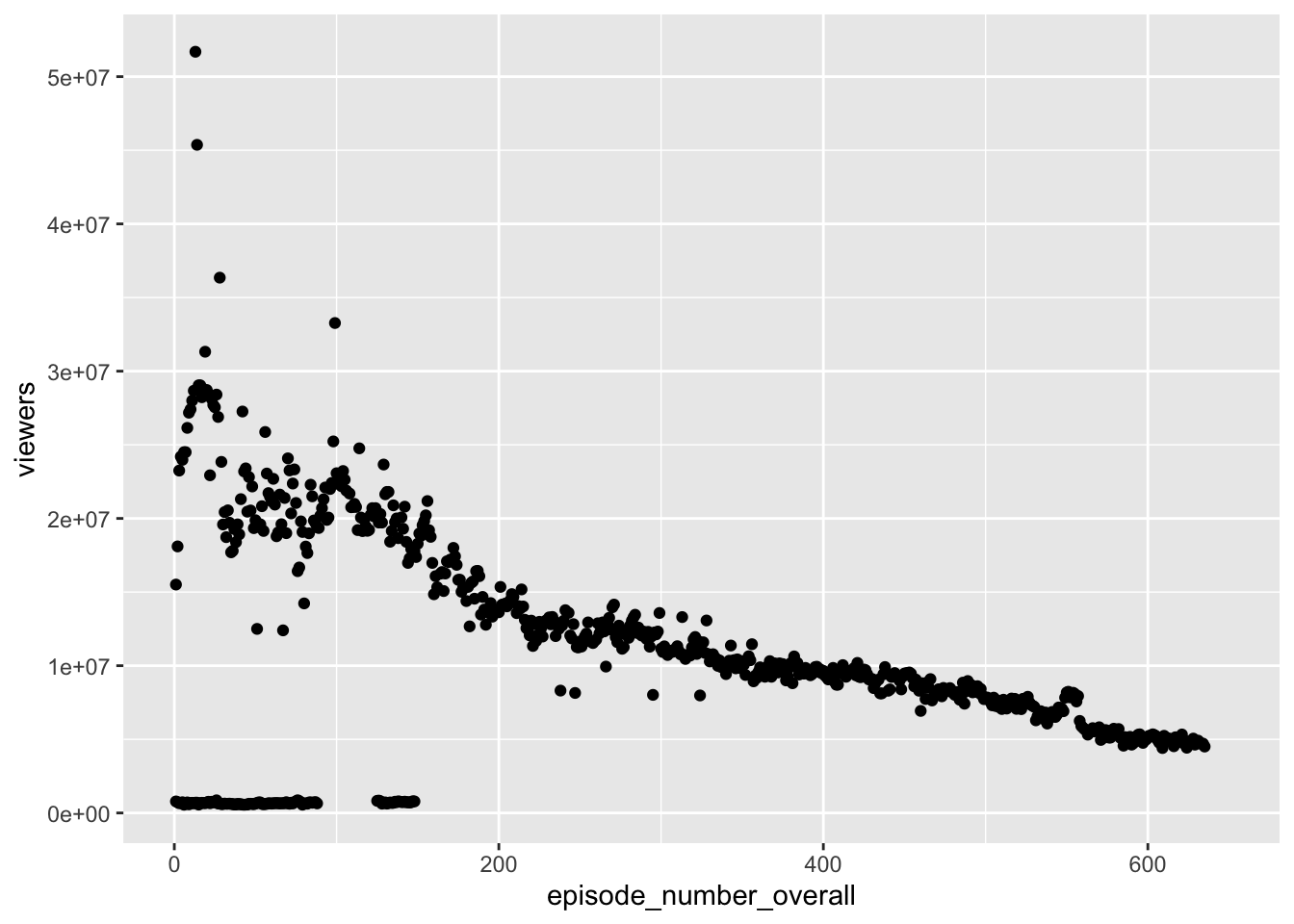
What do you notice? Write a sentence or two describing your findings
7. You must remember to put the aesthetic mappings in the aes() function! What happens if you forget?
# Add a layer and see what happens
ggplot(data = survivor_episodes, x = viewers, y = episode_number_overall)
8. The aesthetic mappings can be specified in the geom layer if you prefer, instead of the main ggplot() call. Give it a try:
# Rebuild the scatterplot with your aesthetic mapping in the geom layer
ggplot(data = survivor_episodes) +
  geom_point(mapping = aes(y = viewers, x = episode_number_overall))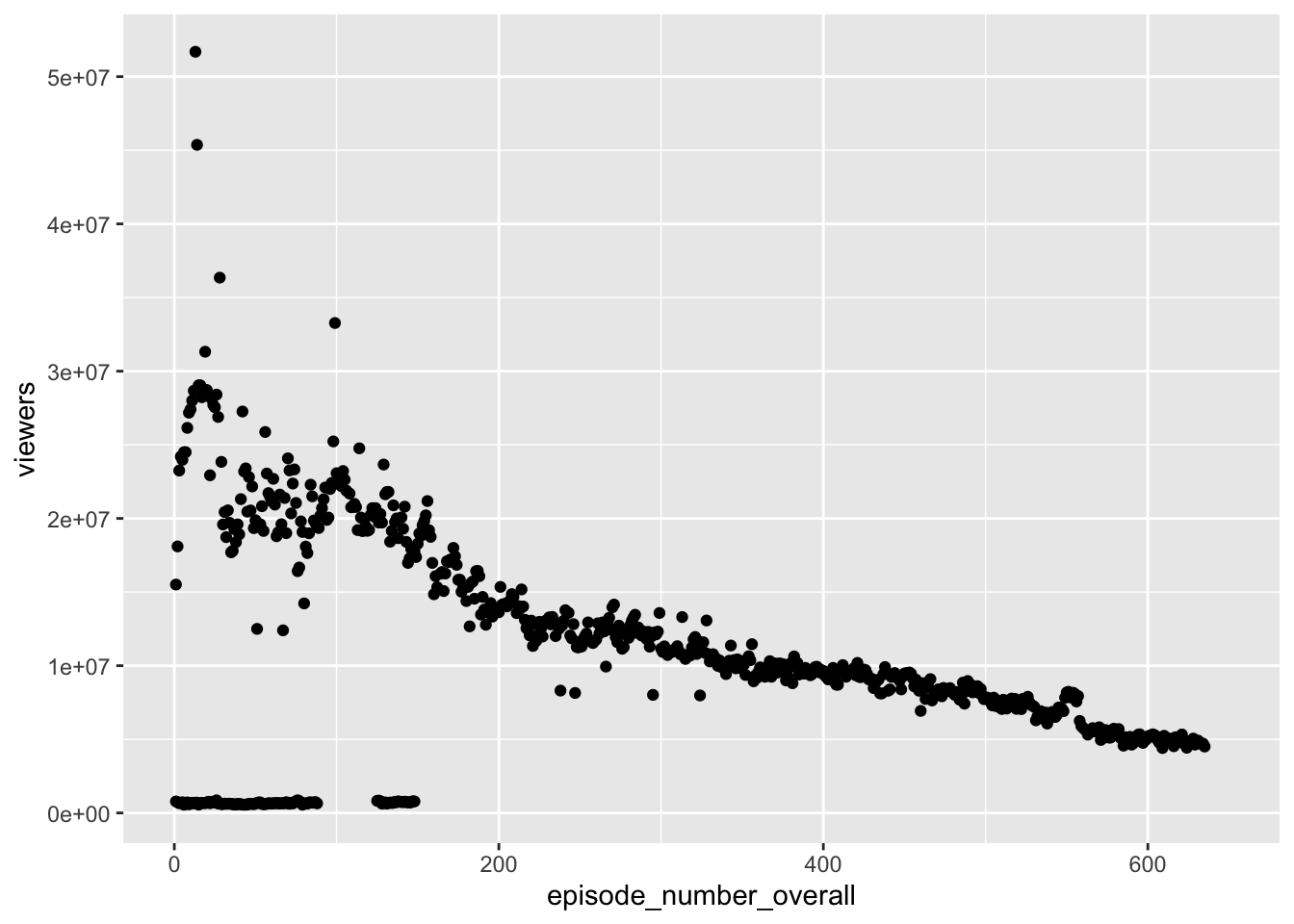
Bonus, if you have time: add a geom_smooth() layer to your scatterplot from question 6 (aes in the ggplot call). Does the trend line back up your guess from the start of this round, or complicate it?
ggplot(data = survivor_episodes, mapping = aes(y = viewers, x = episode_number_overall)) +
  geom_point() +
  geom_smooth()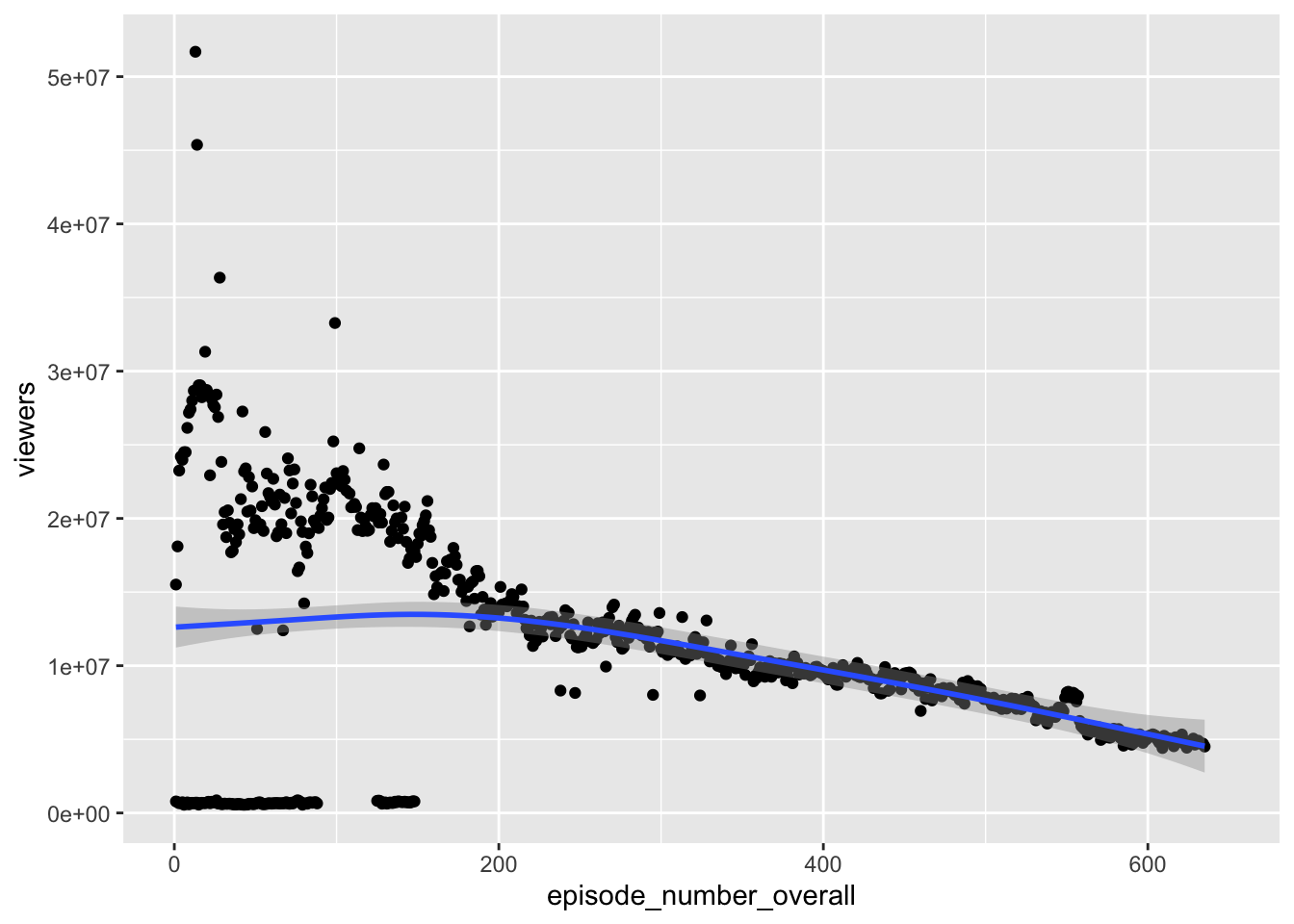
ImportantWait!
Stop here and wait for the next round of groups before moving on
Round 3: Additional Aesthetics
x and y are not the only aesthetic mappings possible. In this section you’ll explore the color, size, shape, and alpha (i.e. transparency) aesthetics. This time you’ll focus on a different question: does a better-reviewed episode draw more viewers, or are ratings and popularity unrelated? Make a guess before you start plotting.
9. Create a scatterplot of viewers vs. imdb_rating. Add the color aesthetic to map version to the point color. Does the plot support your guess?
ggplot(data = survivor_episodes) +
  geom_point(aes(x = imdb_rating, y = viewers, color = version))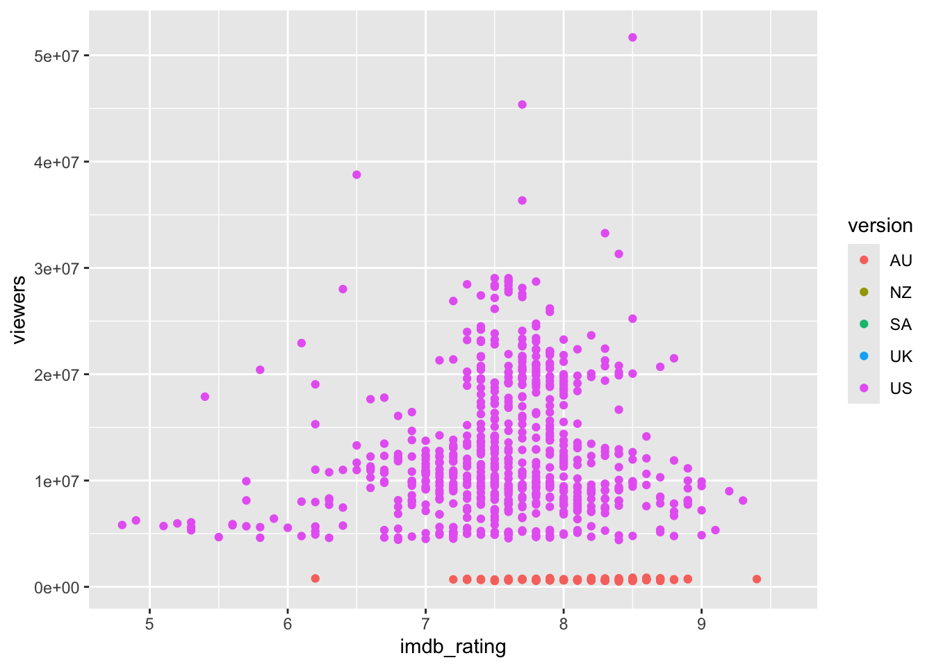
10. Create a scatterplot of viewers vs. imdb_rating. Use shape to represent version. Is this plot easier or harder to interpret than the previous plot?
ggplot(data = survivor_episodes) +
  geom_point(aes(x = imdb_rating, y = viewers, shape = version))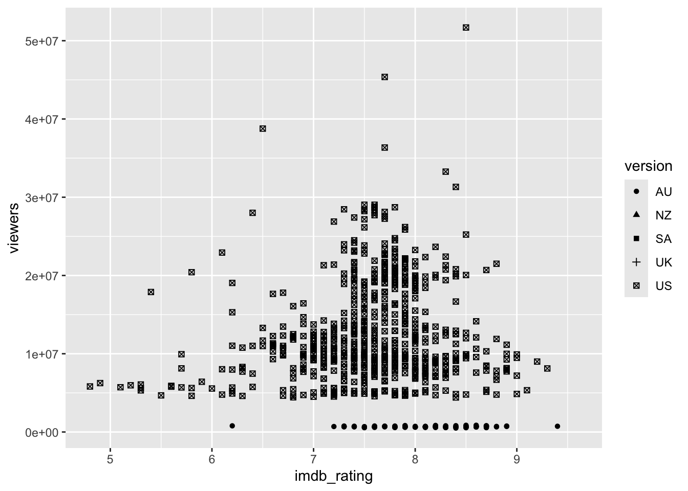
11. Create a scatterplot of viewers vs. imdb_rating. Use both shape and color to represent version. Is this plot easier or harder to interpret than the previous two plots?
ggplot(data = survivor_episodes) +
  geom_point(aes(x = imdb_rating, y = viewers, shape = version, color = version))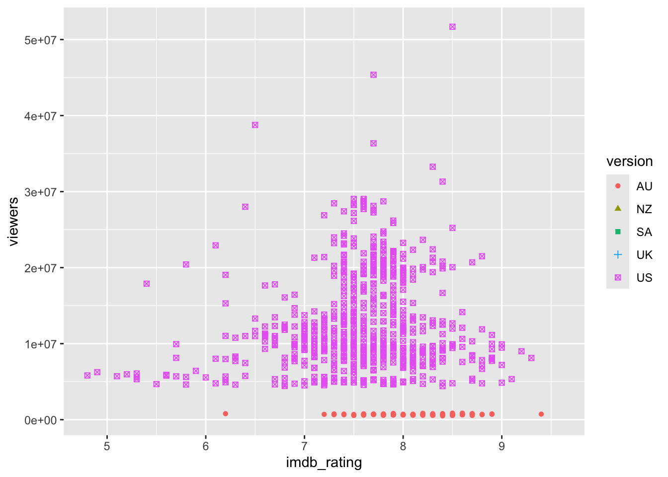
12. Create a scatterplot of viewers vs. imdb_rating. Use color to represent the season. What did you learn from the plot?
ggplot(data = survivor_episodes) +
  geom_point(aes(x = imdb_rating, y = viewers, color = season))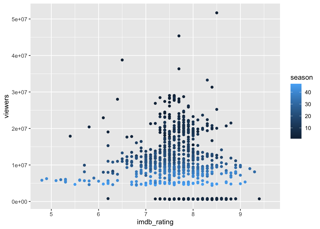
13. Create a scatterplot of viewers vs. imdb_rating. Use size to represent the season.
ggplot(data = survivor_episodes) +
  geom_point(aes(x = imdb_rating, y = viewers, size = season))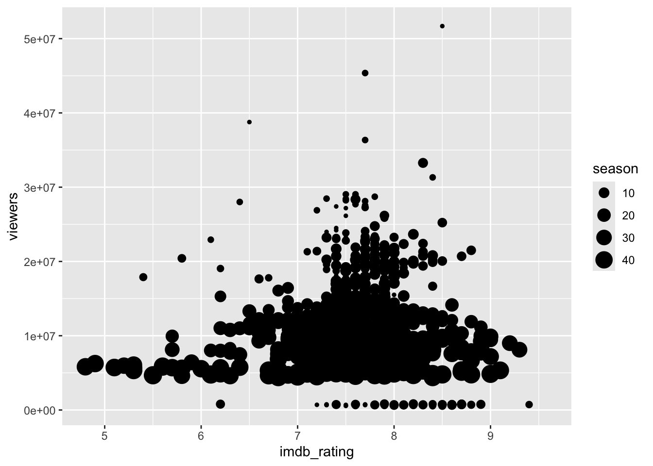
14. Look back at your scatterplots from the last few questions. Explain the differences when you map aesthetics to discrete and continuous variables.
15. Create a scatterplot of viewers vs. imdb_rating. Use alpha to represent the season.
ggplot(data = survivor_episodes) +
  geom_point(aes(x = imdb_rating, y = viewers, alpha = season))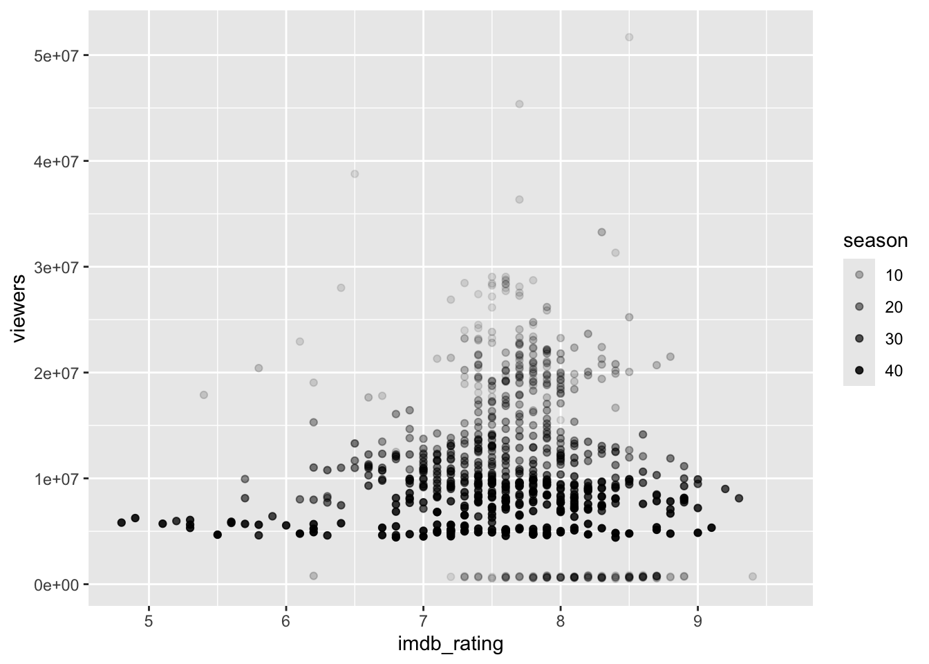
Bonus, if you have time: a lot of episodes share the same rounded IMDB rating, so points are stacking on top of each other. Try geom_jitter() instead of geom_point() (same syntax!) on the viewers vs. imdb_rating scatterplot. What do you notice?
ggplot(data = survivor_episodes) +
  geom_jitter(aes(x = imdb_rating, y = viewers))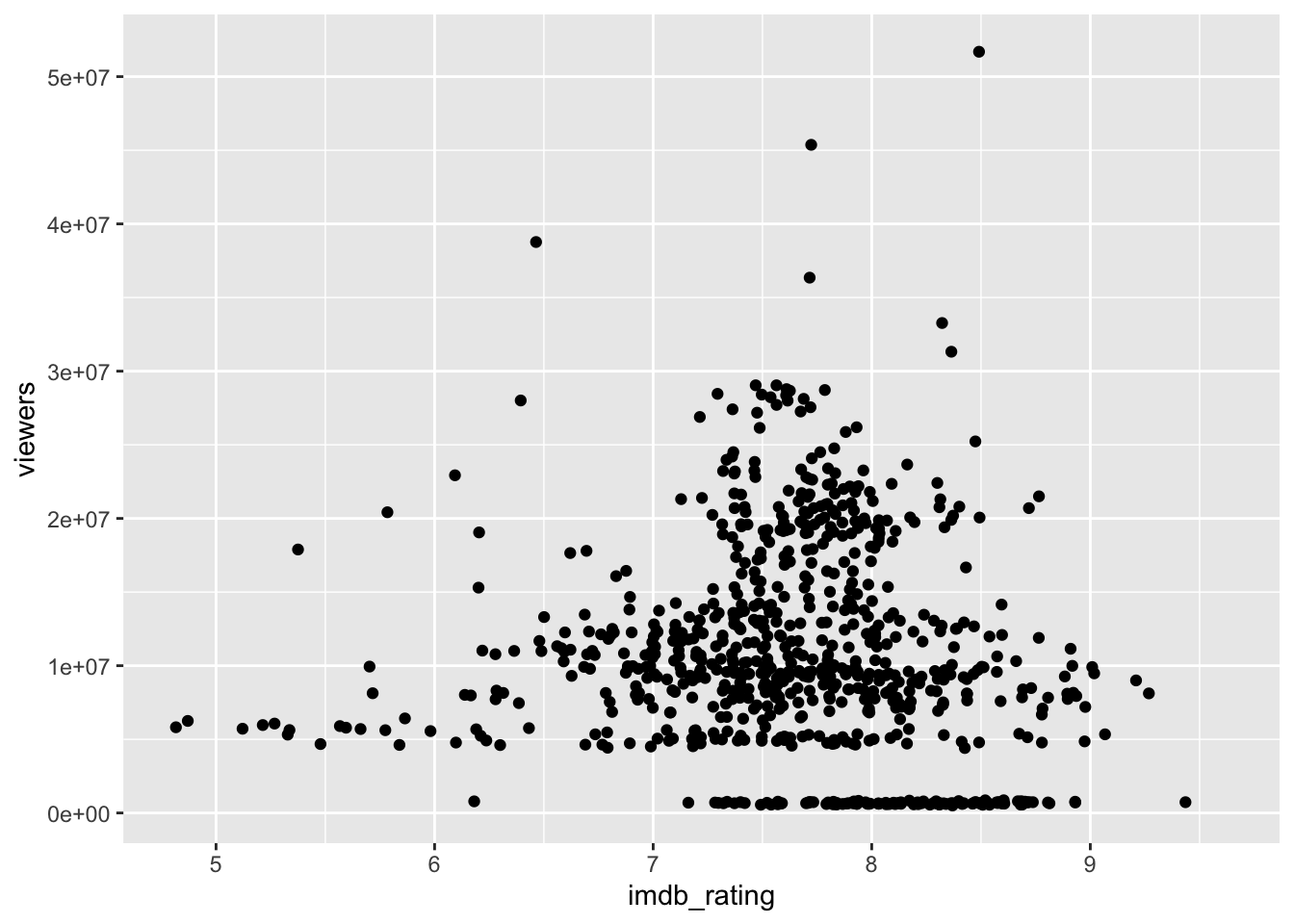
ImportantWait!
Stop here and wait for the next round of groups before moving on
Round 4: Visualizing Distributions
For the rest of today we’ll switch to a different dataset from the same package: confessionals, which has one row per castaway per episode, recording how many on-camera “confessional” interviews they gave.
survivor_confessionals = readr::read_csv("../../data/survivor_confessionals.csv") # https://stat220-f26.github.io/data/survivor_confessionals.csv-
season,version: same as before -
era: which stretch of the show’s history the season falls in ("Seasons 1-15","Seasons 16-30","Seasons 31+") -
episode: episode number within the season -
castaway: the castaway’s name -
confessional_count: how many confessionals that castaway gave in that episode
16. Build a histogram of confessional_count using geom_histogram(). Don’t hesitate to look at the ggplot2 cheat sheet for help!
# Fill in the blanks
ggplot(survivor_confessionals) +
  geom_histogram(aes(x = confessional_count))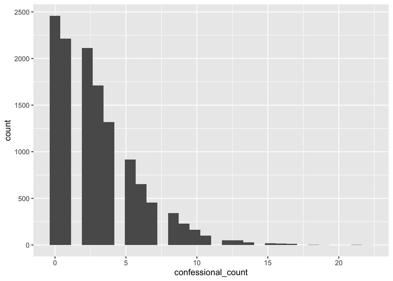
What have you learned about the distribution of confessional counts?
17. By default, ggplot2 uses 30 bins. To change the number of bins, to say 15, add the argument bins = 15 to geom_histogram(). Note: this is not an aesthetic mapping.
# Fill in the blanks
ggplot(survivor_confessionals) +
  geom_histogram(aes(x = confessional_count), bins = 15)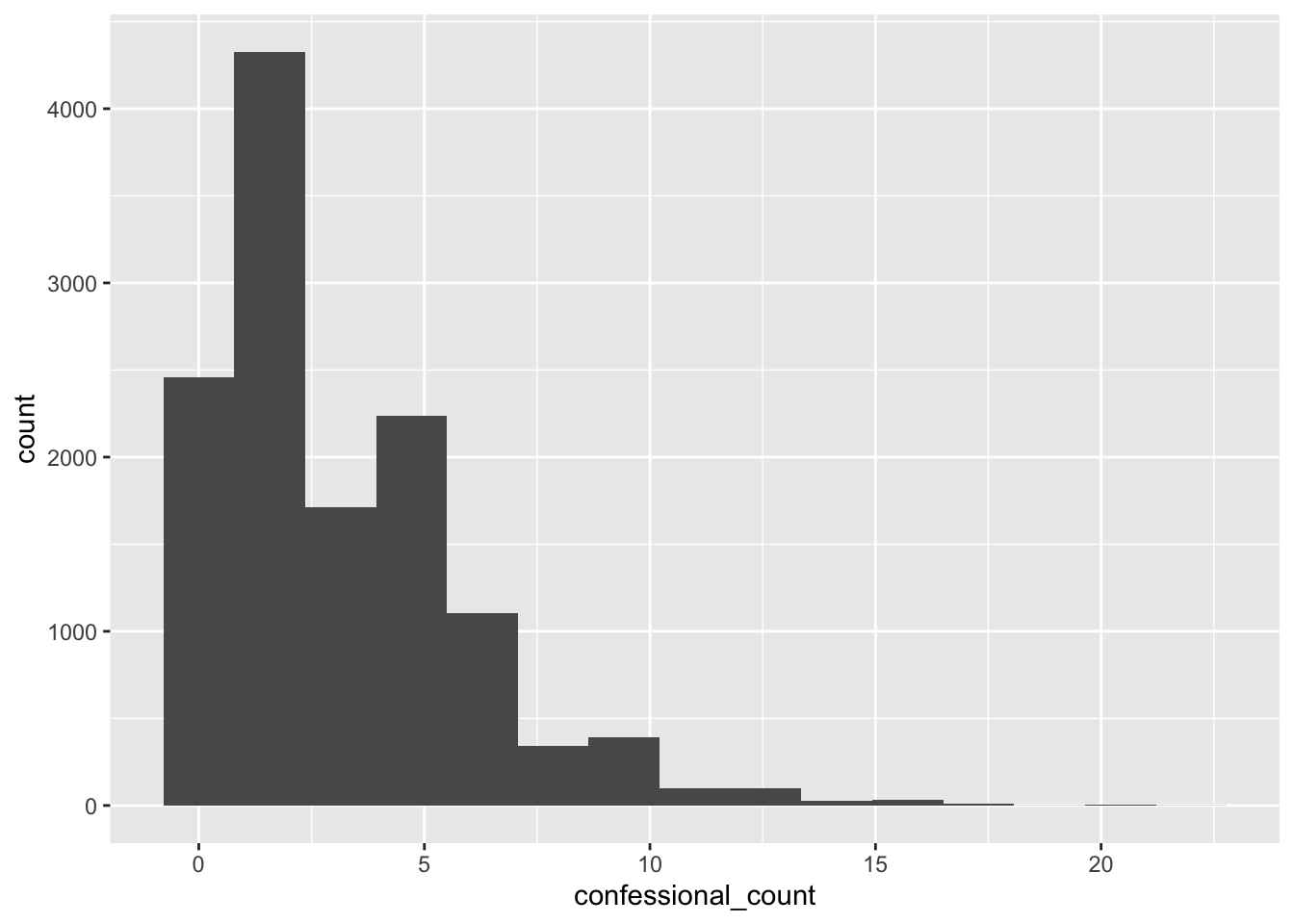
18. Instead of a histogram, let’s create a kernel density plot. To do this, substitute geom_density() into your code for question 16.
# Fill in the blanks
ggplot(survivor_confessionals) +
  geom_density(aes(x = confessional_count))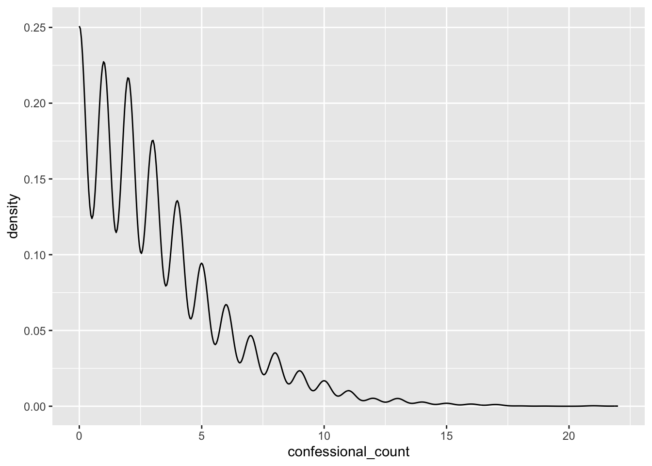
19. Prediction: as Survivor has racked up more seasons, do you think the typical number of confessionals per person has gone up, gone down, or stayed about the same? Make your guess, then make side-by-side boxplots of confessional_count for each era.
# Fill in the blanks
ggplot(survivor_confessionals) +
  geom_boxplot(aes(x = era, y = confessional_count))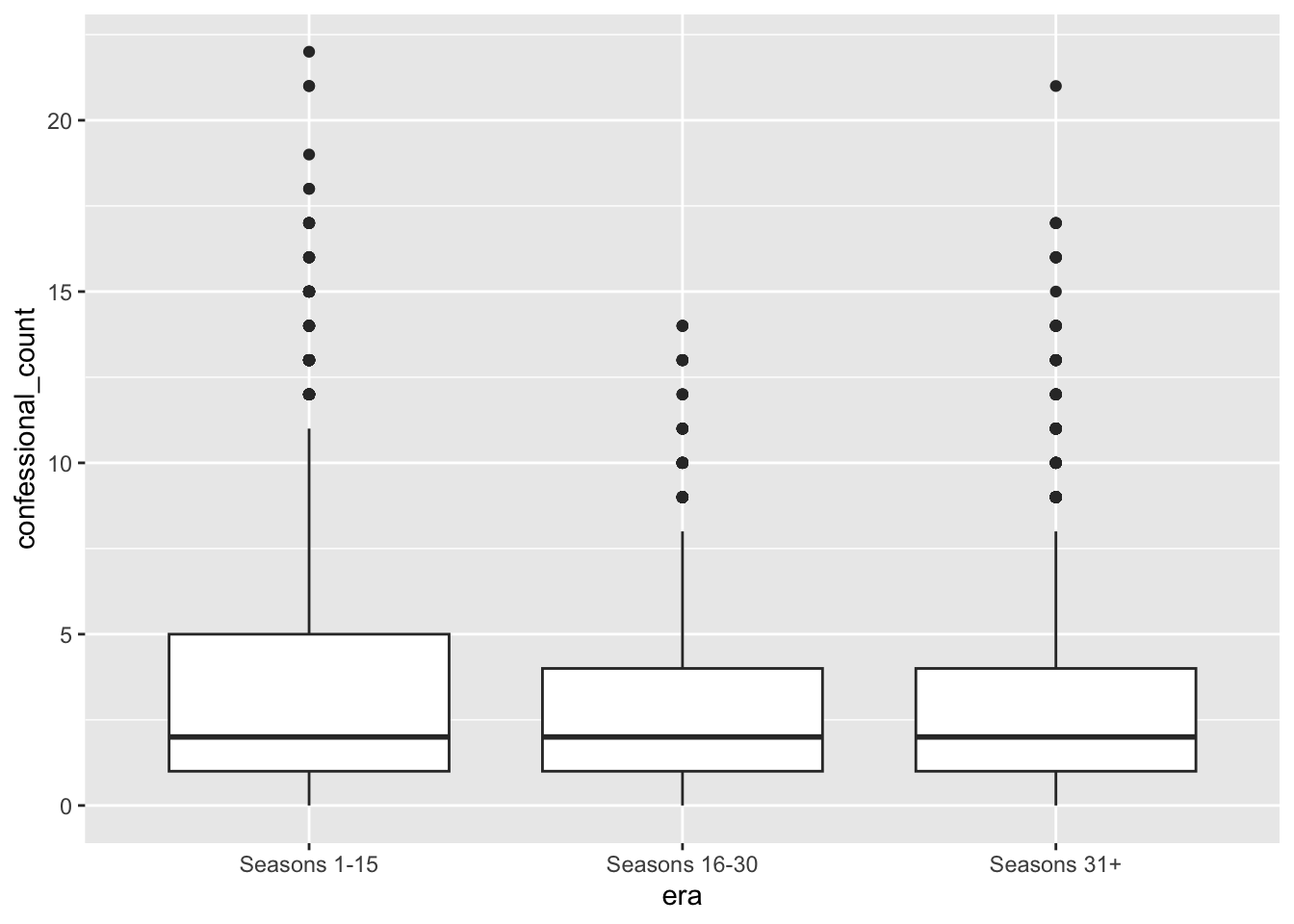
20. A violin plot is a kernel density on its side, made symmetric. Change your code from question 19 to use geom_violin(). Which plot do you prefer, boxplots or violin plots? Why?
ggplot(survivor_confessionals) +
  geom_violin(aes(x = era, y = confessional_count))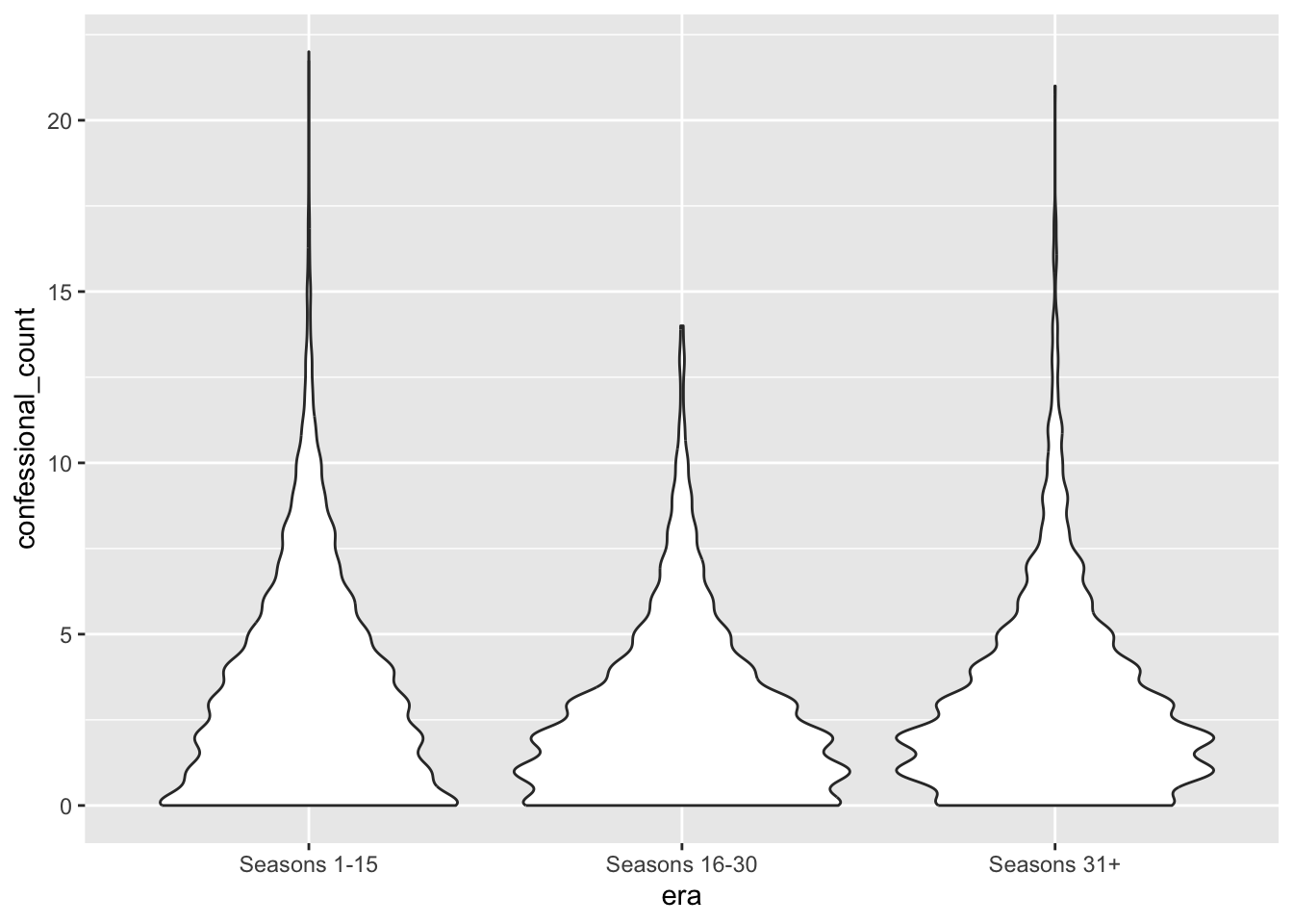
Bonus, if you have time: try geom_jitter() on top of (or instead of) your boxplot/violin from the last two questions. A lot of castaways get 0 or 1 confessionals in a given episode — what does jitter show you about that pile-up that the boxplot and violin plot hide?
ggplot(survivor_confessionals, aes(x = era, y = confessional_count)) +
  geom_violin() +
  geom_jitter(size = .5)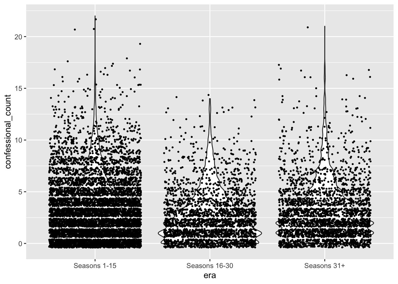
ImportantWait!
Stop here and wait for the next round of groups before moving on
Round 5: Bar and column charts + Labeling
How many confessional records do we have for each version of the show? Let’s find out!
21. Make a bar chart of the number of rows for each version using geom_bar()
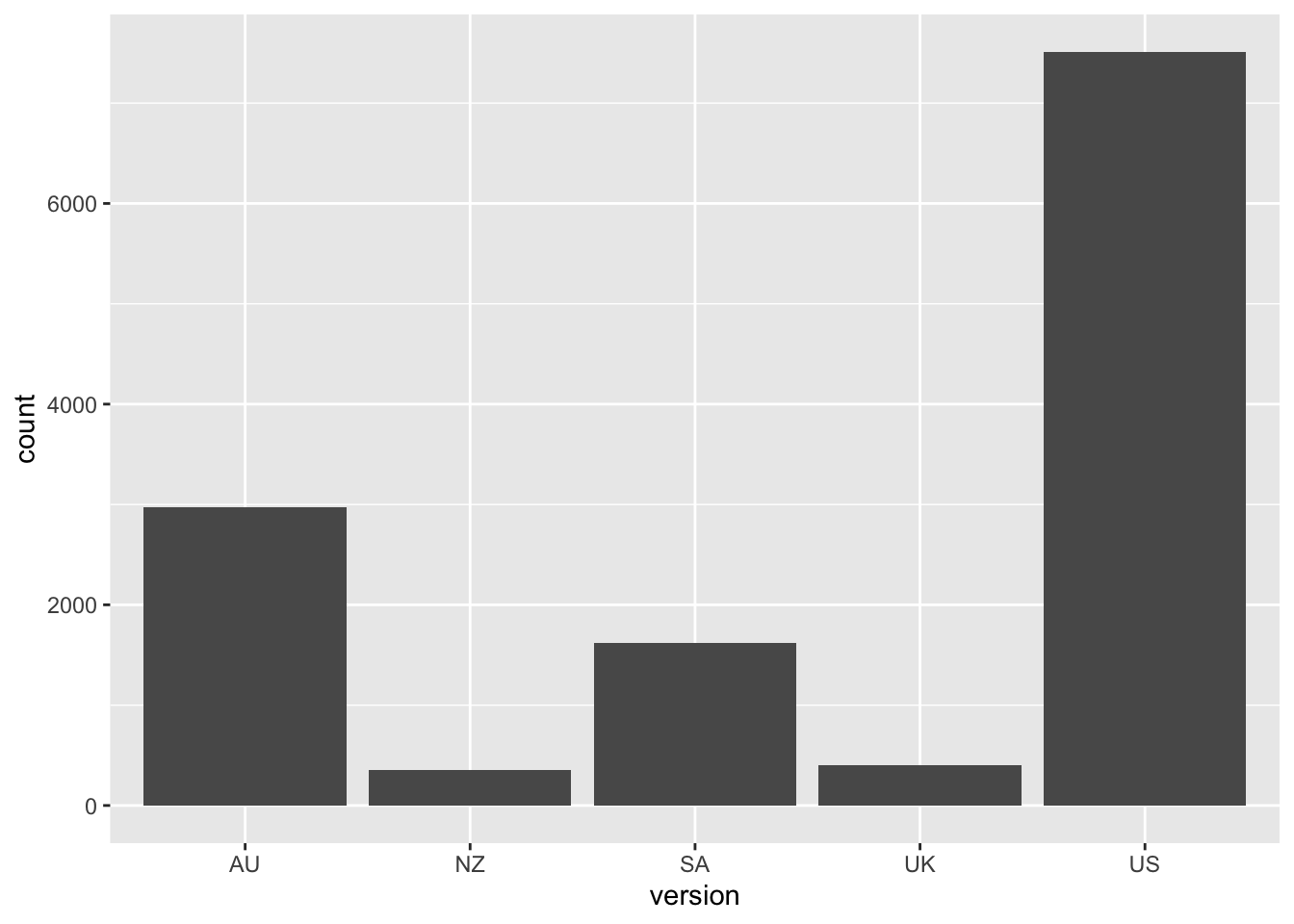
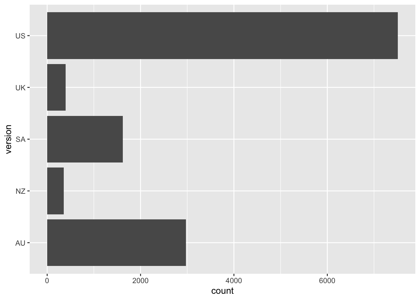
22. When you have lots of categories, it’s sometimes hard to read the labels on the x-axis. One trick is to flip the axes. Rebuild your bar chart using the y aesthetic instead of x.
23 . Sometimes the variable we want to show up in the bar chart shows up explicitly in our data, so we don’t need geom_bar() to count it for us. The chunk below creates finale_confessionals, which contains just the castaways from the Season 40 (“Winners at War”) finale and how many confessionals each one gave in that episode.
Put confessional_count on the x-axis, and castaway on the y-axis. Use geom_col (column) as the geom, using the finale_confessionals data. How is this different than a bar plot?
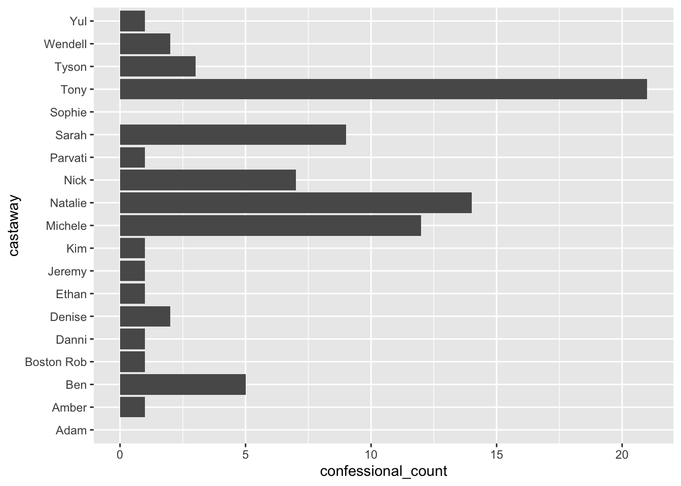
Who got the most confessional time in that episode?
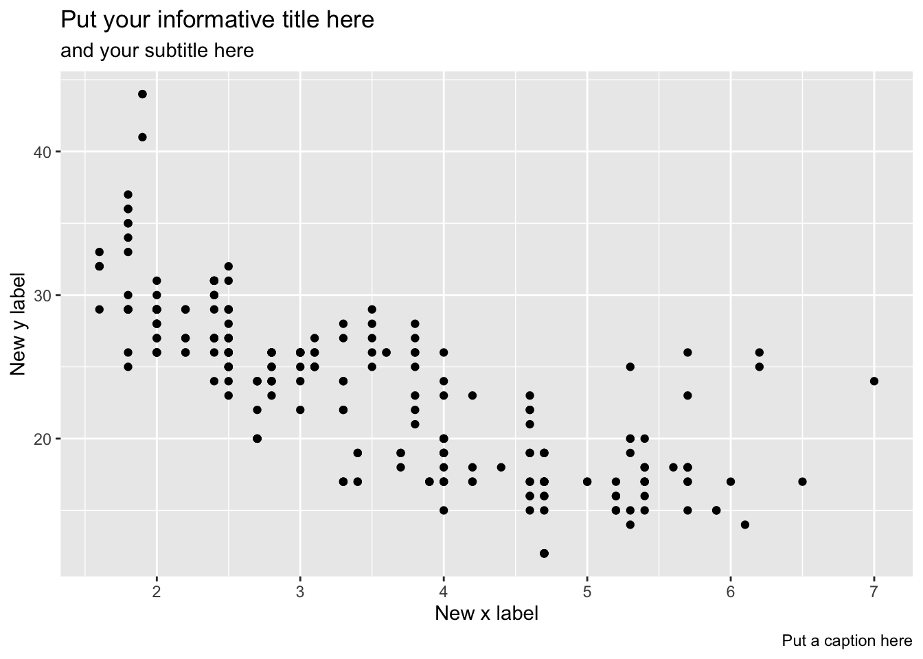
24. In ggplot2 you can add/change the title, subtitle, caption, and x- and y-axis labels by adding a labs() layer. Below is an example illustrating it’s use. Choose one graph from today and add all labels.
ggplot(data = mpg) +
  geom_point(mapping = aes(x = displ, y = hwy)) +
  labs(
    title = "Put your informative title here",
    subtitle = "and your subtitle here",
    x = "New x label",
    y = "New y label",
    caption = "Put a caption here"
  )
ImportantWhen you’re done
Make a post on the “Week 1 - Friday” discussion thread on Ed.
- Option 1: If you have any lingering questions about ggplot, feel free to post them
- Option 2: You can also post your final graph for the last question!