01: College Majors
Getting started
You should open this document in RStudio. To do so:
- Either open your local RStudio program or navigate to <maize.mathcs.carleton.edu> in your browser and log in.
- Go to file –> New file –> Quarto document … –> “Create empty document”. This should open a new .qmd file in your Rstudio session. Delete everything in this file so that you have a totally blank document.
- Next, we need to copy this template into your new quarto file.
- come back to this page and click the “code” button at the top of the page.
- Click the “copy” symbol in the upper right corner of the popup file
- Navigate back to your empty .qmd file and “paste” the text there
- You should now be able to see this document in your own session, and you can run code and edit it as you need to! Make sure to save it in your Stat220 “activities” folder.
Introduction
Which college majors lead to the highest earnings after graduation? Which have the most balanced gender ratios? Does a more male- or female-dominated major tend to pay more, and does that relationship look the same across different fields of study? Answering these questions (at a high level) is the focus of this analysis.
Packages
We will use the tidyverse and scales packages for data wrangling and visualization, the DT package for interactive display of tabular output, and the fivethirtyeight package for the data.
Data
The data we’re using come from the fivethirtyeight package, which packages up the data behind many of FiveThirtyEight’s published articles and analyses. We’ll use college_recent_grads, which comes from the American Community Survey 2010-2012 Public Use Microdata Series and was originally compiled for the FiveThirtyEight article “The Economic Guide To Picking A Major”. Each row is a college major, with columns describing how many people graduated in that major, what share were women, what their median salary was, and more.
majors <- college_recent_gradsSalary and gender balance, by major category
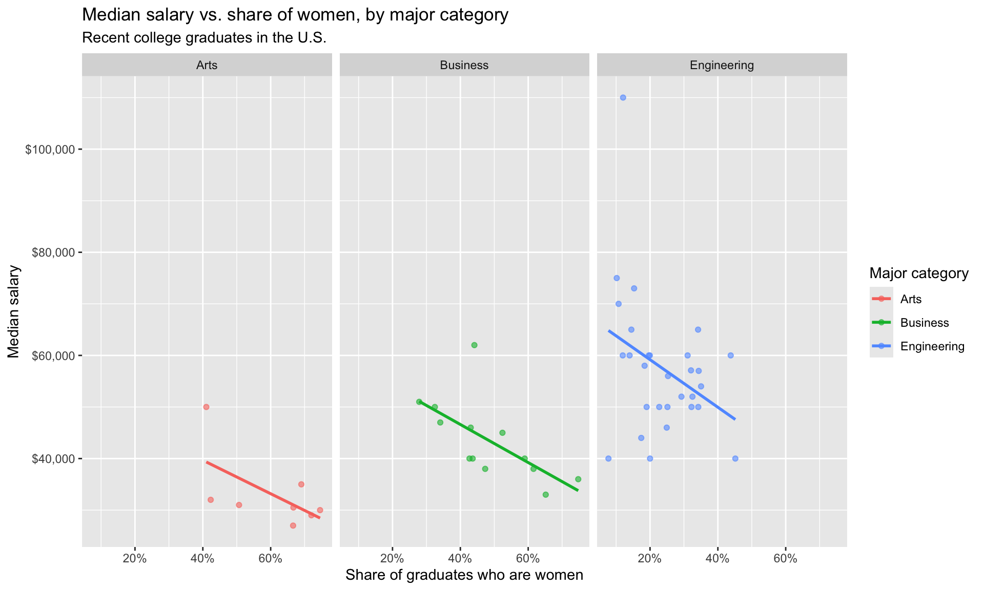
Let’s create a data visualization that displays the relationship between the gender balance of a major (the share of graduates who are women) and its median salary, for a few major categories, and see whether that relationship looks similar across categories.
We can easily change which major categories are being plotted by changing which categories the code below filters for. Note that the category name should be spelled and capitalized exactly the same way as it appears in the data. See the Appendix for a list of the major categories (and individual majors) in the data.
majors %>%
  filter(major_category %in% c("Engineering", "Arts", "Business")) %>%
  ggplot(mapping = aes(x = sharewomen, y = median, color = major_category)) +
  geom_point(alpha = 0.6) +
  geom_smooth(method = "lm", se = FALSE) +
  facet_wrap(~major_category) +
  scale_x_continuous(labels = percent) +
  scale_y_continuous(labels = dollar) +
  labs(
    title = "Median salary vs. share of women, by major category",
    subtitle = "Recent college graduates in the U.S.",
    x = "Share of graduates who are women",
    y = "Median salary",
    color = "Major category"
  )
References
- Ben Casselman (2014). “The Economic Guide To Picking A Major”. FiveThirtyEight.
- Albert Y. Kim, Chester Ismay, Jennifer Chunn (2021). fivethirtyeight: Data and Code Behind the Stories and Interactives at ‘FiveThirtyEight’. R package version 0.6.2.
- Data originally sourced from the American Community Survey 2010-2012 Public Use Microdata Series.
Appendix
Below is a list of majors and major categories in the data set: